|
|
Critique By:
Galeota (K:919)
8/18/2007 7:40:01 AM
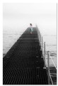
Hello Luis, the words I wrote you are entirely deserved by your talent and sensivity, hence it is a pleasure for me. As far as Galeota, it is a username with an affective link to private souvenirs, and it describes a boat which takes its origins in the XVIIIth century. There is an extraordinary example in Museu da Marinha, in Lisbon, if you ever pass by there. Bem haja.
|
Photo By: luis pereira
(K:26013)

|
|
|
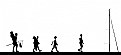
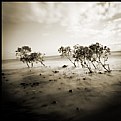
Critique By:
Galeota (K:919)
8/17/2007 7:45:22 PM
Excellent highkey effect to portray the family outing to the overcrowded beach (we suppose...). An original concept well put together by a judicious composition. The mast closing the right handside is a must, as well as the thick black line on the bottom (pier or quay). All in all, a good work with light, silhouettes, and position of the elements.
|
| Photo By: a. gianfranco baccelli
(K:21379)
|
|
|
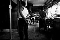
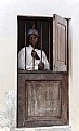
Critique By:
Galeota (K:919)
8/17/2007 7:26:22 PM
Very insightful caption, Gerhard. I like the way you settled a context in which the viewer is allowed to give wings to his imagination, even though that contrasts with the man "emprisoned" behind bars. The presence of the bird is invaluable, as the the position of the man, showing us nothing but his back, like he had no name no more. Like he had been forgotten there and his identity had vanished with time.
|
| Photo By: Gerhard BuschEFIAP/AFIAP
(K:18382)
|
|
|
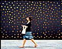
Critique By:
Galeota (K:919)
8/17/2007 7:19:14 PM
Bonjour Jean-François. Le sujet est bien vu en ce qui concerne tout d'abord l'arrière plan original derrière lequel on imagine des êtres aux penchants voyeuristes jetant un coup d'oeil aux passants, mais aussi dans le choix de la vitesse d'obturation laissant la femme dans le flou et donc dans l'éphémérité. J'aime moins les proportions LxH de l'image, et je pense qu'un format 3:2, voir carrément panoramique, serait préférable en termes de dynamisme. Cordialement.
|
| Photo By: Jean-Francois Garneau
(K:1898)
|
|
|
Critique By:
Galeota (K:919)
8/16/2007 11:32:42 PM
Hello Rae. I think her position is unvaluable, and so are her eyes lost in translation if I may say so. Looking through a glass and into herself, paradoxically, to find nothing beyond loneliness. I'm slightly less enthusiastic with your photograph technically speaking: the bottom right corner is messy, and the overexposure draws too much the attention. You could have worked out that corner either with vignetting, either with a judicious crop or clone out work. The reflections around her hair are a bit distracting also. I personally wish her head was slightly more visible. All in all, as you say in your note, undoubtly an insightful shot, nostalgic atmosphere propicious to dreaming or travelling in Time.
|
| Photo By: Rae Pulver
(K:1134)
|
|
|
Critique By:
Galeota (K:919)
8/16/2007 11:21:09 PM
Hello Luis. I'm sure I've come across your photos somewhere else in the web, and as I saw on one of them tonight on the main page of this site, I immediately recognized a particular atmosphere one may find in your visual universe. I am an unconditional admirer of your work because I'm personally touched by the poetic vision you lay on your surrounding world, so impregnated with nostalgia (or so I feel it) and a certain form of loneliness. As our images reflect nothing but our inner world, I'd say there's a poet sleeping tight in your soul, waking up from time to time to let us, the ones in quest for beauty, rejoyce with his imaged gifts. Thank you.
|
| Photo By: luis pereira
(K:26013)
|
|
|
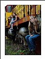
Critique By:
Galeota (K:919)
10/22/2006 6:00:40 AM
Hello Tina. The colors are awsome, subdued with excellent hues and rich, deep tonalities. I love the composition also, and your management of depth of field living the trio behind slightly out of focus. Her serious face expression adds tension to the scene, not as if she was posing, but as if she had a rebel attitude. Finally, good balance between the vertical orientation of the frame and the vertical lines of the train.
|
| Photo By: Tina baker
(K:870)
|
|
|
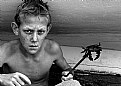
Critique By:
Galeota (K:919)
10/18/2006 3:41:07 PM
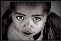
Olá Alfredo. COmposition is rather simple, but your subject is remarkable, as far as I'm concerned. The boy's angulous face carries a particular type of aesthetic, perfect to be photographed. I do like his serious and concentrated facila expression, exposing his prey like a trophee. There is a filmic dimension in the scene and your photograph has the merit of letting our imagination flow beyond it. I feel like wanting to see the scene before and also the way the story continues from here. Good choice to have gone black & white. I like the tones and think you've handled pretty well with contrast. Bem haja!
|
| Photo By: a mb
(K:87)
|
|
|
Critique By:
Galeota (K:919)
10/5/2006 5:13:23 AM
Hello Rochim. I love the way you captured her profile standing out of all the other veiled women, as a gentle breeze blowing across the room. The horizontal division of the frame is a bit awkards, as well as the pano format for this type of scene (I guess you cropped it to best suit your intention/subject). Nevertheless, well exposed, beautiful thin grain and very aesthetic tonalities. Cheers.
|
| Photo By: Rochim Hadisantosa
(K:113)
|
|
|
Critique By:
Galeota (K:919)
10/4/2006 2:36:58 PM
Hello Eunice. some good things, such as the tryptic of men in a sort of triangle and successive layers, and the resemblance in their arms position. Contrast is too harsh though, in my opinion. The blown highlights on the right hand side are really too much, and even the black & whte conversion doesn't help to avoid them. Bracketing would have been judicious in this situation.
|
| Photo By: Eunice Li
(K:-29)
|
|
|
Critique By:
Galeota (K:919)
10/1/2006 7:09:30 AM
Hello Gayle. I've just went through the previous comments and I'm surprised that even though the word "sensual" arises from time to time, no one actually went further and employed the term "erotic". The fact is I truly think there's an explicit erotic dimension in the way the flower reveals itself to the viewer. You'll perhaps tell me that there's no reality but only visual interpretations (which would mean in fact that perceptions are an individual stimulous, hence different from viewer to viewer). Yet there is a sort of appeal which goes beyond the simple call. The viewer feels like being drawn, or literally aspired into the flower, as if he was bewitched. That could be achieved by your judicious post processing, allowing a new dimension to an otherwise rather common subject. I like the harsh black and white, severely underexposed (or burnt during pp), the secrecy and the danger we can perceive beyond its delicate appearance. Very good work.
|
| Photo By: Gayle's Eclectic Photos
(K:91109)
|
|
|
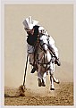
Critique By:
Galeota (K:919)
10/1/2006 6:19:09 AM
Hell Yasir. The moment is spot on, the horse being completely on the air defying the rules of weightlessness. The image is sharp in spite of your subject's movement; you've managed to freeze the instant with a correct shutter speed. I can also observe that the light was probably a bit harsh, but your exposure is without failure, the whites areas being on the limit of overexposure but still under control. I like the fact that the dust behind helped to isolate the subject from the background, even though it doesn't allow for the usual nice bokeh that can be achieved with this kind of lens.
|
| Photo By: Yasir Nisar
(K:129)
|
|
|
Critique By:
Galeota (K:919)
9/30/2006 7:59:47 AM
Hello ZioSeb. Incredible how his eyes seem to come out of his head. I wonder if you "pushed" the effect a bit by dodging in there. Anyway, well caught, a moment of tension and we really feel like being in the scene. It is a dynamic insight of the measure of forces between the two men. Their facial expressions and body postures are unvaluable. I do like your black and white, with harsh contrast and lots of detail to be seen. This is a fine work.
|
| Photo By: ZioSeb zioseb
(K:492)
|
|
|
Critique By:
Galeota (K:919)
9/30/2006 5:40:00 AM
Hello Mr Oochappan. I'd guess this is a fine choice as a first photograph to post. After all, geometric forms and their juxtaposure are one way among others to build an enigmatic path towards knowledge (should it be the discovery of others or perhaps only our environment). Both the triangle and the circle balance the left half of the frame, setting the resumé of the human's life complexity seen on the foreground. I hope you enjoy this new travel of yours, and wish you success in your revealing of Tamil Nadu.
|
| Photo By: oochappan p
(K:6)
|
|
|
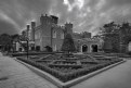
Critique By:
Galeota (K:919)
9/30/2006 5:32:23 AM
Hello Salvatore. Composition seems good to me, with a judicious use of the wide angle at the corner of a triangle, bothe alleys on the sides leading to the small castle in the background. Technically, I personally think there are some flaws. I guess you used your lens at the wide end of your zoom, and the corners seem really soft, with a normal distorsion (which could have been slightly corrected in pp), but an unpleasant fuzziness. I'm not particularly fond of your black and white conversion. It lacks "punch", and the greys are rather dull. You should have worked your conversion in order to accentuate contrast and bring in a wider range of tonalities It's greyish throught the image, and that doesn't help to bring out the textures. Then there's this glow around the edges. I'm not sure if it comes from an unsuccessful attempt of sharpening, or simply the immoderate use of shadows/highlights adjustment. This glowing is simply not aesthetic, as far as i see it, and I doubt it would make a fine print. I think you have a good basis (the original photograph), but you should try to improve your pp skills which, after all, is not any different from the traditional process of working film in a dark chamber. Cheers.
|
| Photo By: Salvatore Rossignolo
(K:13559)
|
|
|
Critique By:
Galeota (K:919)
9/25/2006 7:00:39 PM
Olá Elsa. Geralmente é do outro lado do peito que as memórias levam à fractura do que lá vai dentro. Talvez porque o coração mora à esquerda e é desse lado que a mão se pousa para sentir que ainda há vida. Algumas recordações subsistem à custa de muita vontade, mas nada pode conter a inexorável decomposição das impressões que a pele foi coleccionando durante a vida. Gosto muito da textura que por aqui vai...
|
| Photo By: Elsa Mota Gomes
(K:1565)
|
|
|
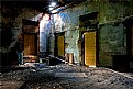
Critique By:
Galeota (K:919)
9/24/2006 4:55:08 PM
Hello David. It is an interesting scene, with a good management of light. Colours are subdued, and I do appreciate the mixture of textures. Composition wise, I'd say you have chosen a good point of view, allowing you to frame a triangle in the background, but there's an issue with the man's positioning. He's hidden by the shadows, hence not explicit. Then there's the difficulty to understand the scenery. What are you trying to tell us? You've set a context but what story would you like to go through? It is difficult to establish a link between the man with a tie and the environing ruins. Either we should see his face (because a face usually tells a million stories), or you should lead our interpretation by writing a resumé in the "about". It's nice, but I'm wanting more... hope this helps.
Cheers
|
| Photo By: David M Roberts
(K:914)
|
|
|
Critique By:
Galeota (K:919)
9/23/2006 9:33:29 PM
What though the radiance which was once so bright
Be now for ever taken from my sight,
Though nothing can bring back the hour
Of splendor in the grass, of glory in the flower
We will grieve not, rather find
Strength in what remains behind;
In the primal sympathy
Which having been must ever be;
In the soothing thoughts that spring
Out of human suffering;
In the faith that looks through death,
In years that bring the philosophic mind.
~Splendor in The Grass~
William Wordsworth
|
| Photo By: Antonia BauerleinSehnert
(K:30599)
|
|
|
Critique By:
Galeota (K:919)
9/23/2006 9:27:34 PM
Now Ms Karina, how should I express the joy to come across your path in here? I guess I've met you before somewhere else, right? I love the way you built this image and the ways it strikes and wakens up our imagination. She's heading to the light without hesitation because she KNOWS there is nothing beyond light to be feared. You know this would have also been good in black & white, perhaps even better, since there's already no colour and the subject lends itself perfectly for a timeless atmosphere. See you soon, around...
Be well
|
| Photo By: cessy karina
(K:14205)
|
|
|
Critique By:
Galeota (K:919)
9/23/2006 9:23:20 PM
Hello Abdullah. I confess I rarely come across a partial desaturated image that impresses me. I like yours very much. Composition wise, the diagonal made both by the hand and the face in the background is perfect. Lovely bokeh also, even though I'm not really sure you managed to have f2.8 with that lens...(either it's the wrong lens, either the aperture is just not correct). The depth of fiel is just enough to see her looking at us behind her hand. The vignetting adds to the atmosphere. Good work!
Cheers
|
| Photo By: Abdullah Bailey
(K:6)
|
|
|
Critique By:
Galeota (K:919)
9/23/2006 8:16:01 PM
'lo Robert. This is an interesting photograph. I like the way you framed the scene, and even though I would have prefered to see the boy looking slightly upwards instead of looking down, I can't help letting myself be carried by the way he seems lost in his thoughts.
Light is a bit dull, and that reflects in the washed out tonalities which don't really favour the subject. You'll tell me it has the advantage of representing exactly what you saw, but perhaps with a bit of post processing you'd be able to improve the overall appearance and quality (contrast wise) of your image. Of course, it would also help to bring out the textures of the wall and the wood, which make always a nice contrast when put side by side.
|
| Photo By: Robert Waddingham
(K:3389)
|
|
|
Critique By:
Galeota (K:919)
9/23/2006 7:52:45 PM
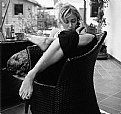
Hello Lin, this is an interesting composition with a tryptic of layers side by side, interconnected by a focus point which happens to be, paradoxically, out of focus. Even though our eyes move from right to left, which is not the traditional direction to read a photograph, this is done easily because the guy on the right hand side seems to be watching in the same direction where she's pointing at...well..yes...heu, heu, the magnificient example of Greek's hominus representation.
My only nitpick is related to your point of focus, actually, which is rather shallow (lovely bokeh) and is set on the lady's back...I don't know, perhaps focusing on her hair would have been more "logical" (logic by my own personal standards, of course).
Cheers
|
| Photo By: Lin chan
(K:190)
|
|
|
Critique By:
Galeota (K:919)
9/22/2006 2:52:20 PM
"resolution" do you mean conceptually?
'lo Mark. No, although you're using film and can actually go for large prints with a relative confidence, I meant the resolution rendered by the pinhole lens which has its limits. Soft focus may be a source of particularly moody atmospheres, but details are often put aside to the profit of an overall visual insight. I might be wrong though. Do you usually print your work? What kind results are you getting, definition wise?
|
| Photo By: Mark Hamilton
(K:8387)
|
|
|
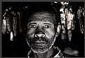
Critique By:
Galeota (K:919)
9/22/2006 2:14:12 PM
Hello again Txules. I'll take a minute to tell you how much I appreciate your last two uploads. Not like the child looking upwards, these ones show us meaningful human beings looking straightforward into your camera, with an intensity that can't be ignored. Let me praise once again your superb black&white conversion technique, and tell you how much light has been well managed in thse interior portraits. The eyes do play an important role, and you do well in bringing up their brightness, but what impresses me the most are their mouth and the strength reveled by their facial expression. Now, how about a comment to accompany your photograph. Who is this man? How did you come to interact with him?
Cheers
|
| Photo By: txules .
(K:62768)
|
|
|
Critique By:
Galeota (K:919)
9/22/2006 2:04:37 PM
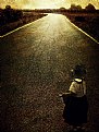
Hello Benedetto. It is not the first time our paths come across, and I remember well having seen your photographs previously, somewhere else in the web. I am particularly pleased to find out your work here, with many photographs I'd never seen before. Of course there is a truly admirable work of post processing in your images, where you let your creativity flow and give birth to fantastic scenes. But what is more to be praised is the way you make feelings arise in those who look at your photographs, as dreams rising from our subconcious to be confronted to reality (or our perception of reality, if you prefer).
This painting portraying one of those dreams, in the rising sun of a golden day to come, appears to me as an unbelievable optimism and belief in life. I wish I could look at myself as a child, with my present eyes of an adult, and project my existence on that road that leads to light. Thank you.
Cheers.
|
| Photo By: Benedetto Riba
(K:15792)
|
|
|
Critique By:
Galeota (K:919)
9/22/2006 1:48:15 PM
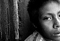
Hello Luis, sorry I won't share the opinion of previous criticers. Although I have nothing against head crops (on the contrary), I really don't thnk your composition is working here. Seems like if he was leaving the room and suddenly remembered he had forgotten something behind. The crop seems unnatural, like if you had actually taken your photograph two seconds too late (or too early). Half an eye, half a nose, you have, imho, just half a photograph. As for the journalistic value of this, perhaps a photographer's comment in the "about" would have helped. Otherwise, we learn nothing about him, not even your view on the subject, which makes me think he could just be another kid anywhere in south america. Hope this doesn't sound too harsh. Just a matter of personal opinion.
Cheers
|
| Photo By: Luis Soto
(K:354)
|
|
|
Critique By:
Galeota (K:919)
9/22/2006 1:38:27 PM
Hello mark. A particular atmosphere well rendered both because of the long exposure and the particular effect of the Pinhole camera. Don't really know if it's on purpose, but the tilted horizon works well and adds a touch of creativity (should I say chaos?), in what otherwise seems to be a timeless, harmonious, scenery. Lovely tones. In the minus side, I guess it really lacks resolution and I doubt it would make its way to make a fine art print.
Cheers
|
| Photo By: Mark Hamilton
(K:8387)
|
|
|
Critique By:
Galeota (K:919)
9/21/2006 9:46:53 PM
Hello Davide. Composition is superb, as far as I'm concerned. The square middle format suits well the scene, and your photograph has a wide range of tonalities showing details in shadows as well as highlights (perhaps a bit overexposed in the upper background, but not really an issue). Although the image quality and resolution seems already excellent (thank you couple Hasselblad/Planar), it could take a bit more output sharpening for web posting. Good work.
Cheers
|
| Photo By: Davide Bressanello
(K:3103)
|
|
|
Critique By:
Galeota (K:919)
9/21/2006 9:42:24 PM
Hello Txules. Technically, I have nothing but praises for the quality of the lens used and also for your b&w conversion technique, together with the pp work on his/her eyes. I'm a bit deceived by the way you chose to photograph your subject though. i'm not personally very fond of these kind of point of view, where you look at children from above, making them lift their eyes in a sort of imploring/admiring/submitted way. Then there's the lack of context in your photograph. Ok, she's cute. But every child in the world is cute. What else can we learn from Madagascar, from her life, from the link that took you to take her photograph? Nihil. Sorry, doesn't really work for me. Filling the frame with a cute face isn't quite enough to make a good photograph. Hope this doesn't sound to harsh. Just expressing my personal opinion as honestly as I can.
Cheers
|
| Photo By: txules .
(K:62768)
|
|
|
Critique By:
Galeota (K:919)
9/21/2006 9:35:00 PM
Hello Arnoldas. What a subtle and poetic image. Of course, working with an Hasselblad is already a delicate in itself, in the sense you make place to the extraordinary world (composition wise) of middle format cameras. This is well succeeded, imo, even though I have the feeling it works better seen exposed on the web, than it would on a art paper print..would have to see, perhaps I'm mistaken. I love the details allowed by these high quality cameras and lenses; the small branches cutting the background are like veins assuring a breath of life to the environing night. Beautiful work.
Cheers.
|
| Photo By: Arnoldas Jurgaitis
(K:2)
|
|