|
|
Critique By:
Antonia BauerleinSehnert (K:30599)

4/29/2005 4:48:16 AM
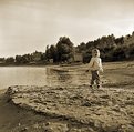
I was thinking "S" based on the shape in the sand. The composition is grand, especially with your daughter's placement to the right. The tones are very nice, and I see the darkest ones at her feet and on her sandy hand, and the highlights in her clothing and hair, which is terrific coupled with her being the focal point and all. Excellent use of DOF with the blurred background. Sepia works nicely with the subject of this as well -- the sand and sky are harmonized and it also pushes her as the focal point. Very well done.
|
| Photo By: David Hofmann
(K:22223)
|
|
|
Critique By:
daz asdasd (K:1026)
7/12/2005 4:19:05 PM
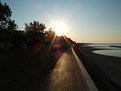
Hi Arabella!
When I look at this picture I really miss something, What's to the right?
I suggest you to point your camera a little more to the right next time (See the picture by me), just to make the picture more interesting.
Great exposed!
/Thomas
|
| Photo By: Arabella Dell'Atti
(K:160)
|
|
|
Critique By:
Eric Peterson (K:4419)
7/12/2005 1:39:58 AM
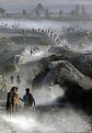
Wow. Spectacular shot. I didn't see the birds in the thumbnail. You might want to look at this as a vertical shot to emphasize the lines formed by the cypress trees. Attached is a quick crop with a small amount of sharpening to show what I mean.
Eric
|
| Photo By: Darlene Boucher
(K:15739)
|
|
|
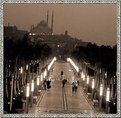
Critique By:
Saeed Al Shamsi (K:47735)
7/7/2005 7:01:45 AM
OHHHH.. this really a gift to UF, you drawn to in a scene, the patterns in the field, the track to the temple, the dust caused by the movements, you fill the boundary of the mage with the dynamic movement as of watching a film not still image. This is opportunity where a once in a lifetime situation like this presents itself framing it quickly will be second nature. A master piece of work, congrats on such fantastic hot shot. Which deserve award.
Ps. this is my first time in UF to rate an image with 7.into favorite.
Saeed
|
| Photo By: Kenvin Pinardy
(K:65)
|
|
|
Critique By:
Kiarang Alaei (K:49415)
7/11/2005 11:31:00 AM
The stories of busy city continues in your camera.you are able to find some dramatic angles with wide lens. indeed 10.5mm is a very good choice to creat some strange perspective and splendid feeling.just pity for compressing(of jpeg) that's some distract in pixels of black areas.
|
| Photo By: Hugo de Wolf
(K:185110)
|
|
|
Critique By:
Guido Tweepenninckx (K:20076)
7/9/2005 9:16:11 PM
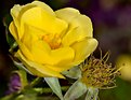
nice shot ,Brian
dont think its in focus
beter to take more distance and crop a little afterwords,because suppose this is a very small flower.Or on M mode you can flash at shutterspeed 1/400
only the bottom part of the frame is black.
You shud try Flash shutterspeeds test and see what it gives.
It works on my 300D with external flash.1/400
|
| Photo By: Bryan Jarmain
(K:11941)
|
|
|
Critique By:
Bradley Prue (K:30678)
7/8/2005 12:34:42 AM
Linda,
First of all, the photo itself is stunning... It is not often that I recognize a frame..as I usually don't find it very relevant to the photo. However, your eye for framing this shot is impeccable! It really does take an already brilliant pallete, and make it even richer and bolder, withOUT detracting from the subject. The detail of the leaves is tack-sharp, the color satisfies, and as usual, you have balanced the shot expertly!
Your words are appropriate, touching, heartfelt, and well....it would be hard to express the shock and grief any better. Your heart, soul, and talent aligned perfectly here...
..Brad
|
| Photo By: Linda Imagefree
(K:72276)
|
|
|
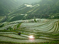
Critique By:
Mark Wlaz (K:4564)
7/5/2005 2:30:49 AM
James,
The lighting is superb, and you've so beautifully captured this landscape. It's quite an impressive realistic image.
But what I find as equally fascinating, is the possibility of using this same image as an abstract piece of art. To my eye, if the image were cropped just below the houses, so that only the terracing in the bottom half of the image remained, you'd have an entirely different piece of art that remained ... of equal, but very different beauty.
Mark
|
| Photo By: * James *
(K:20200)
|
|
|
Critique By:
Carol Cefalu (K:8388)
7/7/2005 9:38:56 AM
Fabio,
I love this!
May I make a suggestion?
First, create a second copy layer and convert that copy layer to "lab colors" while keeping it in bw. In PS..IN your layers palate.. convert that top layer to "multiply" you'll be amazed at how that pulls the tones up.. and makes it MUCH richer. Then adjust your curves and contrast and brightness after..Flatten as jpeg. I have included a quick sample with masking effects..
I hope this helps..You have A huge AMOUNT of great photos to work with and I look forward to seeing more from you in the future!
Carol
|
| Photo By: Fabio Ficola
(K:10466)
|
|
|
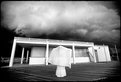
Critique By:
Roger Williams (K:86139)
7/6/2005 4:12:00 AM
I like it a lot, but I see a few things that slightly detract from the appeal (for me) and at least one that puzzles me. Nice strong contrast, with just the right suggestion of detail in the almost-blown highlights and the almost-solid shadows. Right on the limits! But I think I see the edge effects of over-sharpening. Perhaps you didn't remember to set dpi to 72? (300dpi and Usefilm will downsize your image AND boost the sharpening!). Also, I think you might have tried to throw the distant scene even further out of focus. I don't know if that was possible, of course, but as it is, it's a bit too insistent for a mere background. I think I see why you included more foreground than usual... to get a sense of space into the picture to balance the fact that the ladies appear rather scrunched up against the railings (and for that matter against the view behond them). But what is that blurring and area of low contrast in the lower L and R corners? Deliberate PS work? Despite the above I really DO like it. And thanks for your encouraging comments, Paul.
|
| Photo By: Paul's Photos
(K:35235)
|
|
|
Critique By:
Hugo de Wolf (K:185110)
7/4/2005 7:36:38 PM
Hi Gerhard,
Good to see you haven't lost your touch; those cherries look spectacularly real, excellent tones. I also like the framing, with the subtle gradient in the surface. I only think, that going a bit more extreme on the DOF would've emphasised the depth between the two cherries a bit more, but that's about it. On the other hand, the stem of the nearest cherry is already a bit out of focus, and that would only get worse with a bigger aperture. I think this is a typical case where either a composite shot (one with a high DOF for the cherry in front and one with a very shallow DOF for the "rear" cherry could work, something that can also be created with some digital "post-processing"....
Either way, very well composed. Sorry to have kept radio silence for such a long time....
Cheers,
Hugo
|
| Photo By: Gerhard Hoogterp
(K:4863)
|
|
|
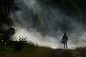
Critique By:
Hugo de Wolf (K:185110)
7/4/2005 5:39:34 PM
Hi Jeff, Great shot, very powerful indeed. The light sure is very strong. And despite the pure beauty of it, I think the shrubs on the right take away a bit of the overwhelming atmosphere created by the silhouette of the man, the shimmer of the path in the foggy light.... It's only a minor detail, and by no means a bad thing. Maybe personal, but it makes my eyes shift from the person to the left and back.
The exposure, showing the details in the foreground and beyond the lighted fog are excellent.
Then again, this is one of those shots that make me think.... Very strong image!
Cheers,
Hugo
|
| Photo By: Jeffry Surianto
(K:768)
|
|
|
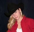
Critique By:
Carol Cefalu (K:8388)
7/4/2005 3:50:37 AM
Very pretty Michelle. I would suggest maybe a tad more contrast and maybe sharpening up her eyes a little...( in Phot Shop with the "unsharp" tool..What about adding some magenta and yellow (sepia) to give is a little more warmth?
Intimate portrait of a beautiful woman.
Great!
Carol
|
| Photo By: Michelle Ayon
(K:33)
|
|
|
Critique By:
Melissa (K:1791)
7/2/2005 2:54:16 AM
Dale Ann, After viewing all three images in the series, I do have a couple of comments. I like the one with all the product lined up in a row. It's simple, and to the point, showcasing only the product. This one doesn't really strike me as a good shot to advertise the bags. The crops are off..arms gone, and the skin tones appear very orange. That could be the kelvin setting on your camera, too warm for the lighting. I am guessing studio lights were used. The image with the woman, (I assume the creator of the bags)is better, and would work well as an ad on her site. I like her relaxed pose, but would have preferred to see her legs not cut mid-shin...maybe if you had her bend her legs off to the side so as to include her feet. To put all these thoughts in perspective in regard to commercial photography, here's a quick and effective trick. When photographing a product, take the finished print, turn it upside down, and flash it to someone for a second. Then ask them what they saw. In this case, if your subject says "handbags" then you have a winner! Best of luck.
Regards,
Melissa
|
| Photo By: Dale Ann Cubbage
(K:9755)
|
|
|
Critique By:
Paul Lara (K:88111)
7/1/2005 3:56:01 AM
Her holding the nearly-empty bottle is perfect!
I'm not aware of the background options, but I think it would have strengthened the shot if you had dropped to one knee, to get on their level.
If there was a lot of clutter or peopel behind them, then just throw the lens open to 1.8 to smooth 'em out back there.
|
| Photo By: c c
(K:13449)
|
|
|
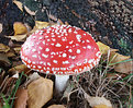
Critique By:
Lea Mulqueen (K:7396)
6/30/2005 11:22:13 AM
Ian, just checked your portfolio...some nice stuff in there!
Since this great looking mushroom grows in your yard and you may have other opportunities to shoot it...here's what I would suggest for next time: 1. remove the destracting dead leaves. 2. get down lower (lay on the ground) and 3. set your focus on the closest edge, using whatever aperature is needed to get the entire 'shroom in focus. 4. try shooting it when the sky is overcast to eleminate any glare (or use a polarizer).
I have a friend who shoots spectacular mushroom shots and that's the technique he uses.
|
| Photo By: ian pearson
(K:1736)
|
|
|
Critique By:
James McGinnis (K:6045)
6/29/2005 4:12:58 AM
Very eerie mood, indeed. I think this is accentuated, of course, by the contrasting clouds on a dark sky but also, and more subtle, is the vignetting. The distortion of the support post on the left is also a nice accentuation of something just a bit surreal.
I'd like to see the girl's face but...that's just me. I like to see the subject. I think facial expressions can add to the mood. In this case, while I think it is a very well done image, I think you could have had more impact by showing a face with some emotion in it.
Great image, though. I don't have you on my friend's list just for the kicks, y'know. I really do like your work!
|
| Photo By: Rada Marin
(K:1187)
|
|
|
Critique By:
Matej Maceas (K:24381)
6/28/2005 5:59:36 PM
I can't decide how far the title should be trusted. Is it sand? Or is it water flowing into some mysterious dark cave (darker area near the centre)? One moment I think I know the answer, the next moment I am no longer sure. It is this uncertainty that makes looking at the photo quite an unusual viewing and thinking experience.
Regarding the burned-in frame, at the top it more or less fits, but on the sides and at the bottom it strikes me as too regular and consequently artificial-looking. It would be interesting to see a version without the framing for comparison.
|
| Photo By: Ian McIntosh
(K:42997)
|
|
|
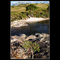
Critique By:
Darrell Larose (K:736)
6/28/2005 3:05:56 AM
Hello Domjan this shows it's the photographer behind the camera, not the technology! The image works well in what's really browns and greens. This simplicity makes the composition stronger. I recall eons ago where I made a close-up lens by taking apart an old wide-angle and tele auxillary lenses and switching the front and rear parts. This gave me 2:1 when mounted on front of my old Spotmatic II. I had to make a 49mm to series 6 stepdown ring in my high school machine shop. Experiment more, you are on the right track.
|
| Photo By: Domjan Svilkovic
(K:3104)
|
|
|
Critique By:
Michael Kanemoto (K:22115)
6/23/2005 2:23:48 PM
Hasan:
Next time you have the chance, take two versions of the shot. Take your "normal" shot, and on the second one try this:
Only show what is barely essential for someone to understand what the subject is. If there is radial symmetry (like a wheel) only show a quarter of it (since the rest is the same). Or, if it is like a person with symmetry, try showing only one half since the other half will be the same.
I've noticed that people's minds will fill in the rest and actually compose a scene beyond the shot that you give them, allowing their brain to interpret more than what is there. For some reason this makes the overall image more exciting and also a little off balance.
I cropped off most of the bike because just from a few parts you can tell what that it is a motorcycle, it's yellow, and even what type it is. The pattern on the wall is assumed to repeat and I sliced out the seams to make it a little cleaner.
Give it a try the next time you are out and see if it makes a difference.
I'm trying out this tool and have been somewhat pleased with the results (I make a lot of mistakes). When it works, some stuff looks great.
Once again, this is just a "trick" and you shouldn't get hooked on it as a crutch, but it is a nice tool to keep in the back of your mind along with the rule of thirds.
|
| Photo By: Hasan Ozkapici
(K:551)
|
|
|
Critique By:
Peter Daniel (K:33866)
6/20/2005 1:58:26 PM
Wonderful Photograph Janice, Great Colors and Clarity. Very well presented. Suggest trying an experiment, since these are available to take several shots of... Try playing with two settings available with your camera and see what they do... I think you will be pleased with some of the results...
Exposure Compensation +/- 2.0EV in 1/3EV increments
In-Camera Sharpening +/- 2 in 1 step increments
Thanks for sharing, and thanks for the wonderful comments on my Photos... I enjoy sharing all this information. It dawned on me that these photos are available to whole world and many may never see these images we capture in real life. I too learn from this information.
GOD Bless...
Your friend, Peter Daniel
|
| Photo By: Jan Graziano
(K:17920)
|
|
|
Critique By:
Tiger Lily (K:10966)
6/26/2005 12:11:53 AM
This is a beautiful place. Rotation in PS is very easy but if image is your background, you have to choose "select all" first. If you don't want to do that, just make a duplicate and rotate that. The short cut for free rotation is Ctrl T...or choose it from the menu. Sherif, Thank you so much for your kind comment on my picture.
|
| Photo By: sherif hussein
(K:13815)
|
|
|
Critique By:
Angelo Villaschi (K:49617)
6/25/2005 8:00:19 AM
Hang in there and do the photos which give you pleasure, Danny. "If you post them they will come" 
We all have photos that we can't figure out why they don't get more comments. There's better photos than this one with fewer comments out there, and I am just being sincere. (And I do like the photo.)
Some people are too lazy/afraid to comment on stuff they don't like (though I can't see what's not to like in this one) and have to explain what/why.
Personally, I'd rather get a picture ripped 10 times than getting 0 comments.
|
| Photo By: Danny Brannigan
(K:19523)
|
|
|
Critique By:
Martin . (K:24957)
6/24/2005 3:14:02 AM
Hey Kay,
Don?t hate the color of your background, since you already know how to change the color digitally. You can also make your background any color your little heart desires with lighting? The percentage ratio between the Specular Highlights, Shadows and the Diffused Value is what counts?
You shot with the on board flash attached to your camera, which is no good. When it comes to lighting, please check out what the Pro?s use? Dean Collins is a god when it comes to lighting. Dean passed away this last February after a 2-year battle with cancer? I cried when I found out about his death. I didn?t even know him, but I watched his VHS tapes plenty.
Dean Collins taught the Pros how to improve their lighting techniques. He also lectured at ?The Brooks Institute? Wow! I watched him teach the best of the best? The famous saying about Dean is ?Those who can do and those who can?t, teach, but Dean could do both? He was an Icon in the photography world! Dean also had a great sense of humor, in which he also used to entertain all of us?
The Last time I checked your photos are at least 20X better than mine, so why are you asking me for advice?
My Best,
Jr. Martin
|
| Photo By: Kay McIntire
(K:11787)
|
|
|
Critique By:
sean slavin (K:3488)
6/23/2005 7:32:20 PM
maurizio, i think you nailed the exposure just fine. it's more important to keep the detail in the white water. black neoprene isn't all that interesting anyway.
the composition is good however i have a personal pet peeve with the tight crops in surfing. yes, that is what is in all the magazines but i prefer to see more of the wave. try to show where he came from or where he is heading. make it different than the view you see on every page of a surf magazine.
one thing i like to do with moments such as these, is to use a slow shutter. somewhere around 1/30 or even slower. if you can get it backlit, it's a beautiful way to make a powerful action moment into something smooth and flowing. more like a ballet.
be different.
|
| Photo By: Maurizio Spadaccino
(K:5132)
|
|
|
Critique By:
Ameed El-Ghoul (K:42215)
6/12/2005 10:02:45 PM
Hi Angelo,
Actually I wouldn't like you building your decision on my thoughts only, so my recommendation is to take 2 pictures for the same subject, one with sky, one without, upload them both, and ask the members to comment on which one they like the most, from there you can go on,
Honest feed back from our members in here would be a definite guidance,
Thanks once again for considering my words,
Regards,
|
| Photo By: Angelo Villaschi
(K:49617)
|
|
|
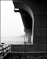
Critique By:
greg mckenzie (K:205)
6/23/2005 5:30:20 AM
I like this but I wonder if an even tighter crop would help, as at the moment I find the bottom section, with the boulders, a little too distracting.
This is one of those images that would take me a few hours to figure out how to crop it, and even then I would never be happy with my final decision, I would always be wondering if there was a better choice of cropping.
I hope that this doesn't come across as negative because I really do like it with the sweep of the curvged bridge disappearing into the mist providing a contrast with the barbed wire - sort of a contrast between freedom and imprisonment.
|
| Photo By: Andy Pollard
(K:1359)
|
|
|
Critique By:
chantal heijnen (K:979)
6/22/2005 5:46:31 PM
Hi Santonu,
I hope you don't mind, but I did some changes in PS. I hope you like it. I used the crop tool and when you use perspective you can chancge the "angles" and straigthen the picture. Now it doesn't look like a snapshot anymore!
Chantal
|
| Photo By: Santonu Roy
(K:60)
|
|
|
Critique By:
Ned Ali (K:11928)
6/22/2005 3:22:10 AM
wonderful details!
do you compose then focus manually or autofocus on the eye then recompose? or probably you make use of the multifocus points in your camera!
because i don't usaully use a tripod, i ALWAYS use th centre autofocus point, focus on the eye then recompose. however, i quess that using a tripod needs another skill to get the focus right. i really want to use the tripod for every single shot but i find it troublesome!
best wishes,
ned
|
| Photo By: Darlene Boucher
(K:15739)
|
|
|
Critique By:
J S (K:1806)
6/21/2005 3:30:56 AM
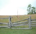
Hello Earl,
Welcome to the new exciting world of Nikon D70! You sure have made a wonderful selection. I, myself, truly love the D70... well mine is the D70s, but it is the same thing. : )
This is a lovely catch of a deer! Too bad in my personal experience with deers. I always see them running away before I can even point my camera at them. Maybe I should tiptoe and I walk through the woods. ; )
This is a great catch, but it's just disapointing that it is over exposed. The exposure made this photo look really washed out and plain. I thought I could show you what you can do to correct it up a little. Just help smooth out the "plainess" of the photo. I adjusted the contrast, and the colors to bring out the colors of the grass and the fence. Then I added a blue sky to help balance the "fresh" mood of the photo.
This is all I could do for now. I hope someone would step in and point out other tricks they can lay on this photo. The photo still feels like there is something missing.
I hope this helps you out. I really hope help restore this beautiful catch of the deer.
Good luck!
|
| Photo By: Earl Dotson
(K:952)
|
|