|
|
Critique By:
Dr. Rafael Springmann (K:89517)

4/29/2005 10:49:48 AM
Excellent photo of a very sad situation, Paul. th way you captured the old woman's face says it all and the choice of B&W accentuates the bleakness she sees har future.
Thank you for your kind remark about my "Violet hibiscus, detail."
What a contrast between your photo and mine...
Best regards,
Rafi
|
| Photo By: Paul's Photos
(K:35235)
|
|
|
Critique By:
CAGATAY ATASAGUN (K:21564)
4/27/2005 11:02:09 AM
Dear Nathan,
There colors and these compositions are like sunset feelings and sunset colors. After the summer autumn comes and after the day evening and night comes. Recycle of our lives.
Thank you for sharing with us, congratulations!
CAgatay
|
| Photo By: Nathan Gillies
(K:1011)
|
|
|
Critique By:
Bruce Crawford (K:690)
4/22/2005 11:54:57 PM
Franz, thanks for your response. I think that somewhere between the original and your first posted image would work best as suggested by Roger Williams. I attach such an attempt at a rework. I think it emphasises the first girl well and provides a leading line along the girls into the picture. I'd be inclined to clone out the tree branch intruding into the picture as it compete with the girl for the viewer's interest. Anyway, hope this helps.
|
| Photo By: Franz Thoma
(K:3365)
|
|
|
Critique By:
Roger Williams (K:86139)
4/23/2005 12:03:05 AM
This is a great one, Keith. It's got a place in my gallery of fame. Er, that is my favourites. It'll be an inspiration to soldier on with the macros. Actually I'm having lots of fun with my old-fashioned SLR. I've just discovered the joys of EXTREME telephoto lenses (for me that means, gasp! 135mm). Oh, and circular fisheyes. Still love rangefinders but appreciate the extra dimensions my hobby has recently acquired.
|
| Photo By: Keith Naylor
(K:13064)
|
|
|
Critique By:
Antonia BauerleinSehnert (K:30599)
4/23/2005 12:44:06 AM
You come up with new and fresh and different so often my friend. Delightful! Just like she's peeking around the corner of the frame. Why didn't I think of that (and I WILL steal the idea)  Antonia Antonia
|
| Photo By: Dina Marie
(K:-1410)
|
|
|
Critique By:
M. Zafar Rabbani (K:1451)
4/20/2005 3:41:27 AM
This is excellent. Composition of this shot is very thoughtful and so is the execution. A slight motion trail of the person has created a delicate sense of movement in the frame. The exposure IMHO needs to be adjusted. The highlights of the spotlights have under-exposed the frame around it making the shadows lacking in detail. The midtones also lack body. A quick adjustment of the curves will greatly enhance the detail of the image.
Kind regards.
|
| Photo By: John Loreaux
(K:86210)
|
|
|
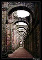
Critique By:
Jan Graziano (K:17920)
4/20/2005 3:43:06 AM
I really love the original photo as it conveys an old and weathered but timeless structure, and from the sky in the original photo it appears to have been taken on a typical overcast day in England. The structure itself overshadows the walkway, and it would seem to me that the details of the rocks and the walkway would be hazy and muted considering the structure and the weather. At least all of the ancient structures that I have visited over in England on a overcast and/or rainy day looked more like Rob's original. However, bringing out the details and lightening the photo does give someone a better idea of the various colors of the stones, and what it would be like to walk down this particular pathway on a bright day.
|
| Photo By: Rob Graziano
(K:6678)
|
|
|
Critique By:
Jan . (K:8693)
4/18/2005 3:28:56 AM
Claude, I am always so moved by the atmosphere of your portraits. I try to study them, and the light, and the way you control the light. I have much to learn about this, and you are a master. I also always love your tones, and these are fantastic. But your composition here is really striking, with all the diagonal lines created by her arms and her body. It was that, and her eyes that captured my attention, and as always, the vintage touches are like icing on the cake! 7+
Excellent, as always!
Jan
|
| Photo By: Claude Tenot
(K:9960)
|
|
|
Critique By:
Andrew O'Rourke (K:1602)
4/12/2005 8:33:48 PM
My take on the focus would have been to blur the photo that was used as the desktop. It would help the blend the two, create some depth and really reinforce the illusion. If the background of the whole photo were sharp the whole thing would appear flat. As far as the crop goes I think if you blurred the desktop photo as suggested you would need to keep that portion of the open "window" on the screen to maintain the idea of the computer screen, otherwise it might look like just a frame.
|
| Photo By: Ken Tinley
(K:1856)
|
|
|
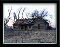
Critique By:
Patrick Ziegler (K:21797)
4/11/2005 1:44:56 AM
Rona, This happens to me all the time with the sky blowing out. I have learned to allways meter the sky. I do not know what contrast range your camera has but you should find out. Meter your sky and then in this case the old house. If the differance is within range of your camera then adjust the exposure for your sky and take the photo. If the differance is too large you will have to take other steps like Graduated ND filter or alot of time a circular polorizer will do the trick.
If you use a tripod you can take one shot with exposure adjusted for the sky and then with out moving the camera adjust the exposure for the foreground and then put em together in PS...
Another trick is to avoid shooting the southern sky (understanding you are in the northern hemispher)
ANyway, I do all these things and still blow out a sky once in a while....
|
| Photo By: Rona K **
(K:2375)
|
|
|
Critique By:
David Hofmann (K:22223)
4/11/2005 4:09:31 AM
great tones! I like how they lean onto each other. Shows friendship and warmth. Again you managed to get this special, natural and personal feeling on a photo, even though your photos are all posed. There are so many other posed portraits that lack the serene feeling, the natural look. I can only assume it is also your personality.
|
| Photo By: Ed Krebs
(K:958)
|
|
|
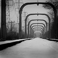
Critique By:
Lou Mmm (K:342)
4/10/2005 4:53:35 PM
Michael, I really like this image. It looks like you got down low to the ground to get this perspective--hope you weren't wearing snow afterwards! I like the human figure, too.
Please take this criticism in the constructive manner in which it's intended (and note that I'm not a professional!):
-- the burned edges are distracting to me; they're much too wide and don't appear to have much of a gradient (i.e., darker closer to the photo's edge)
--You might consider cropping out the light gray sky to the left of the last beam on the left; the light color of the sky is distracting. Or you could cut out that last beam entirely. Either, I think, would work.
|
| Photo By: Michael Alexander
(K:5293)
|
|
|
Critique By:
C W (K:4458)
4/7/2005 2:58:30 AM
I have just come across your "Alone" series and I have to say that it is an amazing one. I like how you ended this series with "We hope to come back soon . . ." You always go out with a bang. Well done! You are an OUTSTANDING and VERY TALENTED photographer.
|
| Photo By: Massimo Di Maggio
(K:36342)
|
|
|
Critique By:
Sony Kusumo (K:7190)
4/7/2005 4:08:00 AM
Now this one is better my friend. Don't put family in one box, lol (on your previous picture, you make it as if you squeeze all those person in one window... just kidding though...).
Well, very nice lighting for your wife & son, but it seemed a bit overexposed on the other family... Guess you should process those two side separately and fixed them together, using the pole as stitching point....
Well, don't play PS too much, it can be addicted though....
Cheers!
|
| Photo By: Rendy Rendratno
(K:442)
|
|
|
Critique By:
Ken Alexander (K:3905)
4/7/2005 4:29:54 AM
A very nice storytelling photo, although I not so sure he was too pleased to be part of the story! The contrast to the empty platform is very well done.
I would say, though, that he does not seem to have his personal identity erased. He looks like a unique individual reacting to the world around him, and in particular, reacting to you the photographer!
|
| Photo By: Sébastien Pepinster
(K:424)
|
|
|
Critique By:
boubekeur boukerma (K:2623)
4/5/2005 4:24:24 AM
Very strong photo showing such a rich potential of different interpretations.
Here, the letters are trying to catch the attention of this young lady. Just to tell her to watch the world around...and her, she is reading as there are only empty chairs around...
Very good idea to have kept the chairs on the right side as they are really part of the "no dialog".
Like very much your "flowers portraits".
Allah Maak
Boubékeur
http://www.usefilm.com/photographer/29937.html
boukerma@yahoo.fr
|
| Photo By: arwa abdullah
(K:34415)
|
|
|
Critique By:
Stefan Engström (K:24473)
4/4/2005 1:43:51 AM
The treatment is perfect for the meditative mood I often see in your photographs. Re. the possible tilt - I think you need to go by the verticals to determine that (the bridge support, the silo) and they confirm the feel one get from the waterline.
|
| Photo By: Burak Tanriover
(K:16610)
|
|
|
Critique By:
Erik Neldner (K:10846)
4/1/2005 4:38:18 AM
Larry,
You've only been shooting for 4 months. Wow! Keep on working at it. You've got the eye.
This shot is interesting as the poles of the clothesline form crosses. The lines themselves appear to be direct connections to the supernal power...."dialing god".
Cheers,
Erik
|
| Photo By: Larry Monserate Piojo
(K:10780)
|
|
|
Critique By:
Joann Winborn (K:12550)
3/30/2005 4:13:53 AM
I like the idea behind the image, and your placement of the plants is very good, however,it is my humble opinion that there is something lacking in this image.
The depth of field is nice, but the plants appear too dark against the water, thereby losing definition. Also, it would be nice if the details of the water were clearer.
The lines in the foreground, right side seem to distract from the plants and might be better if cloned out.
I might have even cropped a bit more to make a square image of the plants and water with only about 1/4" of water on the right side of the image.
Blessings to you and yours.
|
| Photo By: Mark Sherman
(K:15669)
|
|
|
Critique By:
Quix Photography (K:20204)
3/25/2005 11:17:34 PM
Another brilliant shot Bobby.. really like this one... excellent contrast between the rocks & the sea... and I notice your seagull has brought his mates along for this one... tee hee.
Well done
Sue xx
|
| Photo By: Bob Aldridge
(K:14758)
|
|
|
Critique By:
Roger Skinner (K:81846)
3/25/2005 11:42:00 PM
Great idea and nice light and use of it Amanda..just wonder if it had been vertical (portrait) might it have had a bit more clout. But it is a lovely pool of light there in that picnic area for sure.. you were lucky to get it without any cars there. Did you see any Lyre birds while u were there? there's usually heaps running round under those pines
|
| Photo By: Amanda Dowell
(K:956)
|
|
|
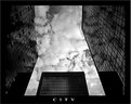
Critique By:
Joe Teng (K:16723)
3/25/2005 2:21:26 PM
Great cityscape! Nice lighting and excellent composition! I really love the angle shot you have taken! Nice skylight as well! Well done!
Best regard Joe!
|
| Photo By: Marcos Benedicto
(K:1100)
|
|
|
Critique By:
Manu (K:13082)
3/23/2005 9:25:13 AM
Excellent angles, shapes and tones Peter...and the composition really adds to the overall shot. Well done and thanks for your comments and for adding me to your friends list...looking forwards to learning from each other..
Cheers
Manu
|
| Photo By: Peter De Rycke
(K:41212)
|
|
|
Critique By:
Matt Davis (K:3935)
3/20/2005 2:55:36 PM
Ahhh... the one shot I open up first and it's a SC. That'll be right!
I love people completing sequential shots and this is a brilliant example.
This'll never stop - what'll happen is you'll just develop teh theme a little.
Age 21 she'll be wearing it on her head, or eating a massive bowl of ceral from it!
Don't let this die, keep it going forever!
Beautiful light, great DOF and nice toning in PS.My niece is my main suject, not got her in a bowl yet though - Ohh did sit her in a bin once - maybe that should be my thing!
It's great to see someone enjoying their kids in this way and recording them as they grow up.
She'll have this on her wall age 21 - I would if my mum took this when I was little. Unfortunately I'm not looking so cute in my childhood pics.
Right, that's enough rambling!
Rgds
Matt
|
| Photo By: Jan .
(K:8693)
|
|
|
Critique By:
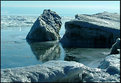
Bryan Jarmain (K:11941)
3/20/2005 6:45:59 PM
It is so difficult to get a good exposure with harsh lighting. I didnt feel that the loss of the dark detail was a problem as the real value in the photo to me is in the cool icy blue water and shadows and catching the whole feel of the place. A cooling filter may have helped as well. Let me have another go anyhow.
I now used the Shadow/highligh feature to bring the exposure down without loosing so much detail, and then added a cooling filter. Just my 2c worth...
|
| Photo By: Andre Denis
(K:66327)
|
|
|
Critique By:
Andre Denis (K:66327)
3/19/2005 2:20:19 PM
Hi Dennis,
I was following your discussion with Dave on the cropping of this photo. This sort of thing comes up all the time. Sometimes you have a great shot and then something stands out that throws everything off in your mind. Sometimes there is just nothing you can do. The beautiful sun rays shining through on the old cement abutment is the photo 
Andre
|
| Photo By: Dennis Polessky
(K:314)
|
|
|
Critique By:
Roberto Arcari Farinetti (K:209486)
3/18/2005 7:13:03 AM
wonderful mark, it is so strongly this idea, a something of misterious intriguer behind the teeth of the fork.. a DOF extremly strongly, creates a halo of great light and mystery! it seems that something must say.., the teeth of the fork..
the curve of the stem of the fork is beautiful, creates the effect of one fantastic spaceship that vien and towards of us!
cheers
roby
|
| Photo By: Mark Hamilton
(K:8387)
|
|
|
Critique By:
Mariana Castro (K:323)
3/13/2005 5:12:32 PM
Hi John, first of all, I'd like to thank you for all your kind coments on my photos. And then I have to tell you how much I'm liking your photos! I'll keep seeing your gallery, 'cause I love the kind of imagens you do!
And this one is beautiful, 'cause "M" has a great face and it looks so great in this image with the lake behind! The tones you use are great too!
|
| Photo By: John Strazza
(K:11535)
|
|
|
Critique By:
Carsten Ranke (K:14476)
3/13/2005 6:42:25 PM
This is one of the most interesting shots from your (excellent) portfolio for me, and I reason why. Maybe it is the fact that a part of my surrounding looks very similar to this scenery, and I made a series of B&W`s in Nov 2003 with fog and snow. Maybe its my intention to learn more about composition, and this a fine example for me. Third, it raises surely technical issues, because you shoot film, and I am "digital" for a while. In 2003, I did not work with masks and composites, so I was not comfortable with the results. I will try a rework on the RAW negative, to come close to the decent tones in your shot. Just curious: why do scan a print, not the negative ? IMO, some information gets lost when you print because the tonal range of negative is superior to print (right ?)
|
| Photo By: svend videbak
(K:7376)
|
|
|
Critique By:
alexander garcia castro (K:7335)
3/13/2005 6:49:56 PM
Judi, I do not miss Australia at all. But you are by far a very good reason to go back. Very touching pictures, very nice.. you leave me with no words. Every picture in your portfolio is full of emotions, of feelings. After seeing your pictures I can only say I did not get to know australia or australians. You need a special thing inside in order to take those pictures.
|
| Photo By: Judi Liosatos
(K:34047)
|
|