|
|
Critique By:
Martin . (K:24957)

3/21/2006 8:54:19 AM
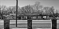
Ant,
I thought I died and went to heaven. My kind of town. The pickup on the left, the hidden house on the left and the cross on top of the steeple makes this way cool.
Not to mention the angles are out of site. Ask anyone, wrong angles drive me nuts, but the church is almost perfectly plumb and horizonally correct. While the light post and sign on the left lean to to right? Did you use a fisheye lens?
Well done and my hat is off to you...
Very angelic indeed my friend,
Marty
|
| Photo By: Anson Moye
(K:3480)
|
|
|
Critique By:
Hugo de Wolf (K:185110)
3/21/2006 9:10:11 AM
Hi Cesare, Very good use of the panoramic feature of UF! I like the composition a lot too, using the line of rocks to create a strong leading line. Very good photo, with just the right amount of saturation and contrast. Funny thing, though: the large panoramic version looks much softer than the smaller version, something I haven't seen before.
Nice shot!
Cheers,
Hugo
|
| Photo By: Cesare Baggiani
(K:1509)
|
|
|
Critique By:
NN (K:26787)
3/16/2006 10:18:28 AM
Hi Thilo! Good to see that there is a way out from this - as it looks - endless tunnel  Is this the same place where you took "The eyes of a ..."? The heavy tilt to the left fits very well IMO as it is balanced by the exit to the right. Very good light/tones, intriguing mood & perfect compo. Excellent work! Is this the same place where you took "The eyes of a ..."? The heavy tilt to the left fits very well IMO as it is balanced by the exit to the right. Very good light/tones, intriguing mood & perfect compo. Excellent work!
|
| Photo By: Thilo Bayer
(K:50358)
|
|
|
Critique By:
Mary Slade (K:40338)
3/16/2006 10:31:11 AM
The shape of this makes the word more powerful to me (not quite sure what you meant by reversed). Also effective having the shadows this side and nothing beyond. Something discomforting and disconcerting about the type of building beyond. Powerfully haunting image Mark.
|
| Photo By: Mark Sherman
(K:15669)
|
|
|
Critique By:
Len Webster (K:25714)
3/16/2006 10:30:50 AM
She's lovely - and the expression has real depth to it. I'm rather puzzled by the title, though: Rin is surely the central subject rather than the hazy building in the distance?
|
| Photo By: kouichi
(K:701)
|
|
|
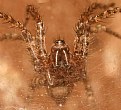
Critique By:
Tabitha Woods (K:8650)
3/16/2006 10:32:11 AM
Wow nice sharp details! I can't get a lens this size to focus that close! maybe being USM makes the difference.. Anyway great light, mayb you could try making this wider to include the rest of his legs? I have a funnel web living in our fence and all I ever see is his eyes and mandibles! Great up close shot Rich!
Regards :O)
|
| Photo By: Rich Swanner
(K:-3732)
|
|
|
Critique By:
Yoshiyuki Tanaka (K:13580)
3/10/2006 9:31:46 AM
Very, very gorgeous red, Dave! A difficult colour, and yet you managed it successfully!Wonderfully contoured against the black background, with sharp details.It must be a delight to your eyes!
YT
|
| Photo By: Dave Stacey
(K:150877)
|
|
|
Critique By:
Mary Slade (K:40338)
3/10/2006 9:45:10 AM
So that's what it is...a coffee machine? I kept coming back to it to see if it dawned on me and didn't like to ask! I like the colour and the light lines and shadows. But I kept seeing a toilet seat at the bottom left! It was a real mystery!
|
| Photo By: Martin .
(K:24957)
|
|
|
Critique By:
Glenn Morgan (K:1029)
3/10/2006 9:45:53 AM
Find this photo verging on surreal. Lovely tones and colors. Dynamic composition...my eyes wander around the image finding interest everywhere & finally settling on the grass in the foreground. Great experience thank you Guilio for this. CU Glenn
|
| Photo By: Giulio Rotelli
(K:28441)
|
|
|
Critique By:
Yoshiyuki Tanaka (K:13580)
3/5/2006 10:25:40 AM
This is quite unusual and very well captured!For all the activity in the foregroud, the checkered mountains in the background make a beautiful contrast.Love the wood colour in the foreground!
YT
|
| Photo By: Kathy Hillard
(K:25721)
|
|
|
Critique By:
Olga-Eva Krajciova (K:19240)
3/5/2006 10:24:38 AM
this is really great mirror of us...people...because we can´t be never sure that we are standing on the earth...sometimes we can feel like standing on the earth but it can be heaven at all...
lovely
all the best to u
olga
|
| Photo By: Ismet Smajis
(K:6911)
|
|
|
Critique By:
Caterina Berimballi (K:27299)
3/4/2006 7:34:58 AM
Both are incredible macros Glenn. Perfect colour, detail and exposure. If I had to decide between the two though, I'd lean toward this composition. Only because I find the diagonal tilt more appealing.
Beautiful images...
Cheers
Rina
|
| Photo By: Glenn Edmiston
(K:7366)
|
|
|
Critique By:
Phillip Cohen (K:10561)
3/4/2006 8:35:18 AM
Very nice shot Valentin, it looks almost like it was shot on Ektachrome slide film with the blue tint in the shadow area foreground.
I think I would have tried some fill flash here to warm up the foreground and bring up the exposure on the lady a stop or so. This would also have had the effect of dropping the background exposure down a stop in relation to the forground, as it is the brightest part of the image and just a little overpowering in the view.
I would love to visit that part of the world some day. The photographic opportunities in such an interesting place must be endless. Thank you for posting this image.
Phil
|
| Photo By: Valentin ( F ) Besciu
(K:-21)
|
|
|
Critique By:
Riny Koopman (K:102911)
3/4/2006 11:00:58 AM
Time is something were all familiar with: we observe it, mark it, wish for more or less of it, even try to escape it. Our relationship with time is constantly changing. But what is time, and why do we measure it as we do? How does our perception of time influence our behavior? And the science of time travel - with the discovery of "black holes," it may be closer than you think! Thankx for your kind comment dear Fatemeh! Riny
|
| Photo By: Fatemeh Rahimi
(K:13523)
|
|
|
Critique By:
brian underdown (K:-960)
3/3/2006 1:20:26 AM
i think is a stunning capture as from a point of seeing that gull dive and caught at a right speed and exposure.if my eyes decieve me its because its 1am but that looks to me like a fish leaping out of the wave .
and the castle doesnt look over dominent it helps for the wider view of the landscape.again perfect exposure.im guessing but may be wrong but the four seagulls are these added in ps? however it doesnt distract from the shot.
great allround shot.
ps sort out your grammar!
brian
|
| Photo By: Bob Aldridge
(K:14758)
|
|
|
Critique By:
Mervo (K:8643)
3/2/2006 9:47:27 AM
EXCELLENT! Nice colours against that somewhat duller background. Love the apprehension in the boy and the movement captured. In the UK, this staircase would probably be blocked off because it didn't have a safety rail hehe :-)
Good work!
|
| Photo By: Claudia F.
(K:2930)
|
|
|
Critique By:
Jeanette Hägglund (K:59855)
3/2/2006 9:54:54 AM
FULL POINT shot Brian. The cloud is too much, i love it, the formation and the tone, the reflection of it in the water and the suggestive feel it creates. Masterpiece!!!!!!!!! 7+++
Jeanette
|
| Photo By: brian underdown
(K:-960)
|
|
|
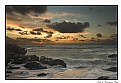
Critique By:
Roberto Arcari Farinetti (K:209486)
3/2/2006 10:24:35 AM
the little water have created a lens effect, that increase the sunrays and the fantastic clarity!!!
you have a very good eye.. and mode, I still think of the photography of the apples and of the stair, an excellent work, I would not be indeed skilled!
simple & excellent!
roby
|
| Photo By: Mark Longo
(K:12760)
|
|
|
Critique By:
Saeed Al Shamsi (K:47735)
2/27/2006 7:15:50 AM
The old building done with art and beautification especially the entrance that is the first impact and impression towards the building, not like modern ones. I can see both side of the entrance some scaffoldings nice to see those building with regular restorations.
Superb capture
Saeed
|
| Photo By: Marian Man
(K:80636)
|
|
|
Critique By:
Denis Cemazar (K:151)
2/27/2006 8:32:59 AM
Absolutely fantastic shot Gerry!
Your images are really inspirational and make me go out and shoot more and more landscapes!
Lovely colours and tones of this small island. It was worth to drive 3h and waiting for this light. Looks like a phantasy.
I enjoy it a lot and thanks for sharing!
*Denis
|
| Photo By: Gerry Pacher
(K:7303)
|
|
|
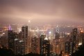
Critique By:
Peter Margetic (K:2084)
2/27/2006 8:59:49 AM
Hi Miranda,
I don't think there is anything to be unhappy about, the cloud / smog thins out as you go down the image where it is very clear at ground level. It looks as though you are taking the pic the base of the cloud, I really like the effect.
Peter
|
| Photo By: Miranda Legg
(K:409)
|
|
|
Critique By:
cecilia tovini (K:29423)
2/24/2006 10:35:36 AM
Very nice. I like the choice to keep the focus on the back leaving the woman quite discovering. It is like to say that the future is for people who go than for the people who stay. I don't know why but this is my morning feeling today.
Cecilia
|
| Photo By: Bender Rodriguez
(K:-10)
|
|
|
Critique By:
sanjeev jain (K:8763)
2/24/2006 10:58:26 AM
one of the best work that i saw today i feel the foreground refelcts future here and ground reflects the past the girl in the middle is in the present moment past and future is all same i am passing through it and here i am in it not passing wow....fantaastic capture harmonius......
|
| Photo By: fahrettin sankaynagi
(K:-214)
|
|
|
Critique By:
stingRay pt.4 . (K:250401)
2/24/2006 11:19:56 AM
A wonderful title my dear Robin and fits the subject like a glove. There is still beauty left in these remains and the thoughts that it can't be long before we see it's decendants. Well spotted and taken....Best wishes to you as always.....Ray
|
| Photo By: Robin W
(K:16308)
|
|
|
Critique By:
Caterina Berimballi (K:27299)
2/23/2006 3:35:26 AM
LOVE the expressions here Randee! Too cute That's not a bad camera phone you've got there either. Produced some great definition, colour and light. Personally, I think the inherent grain gives this image huge character! What a crying shame those blasted things can't take a bigger image... This would definitely be worth hanging up on a wall, LARGE!! ) Well done snapping this one.
Cheers
Rina.
|
| Photo By: Randee Armstrong
(K:-820)
|
|
|
Critique By:
Steve Aronoff (K:18393)
2/23/2006 4:09:49 AM
A surreal scene, Andrea. It feels like the ocean on a planet in another solar system. The subtle reflections in the foreground of the colors of the sky is terrific. Really nice!
Best,
Steve
|
| Photo By: Andrea Moltoni
(K:120)
|
|
|
Critique By:
Ina Nicolae (K:44481)
2/23/2006 4:17:35 AM
Very powerful piece, Tutku, very much like an explosion giving a sense of time and energy, like a big tear into another dimension. Great tones of purple! Beautiful artwork! Best regards, Ina
|
| Photo By: whoiswho t
(K:10700)
|
|
|
Critique By:
Gabriel Fuentes (K:6565)
2/20/2006 4:57:08 PM
I just love the way you've restricted your dof to the foreground, making the barns more blurry, presented like a faded backdrop, which fits the fact they are relatively farther away, therefore accentuating that the viewer is looking up close -- into those blueberry branches that have the detail that needs focus. Moreover, the barns increase the depth perception. Such a pleasant combination of form, color and composition. I like it!
|
| Photo By: Kathy Hillard
(K:25721)
|
|
|
Critique By:
Mark Longo (K:12760)
2/17/2006 1:25:54 PM
I love this one. The colors are superb. A very appealling air of informality! And a really attractive (appetizing?) grouping of colors!
I think the orange takes the arrangement to a new place than some of the other shots you have displayed of this similar arrangements. Somehow the vivd color of the orange highlights the soft subtlety of the other colors in the shot, and also provides a nice central focus. My eye ventures out from there, but always has a resting place to return to. I think the glass beads are an interesting element, though maybe I would like them to be more evident. I did not notice them at first glance, but I'm not sure how to suggest making them more evident. Really though, I don't think they're a crucial element and could be there or not there, which is fine. I think the arrangement is strong as it is and doesn't really need them.
I like the shallow DOF in this. I believe the background colors are red peppers but it also looks like a gathered red cloth backdrop in the lowered light and I think that is an attractive and interesting apsect. I also love the mating of the onion and wadded paper. The textures are so similar and the paper calls attention to the element of delicacy in the arrangement brought by the onion skin. I like the paper as human element via the handwriting too, and the fact that it's a discarded sheet adds to the lovely informality of the arrangement. I also like that you positioned the arrangement at the end of the tray, rather than along a longer edge, with the orange sort of spilling off the end. It may have seemed like an obvious choice at the time but it makes the arrangement look more happenstance, more casual and less posed, which I think is a nice nuance. Clever.
The lighting is superb! The darkness to the left and the dullness of the red provides a wonderful contrasting backdrop that makes the main subjects pop, and also hold much more attention for the viewer. Also, the fade-to-black on the left introduces a subtle hint of mystery.
Lastly, I think the paper and onion, as elements that are positioned off the tray, yet still in contact with the tray and arrangement grounds the tray nicely, even though we don't see much of the surface it all sits on. We don't need to.
Ina, this is an awesome work, you should be very proud of this. It's definitelty a fave of mine, I hope its one of yours too!
Best,
Mark
|
| Photo By: Ina Nicolae
(K:44481)
|
|
|
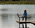
Critique By:
Susie OConnor (K:34798)
2/11/2006 2:16:37 AM
Oooh, this one makes me nervous! You must really trust her to stay put! Nice colors and mood in this shot K. She looks like she is lost in thought...Good one.
Susie
|
| Photo By: K Blair
(K:1589)
|
|