|
|
Critique By:
Ina Nicolae (K:44481)
10/6/2005 1:20:40 AM
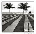
Fantastic image! I love the fact that there is no distracting cloud in the sky, no color (just sepia tones) and no other information than what you want to communicate. The message is clear and well taken. Composition is great in terms of ground space below and empty space above. Again, a timeless image! And a 7/7 Ina
|
Photo By: Anthony Lound
(K:6661)

|
|
|
Critique By:
Angela Freed (K:10061)
10/6/2005 1:33:31 AM
Great shot. I love the affect of the lines making the picture so deep. I feel as though I could walk right into it. Very good entry for this project of silhouette. I do have to say that I like the rework with the pole gone. That makes the picture very good.
Angela
|
| Photo By: waldemar ebner filho
(K:5242)
|
|
|
Critique By:
Bob Walker (K:1066)
10/6/2005 2:32:20 AM
Hi Tush1t (lets see if this gets through the filter),
Since usefilm filters urls in comments it would be difficult to give specific web sites that contain PS tutorials. There are many, many good ones out there, any search should net you several.
As for books, two that I would recommend are 'The Photoshop CS(or CS2) Book for Digital Photographers' by Scott Kelby and 'Pro Digital Photographer's Handbook' by Michael Freeman.
Attached is your image with the levels adjusted slightly to add more contrast. I've embedded the before and after histograms from the levels dialog box to show what I adjusted.
Normally, a good starting point is to move the white slider to the left until it is just under the end of your histogram, and move the black slider to the right until it is just under the beginning of the histogram. This basically sets the white and black points in the image. In this case, we can ignore the spike at the far left of the histogram since this represents the black frame around the image.
Additionally, you can hold the Alt/Option key while moving the sliders to see where the clipping of details starts to happen.
Keep in mind that there are several ways to perform similar tonal adjustments in PS, with Curves being one of the more powerful tools. But Levels is always a safe place to start for simple adjustments.
Hope some of this helps!
Good luck, and keep the images coming...
Bob
|
| Photo By: Tushit Jain
(K:1697)
|
|
|
Critique By:
Fabrizio (K:2543)
9/30/2005 11:49:40 AM
....Are you going Marcus????....I have a question:::..I've just bougth the Canon extender 1,4 to use with the 100/400 IS as yours.....so My camera is Canon 350D so a cannot keep the AF...(is possible just with the Mark II D/DS models)...the problem is the seguent..you know in the wilde shots is difficult to have the rigth time for the manual focus....so I found on the web a suggestion to keep the AF(you must to cover the last three pin conctact of the extender by the scotch) and I tried it realizing that the Af works altough slowly.....
How do you usualy work by the extender?????
thanks very much...
|
| Photo By: Marcus Armani
(K:36599)
|
|
|
Critique By:
Susie OConnor (K:34798)
9/29/2005 2:16:07 AM
Screen: make a selection around the area that is too dark. Control J to make a layer of this selection. Change the blending mode to "screen". It will lighten up the area considerably. If it's too much you can lower the opacity until it looks right. If an image is too light you can do the same thing and change the blend mode to "multiply". It's pretty amazing what this tool can do.
Let me know if my instructions are confusing. I'm using Photoshop Elements 3. I quickly did a screen on this one (hope you don't mind) it's pretty rough but you get the idea. I lassoed your mom and the part of you that was dark. Hope it comes through okay.
Regards, Susie
|
| Photo By: Angela Freed
(K:10061)
|
|
|
Critique By:
Martin . (K:24957)
9/26/2005 9:48:16 PM
Eleisa,
I love this capture. I didn't even think twice about this being over exposed at all, but I'll answer the question you asked Ciprian...
Yes, you can adjust the brightness after you pull the trigger... I will give you a more detailed report if you want.
I hope you don't mind, but I did touch up the upper half of this fine capture... Now it's probably underexposed... ;( I hope I can help?
Well done my friend,
Martin
|
| Photo By: Eleisa Martin
(K:2569)
|
|
|
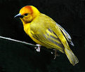
Critique By:
Alastair Bell (K:29571)
9/26/2005 9:52:03 PM
Got to say you've done an excellent job of removing the background and it works all the better as a result. That yellow really does stand out against the black of the background...
Good detail too!
Alastair
|
| Photo By: Alison DuFlon
(K:36566)
|
|
|
Critique By:
George Vlahos (K:1727)
9/23/2005 1:26:25 PM
Hi Elisa.
This is a great shot.
Firstly, the comosition is excellent.
Secondly, and in my oppinion most importantly, your angle of view is what distinguishes this shot from others.
Floral shots are common, and all generally well done.
However your angle of view has added an extra dimension, which adds interest and holds the observers eye.
It is almost as if people will look at this image, squat down, and look up, trying to see it the way you did, through the viewfinder.
Well done.
Regards,
George.
|
| Photo By: Eleisa Martin
(K:2569)
|
|
|
Critique By:
Stefan Engström (K:24473)
9/23/2005 2:01:17 PM
It really is a lovely shot - very soft but not in a sugary way. It is interesting how the hair actually seems to be the main player in this photo! Doesn't look all that messy to me, casual maybe, but entirely presentable...
|
| Photo By: Trish McCoy
(K:15897)
|
|
|
Critique By:
Derek Dixon (K:4948)
9/20/2005 8:51:56 AM
exellent image, funny choice of b/w... in my head definetly will be colour... but know that I see it b/w gives a new prespective to the image.
Thanks for your comment, much appreciated.
I read that you are interested in IR fotography, guess only using the R72 filter over the canon lens.
You see, I own a digital eos myself, and though interested in IR, nver found the kind of information nedeed to reassure me of good result...
|
| Photo By: Peter De Rycke
(K:41212)
|
|
|
Critique By:
Roger Williams (K:86139)
9/18/2005 11:53:30 PM
Another variant on this theme would be (if your maximum aperture and film speed permitted) sharply stopped motion of the people walking across the end of the tunnel with speed-blurred trains zipping past behind them. Would be a challenge and, I must admit, easier to do with a digital camera, where you get instant feedback.
|
| Photo By: Matej Maceas
(K:24381)
|
|
|
Critique By:
Mirek Towski (K:14880)
9/18/2005 6:57:25 AM
Very good idea for a humorous shot. I think the effect would be much stronger if You cropped out the street scene and even the sign "No climbing..." leaving only the red circle and the man inside. Very good idea once again
|
| Photo By: Billy Houck
(K:2725)
|
|
|
Critique By:
Matt Palmer (K:781)
9/15/2005 8:44:48 AM
A beautiful shot Glen, I love the way the sun catches the rocks and the water reflects the colours of the sky. I do feel though that the lower part if the image is lacking in interest, have you thought about a square crop such as this?
Best wishes
Matt
|
| Photo By: Glen Stowell
(K:277)
|
|
|
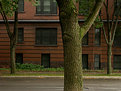
Critique By:
Aram Gharib (K:4656)
9/13/2005 3:04:28 AM
I cannot say more than what has already been said on the appealing characteristics of this picture.
May I just insist on the nice contrast of straight and square shapes of the background building with "irregular" texture and curviline features of trees.
The absence of people is also a factor that emphasizes the particularity of this place that, without its inhabitants, looks more perfect!!
Thanks for sharing.
|
| Photo By: Todd Miller
(K:16464)
|
|
|
Critique By:
Colin Cartwright (K:15699)
8/28/2005 3:59:51 PM
Nice perspective on this, much photographed castle, Marky. Great cloud shadowing on the upper castle. The only problem is, you've over-saturated the green lawn. For me, it's overpowering, and distracts my attention from the excellent, overall image.
The sky and castle are superbly detailed. You've given the impression of a huge sky, and it's really effective as a vertical wide-angle.
Stunning marra!
Colin
|
| Photo By: Mark Evans
(K:17428)
|
|
|
Critique By:
Jeanette Hägglund (K:59855)
9/9/2005 9:48:38 PM
In the first look i was thinking symmetri, but that are just a beginner, the road leading up to the house breaks it....and that in a nicley way! Silnece, time stand still and i can imagines birds somewhere there in Tuscany! But the tractors are quiet right now  )) ))
Have a great weekend!
Jeanette
|
| Photo By: Giorgio Goretti
(K:15471)
|
|
|
Critique By:
Armen Jamkotchian (K:5879)
9/9/2005 9:48:41 PM
What I like about this image is that there are three distinctive objects that make up the composition on the orchestra - the conductor, the musical instrument and the stick. This photo magically combines them through the "silence" of the void dark space into a singe live entity - music.
It is done very professionally.
Best regards - Armen
|
| Photo By: giovanni guido marchi
(K:27040)
|
|
|
Critique By:
Martin . (K:24957)
9/9/2005 10:32:55 PM
Melisa,
I do love the DOF and the detail regarding this capture. Although, I might have shot it using 1/60 @ f/8 and 1/30 @ f/11, as well?
The beauty of digital is, we can shoot as many frames, that we would like and it doesn't cost us a dime more...
I still need to remember I'm not shooting film... My Canon 20D is still set on the single frame Mode... lol ... And it fires off @ 5 fps up to 23 frames, while set on jpeg fine...
Martin
|
| Photo By: z z
(K:7231)
|
|
|
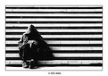
Critique By:
Anindya Maity (K:7880)
9/6/2005 11:29:57 AM
The alternate and parallel bands of light and dark add a powerful element to the scene .The hooded figure with no visible face against this bg makes an intriguing pic.The high contrast suits the subject very much.Good composition.
|
| Photo By: Srdjan Abdijevic
(K:-722)
|
|
|
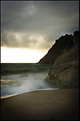
Critique By:
Bint Ahmed (K:333)
9/4/2005 1:31:30 AM
Woow woow wooow
This is really amazing
The F stop you chose is the best for this kind of landscaping shot
The only tiny thinks I will point is straighten the sea and it?s easy you can do it by the photoshop
Other else everything is perfect
Amazing light too
Keep it up
|
| Photo By: Mark Hamilton
(K:8387)
|
|
|
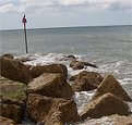
Critique By:
Margaret Sturgess (K:49403)
9/1/2005 1:30:16 AM
Excellent composition, really great light/colours and tones. The sharpness is just right. Like the shape/set out of the two grasses. Maybe would have put a tiny bit more space at the top, it feels as though he very top tips of the grass have been cut off. I still rate it 7 though, it is so good.
Margaret
|
| Photo By: Brian Fillmore
(K:4016)
|
|
|
Critique By:
Tushit Jain (K:1697)
8/31/2005 4:24:03 PM
I really liked how the photograph is darker at the border. Are these because of the use of the spotlight dark filter? Is this a digital filter or one that you put on the lens? I have been trying to get this effect in Photoshop.
|
| Photo By: Fabiola Barrientos
(K:8169)
|
|
|
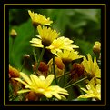
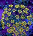
Critique By:
Aurobindo Saha (K:2396)
8/31/2005 8:09:51 AM
Hi,
Thanks to everyone for much appreciation about this photograph. I would like to share with you the criticisms that my wife came up after she saw the picture. And I agree many of her comments.
1. The major negative point of this picture is - the composition - there is no subject of interest in this picture. Which flower did I try to focus and call it the focal attraction? Some may say the one in the middle (almost horizontal) - but that is getting obstructed by another straight flower in its front - this is very distracting. The other two straight vertical ones cannot be focal interest or subject flower as they are not in sharp focus.
2. Very messy - Yes the picture is much cluttered and not a clean composition - please note there are 5 vertical stems and 3 horizontal stems. The mixture of these horizontal and vertical lines doesn?t give a good feel to viewer?s mind. Same applies for flowers - some are in horizontal profile and some are vertical - symmetry is greatly lost in this jungle.
3 Framing ? However framing is good. The OOF flowers in the lower left and right corners drags the viewer?s eyes to the center where the viewer is expecting to find the flower of interest.
I feel these three are valid points. If you look at the picture for some time, you will feel that your eye is searching for some point of interest, some alignments which are highly missing of getting distracted in the whole composition.
What do you say?
Thanks
Aurobindo
|
| Photo By: Aurobindo Saha
(K:2396)
|
|
|
Critique By:
Margaret Sturgess (K:49403)
8/31/2005 1:39:52 AM
Jill I see someone has mentioned the horizon, having just come back from a cruise this is how it looked some of the time LOL  . I really like the colours and textures you have captured. The inclusion of the rocks inthe foreground gives interest as well as adding a diagonal angle to the shot. I haev had a twiddle with it for you to see, straightened the horizon, [don;t think it is spot on] and added a bit of blue to the sky and bit more green colour balance in the sea to see if it gave more impact to the horizon, see what you think . I really like the colours and textures you have captured. The inclusion of the rocks inthe foreground gives interest as well as adding a diagonal angle to the shot. I haev had a twiddle with it for you to see, straightened the horizon, [don;t think it is spot on] and added a bit of blue to the sky and bit more green colour balance in the sea to see if it gave more impact to the horizon, see what you think
Margaret
|
| Photo By: Jill Bartlett
(K:8130)
|
|
|
Critique By:
Mohamed Banna (K:34237)
8/29/2005 10:26:06 PM
7 from my heart to the great photographer who catch kid's moments from her heart...
well done..fits perfect in the project..
if you don't mind dear Susie
i will post here my vision
sometimes i know it's the photographer vision... but here i found you "Undecided... "
)))
have a great nice smiley day Susie
|
| Photo By: Susie OConnor
(K:34798)
|
|
|
Critique By:
Marc Robin (K:3385)
8/27/2005 11:14:40 AM
Hi, I did a bit of dodging and burning in Photoshop using a technique I learned on this web site a long time ago, which unfortunately I can't find anymore (the instructions on here that is). You create a new overlay layer, fill it with 50% gray, and then use a black and white brush, set between 5 and 15% opacity, to dodge and burn gradually. So lets say I want to burn the top third of the photo, I start with a black brush that is as wide as that part, and paint one stripe, then I gradually narrow the brush while keeping the edge of it aligned with the top of the image to get a nice even gradient.
This doesn't always work...for this image I tried it and it gives kind of a funny colour to the sky...maybe by playing with the colour of the overlay layer you can change this? Have to experiment.
Cheers,
Marc
|
| Photo By: Sam Graziano III
(K:14064)
|
|
|
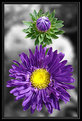
Critique By:
Carsten Ranke (K:14476)
8/27/2005 4:04:39 AM
Outstanding the color contrast, very strong effect, great motif. It would be perfect with just the same amount of space around the flowers on all sides, perhaps a square format (if it is a crop, I would certainly try that out). Anyway, superb picture !
Regards
Carsten
|
| Photo By: Bosnia Photo
(K:3088)
|
|
|
Critique By:
Rafael Torcida (K:1926)
8/26/2005 12:59:59 PM
Amazing portrait full of expression. Less is always more, and that piece of face with beautiful blue eye transmits a lot of emotions. Good use of DOF in the background to create pleasant effect to the eye (of the observer :P). The slight tilting of the face creates an original effect on the portrait. I like it!.
|
| Photo By: BRH BRH
(K:-210)
|
|
|
Critique By:
Subhash Sen (K:11931)
8/24/2005 11:14:32 PM
Dear Deb i do not know much about photoshop but you can do it by using a macro filter & focussing on the mid zone,suppose u use +3 ,+10 macro filters you will find it difficult to focus initially but once you do on the portion you want to the effects are amazing ,just try this i do it to a lot of my florals ,love,dada.
|
| Photo By: Debarshi Duttagupta
(K:26815)
|
|
|
Critique By:
Shane O'Neill (K:3054)
8/23/2005 4:39:09 AM
TTL slow sync is very easy with the D70. What I do is set the shutter speed to whatever you want ... say 1/30th sec, and then reduce the flash output by approx 2 stops. This can be done in camera if you have a Nikon SB flasgun - alternatively you could use a few layers of tissue. It wont take you long to perfect it.
|
| Photo By: Eric Peterson
(K:4419)
|
|