|
|
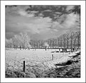
Critique By:
Neil Dolman (K:26883)
12/19/2004 9:11:21 AM
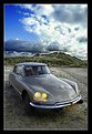
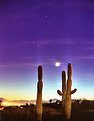
Hi Peter, i clicked on this because i liked the title and yes it does look like snow in the thumbnail, and last but least today i awoke to a covering in white - at last. Big storms over the last couple of days have brought a lot of snow to the mountains. As to your technique, i think it is coming on fine. I would prefer a little more contrast in certain parts of the image but that is personal preference, but could be easily done in layers i guess. Still you are the artist... Keep it up and best wishes for the season and new year from Switzerland, Neil
|
Photo By: Peter De Rycke
(K:41212)

|
|
|
Critique By:
Lester Tradelbloom (K:3291)
12/19/2004 7:55:05 AM
Fantastic perspective Stephen! This is something to be proud of, it is such a simple, subtle photograph, but the perspective you have captured is wonderful. Personally, I think the bar in the background detracts from the strength of the image - see repost.
Congrats.
- Justin
|
| Photo By: stephen evans
(K:-104)
|
|
|
Critique By:
Ian McIntosh (K:42997)
12/14/2004 11:33:04 AM
Hey gidday Heath, nice to hear from you!
Stunning gallery mate and genuinely useful "abouts", like it.
This is going to be a nice place to come to once in a while ( not the hell, though one has to admire the crispness of the lighting conditiuons there by the looks. Notice you're resisting the urge to cook this into something else with photoshop like adding red.
|
| Photo By: Heath Bennett
(K:4429)
|
|
|
Critique By:
Verena Rentrop (K:15233)
12/14/2004 4:29:53 AM
Dear Peter,
this is my favourite in this serie of ship details, one reason is the b&w chosen but especially for the composition which is well arranged and full of different tilts...well done
Cheers,
Verena
|
| Photo By: Peter De Rycke
(K:41212)
|
|
|
Critique By:
Ed Francis (K:1165)
12/10/2004 12:32:52 PM
This is an arresting image, though I haven't quite figured out why. The contrast of the lights against the background sky - which seems almost to be impossibly lit by the lamps is very effective. I like the mystery of the background trees. There's more to a good image than the technicalities though. I'm still not sure why I'm drawn to this one.
The title... I see where the two bit comes in, but maybe I'm just a bit thick... is it supposed to allude to something? Some poetry perhaps? A silly Sandra Bullock movie that I didn't see, maybe?
Thanks for sharing,
Ed
|
| Photo By: Neal Nye
(K:15827)
|
|
|
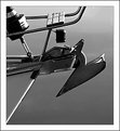
Critique By:
Armen Jamkotchian (K:5879)
12/10/2004 3:44:53 AM
Very original idea. Also, I think technically and compositionally this image is very well done.
I suggest to move the parashute inwards to reach the 1/3 both horizontally and vertically.
Best regards - Armen
|
| Photo By: Fernando Resendes
(K:473)
|
|
|
Critique By:
Dr. Rafael Springmann (K:89517)
12/10/2004 6:52:15 AM
Excedllent colors and composition. Setting the church in the arch, but a little to the right maskes for the beautiful composition.
Thank you for your kind remark on my "rainbow in Tel Aviv".
Best regards,
Rafi
|
| Photo By: Paul's Photos
(K:35235)
|
|
|
Critique By:
Lester Tradelbloom (K:3291)
12/7/2004 2:00:41 PM
I think it is becoming more and more important for people to understand that it is not the subject of a photograph which makes it worthy of commendation - it is the way inwhich the photographer uses his/her own mind to turn the ordinary (and sometimes plain boring) into the extraordinary, the beautiful, and the exquisite. I think it is also just as important for us to see that it is this same creative mind that sets a good photographer above the everage, not the equipment he/she uses.
Both of these things you seem to have conquered and done so in fine fashion. First of all, this image is wonderful, honestly. I see so many photographs on this site which are taking the same angle on their work, but they seem to be forcing this creativity and we can see that. You have not. You have taken probably the most bland and uninteresting subject and turned it into art which you should be very proud of. Now to my second thought - you are walking proof that it is the photographer, not his equipment, that makes him shine - you have used a baseline digital SLR, with the lens that comes with the package (I know because I have recently bought the same model) and instead than letting a rather basic setup inhibit you, you have made the most of it, and for that you have my respect. I think you have captured a truly wonderful photograph here, and I have very little to say about it that is not in high regard.
But in every image, there is always something that someone will want to change. Maybe if you live close to this subject you might be able to use the widest angle on this lens and really distort the prespective here?
I have looked over your portfolio and could not find any bio information, so for all I know you could have a masters in photography and look down on me like trash (1st B. Photography student) but this is only my opinion. I love what you have done, and converting it to B&W has brought out the depth of your imagination.
One thing though - I live in North QLD, and see these crossings everyday - is it just my imagination, or is the sigh reading "Stop on red signal" as you have shown it here, or is it in fact white with black text?
Wonderful work, and very striking.
- Justin
|
| Photo By: George Roukis
(K:209)
|
|
|
Critique By:
Justin Roberts (K:382)
12/5/2004 9:20:46 PM
Ahh Dave!
You have plucked at the heart strings here. in my youth I used to work on Bithels Boats which are, or were, based just about 100 yds to the left of where you were standing. Many a story from those days including how me and a mate tried to ride the Dee bore up and over the that very weir in a rowing boat one dark night. Happy days.
Anyway, a cold morning, an univiting stretch of water under a chill sky. All these elements are nicely portraid and it simply makes you yearn for the warmth of home. Those bare trees in the background and rather plain achitecture just add to the uninvitng and unromantic environment.
The boat to the right has an abandoned air underlying the the thought that others too have fled the scene for a warm hearth.
Justin.
|
| Photo By: dave green
(K:2396)
|
|
|
Critique By:
Lori Stitt (K:75282)
12/5/2004 4:38:49 PM
Hi Hugo,
Nice to hear from you. I just knew you must have a new 'Goddess' up today'! And sure enough, here is this beauty again! Yep, I would for sure have a love affair with this car, such a HANDSOME vehicle this is. Very sporty looking, even though you mentioned it really isn't 'little'!
I like this image, the sky is OUTSTANDING, for sure the right day to photograph her!
I especially like the reflections of the clouds in the nice paintjob. Great lighting
And the warmth of the headlights really make this car SING!!
A nice shot overall.
Lori 
|
| Photo By: Hugo de Wolf
(K:185110)
|
|
|
Critique By:
Michael Kanemoto (K:22115)
12/1/2004 11:18:43 PM
Kostas:
I lost my camera on the final frame to sub-freezing wind and a good gust of wind. The camera went into the windshield of the car in back of me and then into the curb. My cheap assembly of cardboard was run over many times and crushed to death...
It took me a few minutes to pull back around, park, and find the camera, so there was a resulting double exposure, and some headlight burn from flying into the car. I had the camera mounted like you high on the roof looking backwards.
|
| Photo By: Kostas Tzanetos
(K:22012)
|
|
|
Critique By:
E H (K:1665)
11/30/2004 7:56:39 PM
Well, I'm not a pro yet, but there are some things that I would like to comment on:
I very much like the upper left and the upper right pictures, because they both have a very distinct and clearly visible point of (sharp) focus. Of course all of these pictures live from the shallow depth-of-field you have applied, but it plays out extremely well in these two.
The picture in the middle has this point of focus as well, but because it is on the rim of the lamp shade (and because -- naturally -- from that point on the shade deceases into the background in all four directions) it somehow gets lost -- what I see first is mainly out-of-focus area. That might be fully intended (I guess so), but it is somehow distracting nonetheless. Also, I think this particular point of focus is a bit lost because it does not emphasize any particular feature of the lamp. But that's only my opinion.
The large picture on the other hand works as good as the other ones -- it has a clearly defined focus and a wonderful transition area. This one's very good.
Now I see another thing that catches me, and that is the colour. It is a very clever idea to put a yellowish/brownish area into each picture -- even if it consists of a wooden desk. Very well conceived, indeed!
So you have the colour of the metal/lamp, the brownish, dark background and the warm (light/wood) highlights -- very homey. In an advertising sense, it works very good.
Overall it is a VERY GOOD presentation, although I would have second thoughts about the type (and the placement -- sorry, my art director background shows through ;-)).
Cheers
Jaques
|
| Photo By: Christian Lehner
(K:1247)
|
|
|
Critique By:
Panos Skouloudis (K:484)
11/30/2004 8:50:52 PM
iam not amazed ...either surprised...cause i know how good photographer you are...art can transform our daily rutine scenes to something new and magical...u can do that with such greatness........(am i over reacting?)
|
| Photo By: Piotr Niewierowicz
(K:2401)
|
|
|
Critique By:
emily savva (K:21113)
11/30/2004 8:51:52 PM
excellent perspective indeed... the tones and textures are absolutely great and love the overall abstract result... very well done Verena... emy
PS: i also have a pic about the same monument called "music"... i so much enjoy seeing different views... from different people... of a single theme... i certainly like yours a lot... 
|
| Photo By: Verena Rentrop
(K:15233)
|
|
|
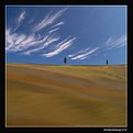
Critique By:
Nitish Kanabar (K:2618)
11/30/2004 10:11:51 PM
Minimal landscape but maximum impact! Very beautiful work. The gently undulating field, its texture invite the eyes to stay in the picture. The two trees on the horizon anchor the image. I agree with Antonio's suggestion about cropping the sky slightly. But overall, this is a fabulous image. Very impressive work, Paolo.
|
| Photo By: Paolo Pagnini
(K:828)
|
|
|
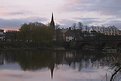
Critique By:
Coral Barclay (K:321)
11/26/2004 11:50:03 PM
Hello John
Thank you very much for your comments and poetics about the otago landscape..even though I come from a very beautiful part of the world, (the north west coast of canada), something about the openness of the landscape in NZ really got me and has stayed with me. i hope to return...this feb/mar. It must be very photographic at this time as you move into spring/summer. (pretty dark and gloomy here at the mo)
cheers
coral
|
| Photo By: John Lamb
(K:9687)
|
|
|
Critique By:
Kostas Tzanetos (K:22012)
11/27/2004 1:12:11 AM
welcome to usefilm Ubu
nice composition,lighting and mood for your first submission! the text on the picture looks very fitting,but i'd prefer a bit more sharpness on his head. ;-)
Maceo Parker is a great musician,btw
kostas
|
| Photo By: Jose Segura
(K:18)
|
|
|
Critique By:
Lukasz Kuczkowski (K:14687)
11/26/2004 1:06:34 PM
what I really like in this shot is: colors of the sky, clouds formation and the black cranes which make this shot interesting;
however, for the composition I would crop the bottom part of the picture (water) because it adds nothing to the view and make the horizon lay in the middle of the composition;
it is my vision only
regards
Lukasz
|
| Photo By: Luc VN
(K:-1816)
|
|
|
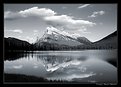
Critique By:
Michael Kanemoto (K:22115)
11/22/2004 10:45:21 PM
John:
I pulled down the image to see and noticed that it is not a pure black and white, but instead a B&W with a blue tone, I think by design.
In this version I converted the photo to pure black and white and adjusted the brightness and contrast of the sky independantly of the ground features for a little more contrast. Is this what you were thinking?
|
| Photo By: Steve Marcus
(K:195)
|
|
|
Critique By:
Eric Goldwasser (K:4294)
11/20/2004 2:14:45 AM
OK, this is awesome! Except for one thing... I think you have a shadow of your lens on the flower. It really would be PERFECT if the whole flower was in light, or shadow. Otherwise I love it. And really, I love it anyway. :-)
|
| Photo By: André Bermak
(K:14443)
|
|
|
Critique By:
Fadel J (K:13974)
11/18/2004 4:20:00 AM
This is wonderful Amna, I like how you included much of the sky! I think the haze looks fine in this image, but why do you think it is the lens that is causing the haze?
Anyway, here's my attempt to get rid of it with PS, I applied a "solid color" adjustment layer with color set to full white and blending mode set to "soft light", and masked out the land from the effect. I also masked out the clouds in the top with a brush using a medium grey color.
As for color temprature, you can shoot in raw and then use the utility that ships with your 300D to adjust the color temprature.
|
| Photo By: Amna Al Shamsi
(K:21795)
|
|
|
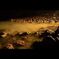
Critique By:
Kostas Tzanetos (K:22012)
11/16/2004 12:11:22 AM
looks like UFO traffic in the sky of Arizona!
nicely lighted and well composed shot it is Michael,but your scanner hasn't done it justice - or these spots are REAL UFOS? :-P
now,about your nightshooting project: since your exposures would be long and the quality of your camera questionable i suggest using a slow enough film to get decent quality and low grain - i use 100 or 200ASA fujicolor superia. as for exposure times,i don't have a standard formula for my shots - they usually vary from half a minute to half an hour depending on my mood,the amount of lights in the route and the effect i'm after. start with 2mins@f16 with 100ASA and bracket around it (30secs - 1min - 4mins - 10mins) not to get the 'perfect' shot really but just to experiment with the various effects and check your camera'a performance. reciprocity failure has not been a real issue for me anyway,and software can help where needed. as for the procedure you're planning to follow,it's ok to remove the tape when start driving but i think you should put it over again BEFORE stopping the car or the shot would have parts of 'still life' together with light trails ;-)
good luck!
kostas
|
| Photo By: Michael Kanemoto
(K:22115)
|
|
|
Critique By:
Stephen Bowden (K:64141)
11/14/2004 4:47:04 PM
Fabulous candid that somehow screams attitude !!
The young girl in front seems to be taking her hands out of her pocket and coming over to hit you !! The lady looking in the shop thinking "I'm not paying those prices", and the 3rd lady behind wondering wether to hit you with her umbrella - or maybe just swing her shopping at you lol
Seriously though, it is a great capture which certainly tells a story. The toning is also wonderful.
Best wishes,
Steve
|
| Photo By: Thilo Bayer
(K:50358)
|
|
|
Critique By:
Emgy Massidda (K:60358)
11/8/2004 10:08:44 PM
Anmazing and very intriguing creature. The close up has some very interesting details that make me want to keep looking at them.
Excellent clarity and sharpness, gorgeous colours and pattern on the wings. Great selective focus too.
I like it a lot
Thanks for sharing, Jorg
Best regards - Emgy
|
| Photo By: Jorg Reif
(K:16020)
|
|
|
Critique By:
Maggie Rodriguez (K:215)
11/8/2004 11:50:35 AM
This is an excellent picture. I like the color one on the bottom that was lightened. I attached my opinion. Hope you dont mind. I think that the thicker border takes away from the picture. The black thinner border makes the picture stand up
|
| Photo By: Antonia BauerleinSehnert
(K:30599)
|
|
|
Critique By:
Rebecca Raybon (K:26654)
11/8/2004 4:42:37 AM
There is something about this photo that immediately grabs me and pulls me into it. It may just be that this is because as I was growing up, my Grandmother always had begonias in clay pots, one of her favorites. I still love them to this day, and as a matter of fact had one come back up in a pot under the porch that I had discarded last year, and is now in full bloom in my dining room after everything else is gone. The rough textures of the wall and the clay tiles, the warm lighting...both beautiful. The flowers almost look like a painting. I simply love this, too much to describe. Were I to have it hanging, I'd have preferred to crop out the top half of the window, and have it mounted in a large frame, mounted as a square image in a cream colored double mat. Beautiful work that touched my heart. To my favorites.
|
| Photo By: Ken Alexander
(K:3905)
|
|
|
Critique By:
Kate Hargraves (K:1620)
11/4/2004 4:31:27 PM
The picture is one thing the poem is the other.
But you have paired them up in a great caption of who you are. (atleast thats my impression)
Now in the order of appearance..
the photo is really great. I like the color - the contrast between the bright sun and the cold blue of nightlight is beautiful. Its really 'hot and cold' and I like the how the person is magnified. I think its a great presentaion to the poem.
Now 2. The poem is good. A bit serious, a bit sad, a bit fun, and very real. I liked the feel.
I bet you would be kewl to know.
Anyway... there is my two cents. Thanks for sharing yourself.. sorry this is so long.... what can I say - my fingers are in love with my keyboard. Have a good one.. hey send me that link to your site.
|
| Photo By: Michael Kenny
(K:679)
|
|
|
Critique By:
Randy Lorance (K:24769)
11/1/2004 4:16:30 PM
Ya know Judi,there's much worse things than having a frog jump on you I thought a SciFi movie showing a bunch of frogs advancing upon a house hilarious.."what they gonna do,hop on you"?
Well,this is a great capture of one the little monsters. Especially that big sinister smile. He's definately been eating a lot of something,luring his victims into complacency with a big grin and his 'green' status, then springing a big sticky tongue attack on them.
Well this time he was captured and you did a good job.
Randy
|
| Photo By: Judi Liosatos
(K:34047)
|
|
|
Critique By:
arwa abdullah (K:34415)
10/31/2004 12:17:07 AM
I absolutely adore this child with angel wings!!!
This image is all about composition I rally like how the space infront of her makes the viewer see a heavenly image of her walking down that bath a true angel
wish her eyes were open tho
great image 7/7
|
| Photo By: A K
(K:8499)
|
|
|
Critique By:
Kostas Tzanetos (K:22012)
10/30/2004 10:38:17 PM
looks unintentional Stefane...more like an accidental snapshot than a serious photograph,in my opinion. since you could check the results with youre digital camera,i'd suggest either a slower shutter speed for a more blurred effect or a higher ISO that would give you a motionless image ;-)
thanks for your comment!
kostas
|
| Photo By: Subata Kitano
(K:2717)
|
|