|
|
 Michael Kanemoto
{K:22115} 8/14/2006
Michael Kanemoto
{K:22115} 8/14/2006
|
B+W always seems to bring out the geometry. Also cropped to simplify down to basics. Really like the shot.
|

B+W Remix |
|
|
|
|
Ricardo Alonso
{K:2186} 6/20/2006
|
Excelente! un juego de perspectiva y escala muy ineterasante.
|
|
|
|
|
Alicia Popp
{K:87532} 6/6/2006
|
Espectacular toma... un encanto... felicitaciones esas formas, luces y colores son muy agradables!!!
|
|
|
|
 Randy Lorance
{K:24769} 6/2/2006
Randy Lorance
{K:24769} 6/2/2006
|
Hi John, I totally respect your credo. I see that good scale would be lost along with a good deal of photograph. I did not really take enough time for careful consideration(or comment). I actually like the elements of second floor and railing and greenery that give perspective, and actually prefer people in most cases. It may be that a few moments either dirrection would have yeilded somewhat better position of persons, but as shot is still a very good composition to which I wouldn't have commented to had it not caught my eye and appreciation to start with.
Nice work
Randy
|
|
|
|
 j esford
 {K:13518} 6/1/2006
|
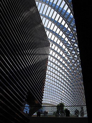
Thanks for the suggestion Randy. Although I AM a math atheist, I do have my standards! The security lamp is a minor annoyance, however it was part of the shot. If I took out the people, I would either have to crop out the entire second floor ramp contents(including the greenery) in which case I feel the scale would be lost, or edit out the people and leave the ramp and greenery, in which case the authenticity of the shot would be lost! The people, ramp, lamp and greenery were present when I captured the moment. They are representative of the atmosphere in that space (my daughter's college graduation) at that particular moment. Whether they add interest, is a matter of opinion for the viewer. And ethically, I cannot manipulate the contents of any photo I take. It's a credo that I have lived by for 54 years and photographed under for 40. Just a quirky side of my personality. Please humor me. I understand and respect your opinion however. -john
|
|
|
|
|
Randy Lorance
{K:24769} 6/1/2006
|
Striking architecture you've captured. I might agree with dave about cropping, people sometimes add to these type images but in this case they do not add interest.
Randy
|
|
|
|
 Robert Kocs
{K:89085} 6/1/2006
Robert Kocs
{K:89085} 6/1/2006
|
A lovely architectural interior with great geometrical
lines and details. Well captured and seen! A very nice
dedication, well presented abstraction.
Well done dear John!
Cheers!
Robert
|
|
|
|
 Kambiz K
{K:37420} 5/31/2006
Kambiz K
{K:37420} 5/31/2006
|
Excellent composition with lovely perspective
|
|
|
|
 vanessa shakesheff
{K:68840} 5/31/2006
vanessa shakesheff
{K:68840} 5/31/2006
|
Great shot an amazing piece of architecture..nessa
|
|
|
|
 Dave Arnold
{K:55680} 5/31/2006
Dave Arnold
{K:55680} 5/31/2006
|
Great abstract with good light providing for an interesting perspective and reflections. I also think this would be excellent if you cropped out the people in the walkway and just left the building itself. And I would then be tempted to remove the lamp at the corner of the building, too.
Thanks for your comments on Haystack Arch. It's the first arch I've seen in my new "neighborhood" and unfortunately it is on fenced, private property so my ability to play with different views was limited to the distance as well as a mesa directly next to it.
Best wishes,
Dave
|
|
|
|
 bill smith
{K:5416} 5/31/2006
bill smith
{K:5416} 5/31/2006
|
Nice eye John,
The lines are pretty cool and the light in the top center seems to anchor the whole shot. Nice exposer too, very well done
Bill
|
|
|
|
|
Mary Brown
{K:71879} 5/31/2006
|
The lines and shapes here are very eye catching. The dark and light contrasts add interest and draw one's attention to that light on the corner making it a intersting focus of attention. Including the trees near the bottom helps put the size of the building into perspective. Neat shot.
MAry
|
|
|
|
 Howie Mudge
{K:27933} 5/31/2006
Howie Mudge
{K:27933} 5/31/2006
|
Excellent composition and love the lines and angles throughout the scene. Exposure is spot on.
|
|
|
|
 Daniel Hernández
{K:105} 5/31/2006
Daniel Hernández
{K:105} 5/31/2006
|
wow!!
Nice perspective... great.
|
|