City - Death Valley State - CA Country - United States
About
A perspective on landscape photography?
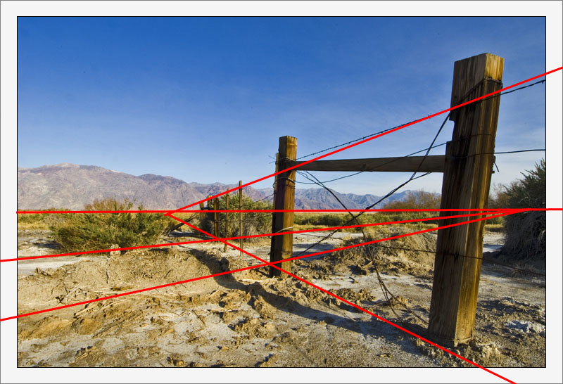
Part I: Eagle Borax Works, Death Valley, before dusk 24 February 2005 Ingredients: Nikon D2x Nikon 12 - 24mm f/4.0 Focal length: 12 mm Exposure: 1/80 Aperture: f/13 EV correction: +0,67 EV ISO Speed: 400
With special thanks to Cessy Karina for reminding me about my own preference for a dominant primary subject.
Hugo, I read with great interest the animated discussion of this thread. First, it reminded me of one picture I posted: http://www.usefilm.com/Image.asp?ID=1038125 and you have done the right thing - which I shall remember your your advice, to take a very low POV. For someone who has seen Death Valley, it brings up memories of desolation, arid space that goes on forever, nothingness. It's an emotion, as much as it is a picture. Not everything we see is beautiful in a common sense, there is a haunting quality of extreme hardship and many forgotten lives of miners and others who perished in an unforgiving environment, trying to escape poverty and to defy all odds. I like it, but one needs the context. Perhaps a little more "about" would turn the attention from "perspective" to history. Cheers, Ina
Hi Manu, funny you should mention that; After uploading the third one of this series, I thought about decreasing the saturation tremendously, going for a rather flat feel. The more I think about that, the more I tend to agree with you. Definitely going to try that! Thanks! Excellent suggestion!
Love the wooden posts and the perspective and the texture of the valley floor etc but I feel there needs to be more...sorry? And the sky needs to be real flat...IMHO
Hi, Compostion is probably one of the most important things in a picture. I have been working on this all my life and you never get it all perfected but the basic elements should be followed for a picture to be good. Composition is something that one does not learn in just a short time, some people grasp the concept easier than others and some never seem to have it. I see so many pictures on here that could have been so much better if they had just learned the basics of good composition and flow of a picture. I am glad to be of help and I have found that you are never too old to learn new things. I enjoy your work. Looking forward to seeing more. Don.
Hi Don, I've read your comment several times, to try to fully understand what you mean. If I've understood correctly, you're describing the dominant diagonal, running from lower right to mid left. In that way, I agree, there are a few humps to take which break up the image.
Funny thing, I've never actually imagined that approach, as I also see those humps creating a countering diagonal, running from lower left to mid right, balancing everything again. A rather complicated compositional theme, yet one I rather like, and use in more compositions. (see the attached image.
I think we're referring to the same way in following the scene to completion, but looking for different specifics.
I really appreciate your time in clarifying what you see! Very insightful! Now I see your point more clearly, I think it also (even though partially) changes my views on this photo. During one of my photography classes, I was told I tend over analyse (which I accept full-heartily...:) in composing. And I think that's the case here too. It's also why I started building triptyches, and venturing out into the more experimental types of photography, such as the lensbaby series. I think it helps me to break this tendency, but it's a habit that's difficult to suppress....
Thanks again for your explanation, very helpful! One of the best feedbacks I've ever received!
Hi Hugo, Here is what I see in this picture, you have a low angle of view and then the eye runs into that hole in the ground and when getting over that you have the green bushes that keep you from going any further into the great scene beyond but when you get there you have a lot of blue sky. Whereas in the scene with the flowers they do not impede the eye from continuing on into the scene and the rest of the picture and the sky is broken up by the blooms on the upper left.. It is just a matter of your eyes following the scene to completion. I hope this is clear as it is what I see when I view these pictures. Thanks for asking and let me know your thoughts now.. sincerely, Don.
Interesting thought you pose about isolating this photo; I do believe that does make a difference, yet it also adds the challenge of making each of the photos "food for thought" as stand-alone too...
I've only been uploading triptyches since I joined UF, and in most cases one by one, spread out over one image per week on average. I'm enjoying the CC area, though, as it's a great source for some very useful and valuable feedback; that might also be a difference, I think.
Ha Teunis, Je bent de eerste die de rotatie in de horizon ziet; ik had de foto al geupload toen ik er achter kwam. Klasse! Wat betreft de verzadiging, heb ik het idee, dat het origineel (de TIFF, groot formaat) dicht bij jouw versie in de buurt komt. Bij het uploaden naar UF gaat de saturatie wat verloren. Wat betreft de compositie ben ik het niet met je eens; je hebt gelijk, dat rechts niet echt mee doet, maar ik vind deze oplossing eerlijk gezegd geen verbetering. Het centrum van de compositie ligt al rechts van het midden, en je maakt dat gevoel alleen maar sterker... Ook het frame is een persoonlijk iets...:)
Hallo Hugo. Ik heb lang naar deze foto gekeken Heb hem vervolgens opgeslagen Vind dat rechts van de hoekpaal nuet meewerkt aan de diepte Heb in paintshop 1% gekanteld , vervolens gecropt,een keer verscherpt en de kleuren 3% verzadigd,ander frame gemaakt Mooi dat je dat ik dit ook eens tegenkom op Usefilm Critique Me Ben benieuwd wat je er van vindt Gr Teunis
Hi Markus, thanks for your feedback. It's definitely good reading material, as the opinions vary from negative to positive, and everything in between... Never expected that to happen!
I think you're more than able to write an elaborate critique, as it's more about feelings, personal liking and other subjective things than about the real technical stuff... At least, to me it is:)
In this picture comes very well to the expression how in the remotest parts of the earth the person has leave behind its traces. A successful picture formation and color formation. Regards Gerhard
A brilliant illustration again! Splendid perspective! It is a nice piece of art! Very nice details! The colours are really eye-caching! Best wishes: Maxime
Hi, Hugo. It's very interesting to read all these different comments but I am not able to write a comparable elaborate critique. First I don't understand much from photography and second I don't want to analyse an image too much into details.
When I see a picture I watch my feelings and emotions I have with it. And this one evokes a lot of emotions in me. It brings me back to the times of the great western movies from the fifties and sixties. I can see the Magnificent Seven riding in the distance. And that's the reason why I like the image.
Hi Hugo, I'm looking forward to the next couple of images to try and understand this one in context. I quite often find myself posting in a series of three as well. I think because you isolated this one in the CC area. A lot of us are seeing it as a one off image and critiquing it that way. The response might have been completely different if people could see all three at once. Maybe this is something that Usefilm could do for us sometime in the future. That is to say, maybe allow us a once a month mini show or gallery of three or for related images. That way our related subjects would not be scattered all over the place and could be seen as a concept set. I think something like this would be very effective. Andre
Thanks Phil. I appreciate your vote of confidence... It seems it's only a minority who like this one... More salt flats between the hills and the slight ridge, similar to the Devils' Golf Course of the previous series.
The fence gives the image real perspective! I am left yearning to know what is in the valley, between the far off hills and the slight ridge in the foreground. You have captured the image so well - a pleasure to view!
Hi Tom, thanks for the honest feedback, much appreciated!
the weird thing is that I can't just ditch it, as I actually rather like it (and despite the beating this one receives, I still do like it:) The composition might be rather unconventional or even quite strong, but the build up in the composition is there, I believe.
The fence is the obvious part, creating a vanishing point to the left, and then I see some (more imaginary) lines, created by the borax works and the shrubs, creating a vanishing point to the left. The mountains are no more or less than a back drop. See also the attachment.
Maybe my intentions will be come more clear with the second and third one; I'm not telling you just yet.
Hugo, I'm a huge fan of yours and you have been very kind to me, but I'm just not getting this one.
The composition gets started well with the fence posts and barbed wire, but the eye travels to the center of the image and suddenly gets lost in distracting elemements -- the bushes, the mountain, the mud -- I can't find what it is you wanted me to see.
I was thinking perhaps monochrome, or a very low angle lighting might rescue this scene, but no.
This image is only ordinary and that is not you...ditch it as soon as possible.
Dear Saeed, tahnks for your elaborate feedback, and you pose some interesting ideas. I appreciate them a lot, as they also help me to look at things from a different perspective - yours.
You seem to be referring to certain rules of composition, and make the metaphore with the composer of music, which I think is a very good one.
A composer of classical music creates classical music following style and perhaps a set of rules. A composter of fusion jazz creates fusion jazz, following his style and perhaps a set of rules.
Now, as a listener, you might like classical music, but don't care for the rules that apply to fusion jazz. That doesn't mean the rules of fusion jazz are wrong, they are just different.
I'm sure, that if I had the chanse to shoot it again, the result will definitely be different. I have to agree with you there, too. But not because I follow different rules, unless I want to create a different style / type of photography, but because the situation will be different. Both the physical situation (lighting, temperature, etc, but also the mental situation (mood, etc). There are many ways in which such a shot may be different, even if based on the same set of rules.
I think there are other ways to make a scene spring into life than just a convincing sense of depth. It's a contrast, a change of dominant subjects, the element of surprise, or anything that makes the viewer think. And I believe, that's just what you did, so in that respect, I like to believe that I've been rather successful in creating a strong composition. Whether you like it or not is subjective, but doesn't say it's good or bad.
Like I said before, I never tried to capture a classic landscape with this photo, and as seen as such a classic landscape, I'd agree on your remark on the fence. But, If you, for instance, look at this photo as a photo of a fence in its environment, completely different rules apply.
I think it all comes down to a subjectiveness, that is based on the way we want to look at an image, and what we want to see in it. And I don't think that doesn't apply with this photo, as it's much more unconventional than that, which is (without telling too much, perhaps things will become more clear when I post the other two images in this series) basically the idea behind it.
Thanks again, I just love these elaborate thoughts, they're very helpful in assisting me to analyse various fields in photography!
As a subject you chose an interesting one with great variation gradients. But to me it has 2d plane image separated into two sections, to make it spring into life you need to create a convincing sense of depth. Whats that mean, to lead the viewers eye into the image and that by manipulating the fore, middle and background elements of the scene. A simple element will lead through these areas of a picture to your centre of interest and can be very effective to communicate the image message effectively. Your low angle shot neither helped you nor did the fence. Especially with the absences of middle area, a strong vertical elements, or a blown out background just to make foreground separated from it. I always bring my composer example especially for landscape images, and that a composer has to arrange a piece of music, deciding which instruments will work together, which sounds flow and which clash, so it is that a photographer has to construct powerful images from the visual overload hitting them from all direction. Saying that am sure if you have the opportunity to go and capture it again the result definitely will be different. Cheers Saeed
Hi John, Thanks for your feedback! I'm rather surprised by the extremely large number of excellent critiques, too. Very useful indeed!
I think I need to explain a bit about the title; Maybe I've used the word "perspective" in a different context, maybe it's the improper use of the word all together; I intended a more metaphorical sense of the word, i.e. looking at things from a different perspective; this landscape isn't the classical approach to shooting the scenery, and that's just what I intended to achieve.
As to the higher PoV, I deliberately chose the low PoV, to break the usual alignment of foreground - background - sky by the poles of the fence crossing them. Again, a rather different "perspective" on landscape photography.
Hi Andre, thanks for your honest critique; don't worry about being negative, I'd rather appreciate it... (and always trying to be frank myself, it would've been rather hypocritical if I couldn't take some serious feedback myself, heh?) So - Don't worry, It's much appreciated!
Besides, it basically all comes down to subjectivity, taste and style; and that's what makes it so interesting!
The funny thing is, that I can't argue with your reasoning; yet the points you mention are the things that make this photo work for me.
I'll explain a bit more about what I like about it. It combines some very powerful diagonals, some more imaginary than others. These diagonals change the primary subject from a classical type of landscape into something more unconventional, as it shifts the primary subject.
Maybe the coherence and theme of this photo becomes a bit more clear when I post the second and third one of this series...?
Again, thanks for your assessment, much appreciated!
Hi Don, thanks for the useful feedback. Much appreciated.
Interesting to read the first line; I (still) think this composition is one of the strongest features of this photo; and one of the more elaborate and challenging ones in my portfolio...:) I guess it's all down to the subjectiveness of style and taste, heh?
I realise my PoV is rather low, but then again, I dind't want to show the mountains in the distance - as primary subject. I chose the low PoV, to break the usual alignment of foreground - background - sky by the poles of the fence crossing them. In that respct, thsi photo is not the standard approach to landscape photography, but far more unconventional. To me, it fits with the feel of DV
You know I always post my images in series of three, and with this being the first, I still have hopes you'll see what my intentions are when I've concluded the series.
I agree I could've corrected the camera distortion; but I deliberately decided against it, as the distortion is also a part of the features I've used - again, it's not intended to be the classical approach to landscape photography.
I just finished shooting some critter that popped out of the salty ground, and for that I needed a fast shutterspeed; I guess I didn't tweak it down. The light, however, was already fading fast; if you look at the settings, I shot this at 1/80' at f/13, so it wasn't that light. Could've used a 1/20'at f/13 at 100 ISO for a few more minutes, though...
Hi David, Thanks for your elaborate feedback, much appreciated.
In order to fully place your comment in the proper context, I'm glad I browsed to your portfolio; Looking at the simplicity of the compositions and scenes, I think I see your point.
Maybe the Perspective part needs some explaining; maybe it's the improper use of the word Perspective; I intended a more metaphorical sense of the word, i.e. looking at things from a different perspective; this landscape isn't the classical approach to shooting the scenery, and that's just what I intended to achieve.
Interesting, though. Your suggestion of cropping 1/4th off the frame (on the left, I presume) would've induced quite the opposite effect of what I want to achieve; The opening / clearing in the fence, allowing an unobstructed glimpse of the mountain ridge is as important as the fence itself; Maybe I've misunderstood your suggestion, and I would appreciate it if you'd show me what you have in mind.
Hugo, I find the composition of this picture lacking. Your angle of view is a bit low if you wanted to show the mountians in the distance. As it is the fence leads me to that hole in the ground and I can't get any further. The wide angle lens had distorted the post on the right and maybe could be corrected in PS2 with lens correction. Evidently you had something in mind when you took this but I fail to recognize just what it was. Don.
I'm fascinated to see the comments developing here, since they are tending more towards critique than most comments posted on UF at present. I guess that may be in response to your own honest and constructive comments.
I'm going to sit on the fence (excuse the pun) a bit over this one. I agree the fence leads the eye to the centre of the image, but that's where it would go naturally anyway. So I have to agree with David on that point.
But I do like that lumpy salty foreground. And the blue sky (it's still winter in Poland - so maybe that's why...)
Overall, it doesn't look like a desert perspective to me. For that, I would probably like the image taken from a higher point of view, so that I could see the desert stretching away into the distance towards the mountains.
But it does convey the impression of barriers, natural and man-made.
All of which reminds me that commenting on a website is no substitute for sitting round a table!
Hi Hugo, I am going to be completely honest with you with this comment. It's only the way I see it, just take it for what it's worth.
I have looked at this image for a long time and also went back and forth to other images in your portfolio. On your first page alone, you have many deserving awards and at least two dozen outstanding images that to me seem far superior to this one. I will be very interested to follow this thread and see what others have to say about this one.
The way I see it is you have the bottom left dominated by some less than spectacular sand and dirt. The upper third dominated by some blue sort of uninteresting sky. A leading line and perspective formed by the fence that really doesn't lead to anywhere much.
Wow, this sounds awful negative. I suppose it sounds that way because of how outstanding most of your other images are.
It's not that it's a bad image or anything, just that to me, it's not that interesting.
Like I said, it's only my assessment, and I am interested to see what others write, in case I have missed something. Andre
Hugo, we seem to spin in swirls of conscienceness, as our photos are next to each other. Brilliant shot my friend! The fence (full of the character) delivers the eye gracefully to the mountains. Nice colors, especially the skys' gradient, and composition. Sal
The image has nice color and contrast, but the title, which includes perspective, leads to what I find troubling about the photo. The vanishing point of the fence line is about a third of the way into the frame, but the prominent post in the center of the frame stops your eye dead. All the interest is really in the right half of the picture. I think that cropping the left 1/4 of the frame would dramatically improve the composition.