|
|
|
deniz kaan copur
{K:12726} 4/22/2003
|
great!
|
|
|
|
|
Gayla Christ
{K:70} 4/22/2003
|
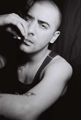
Can;t remember which Ilford I used... I chage so oftern. Like I said, the rest of the roll came out like it normally does, high contrast, which is what i like, except this one, which came out gray. I actually liked it in this one which is why I left it alone in PS. there are some other shots off the same roll on the site.... they were more what I was used to with Ilford.
www.666photography.com
|
|
|
|
|
Brian Warner
{K:213} 4/21/2003
|
Great job. Love the mood. What Ilford did you use? Seems to me that when I shoot Ilford i get more contrast then this. You get a lot of tones... what I would normally get in Agfa Scala or Tri-x. Great job... I'd almost like to see the dark tones darker though. I like rich blacks in b&w, which is why I shoot a lot of Ilford HP5. The sharpness here is tricky. His jean strap is in strong focus - but his eye, right above it isn't... I personally the eye should be in the same stark focus... as that's where I'm drawn. But this is good, none the less!
|
|
|
|
|
Jonathan Kane
{K:10641} 4/21/2003
|
Great portrait! I am glad it's in b&w. Sometimes colors just get in the way. I really like the way you composed the image. Much much more interesting than if you had not tilted the camera. I think you really learn a lot about the subject from looking at this image.
|
|
|
|
|
Vicki Bentley
{K:5080} 4/21/2003
|
Good composition. Needs to be sharper.
|
|