|
|
 Jan Hoffman
{K:39467} 3/5/2007
Jan Hoffman
{K:39467} 3/5/2007
|
Leora -- Thanks so much for commenting. I think the "reviews" I received for B&W versus color were mixed at about 50/50. Over time I decided that I liked the B&W a bit more than the color. aLi did have a great idea and it was very helpful.
--Best to you, Jan
|
|
|
|
 Leora Long
{K:11135} 3/4/2007
Leora Long
{K:11135} 3/4/2007
|
I thin this works really well in BW, Jan, so that was a good suggestion from aLi Naghizadeh. Fits the mood. Nice all over pattern.
Cheers, Leora
|
|
|
|
|
Jan Hoffman
{K:39467} 2/8/2007
|
Stefan -- Thanks so much for your comment!
--Best to you, Jan
|
|
|
|
 Stefan Fischli
{K:927} 2/8/2007
Stefan Fischli
{K:927} 2/8/2007
|
hi jan. nice one. b/w works very well. cheers stefan
|
|
|
|
 biljana mitrovic
{K:48110} 2/5/2007
biljana mitrovic
{K:48110} 2/5/2007
|
You are velcome like always dear Jan
Biljana
|
|
|
|
|
Jan Hoffman
{K:39467} 2/5/2007
|
Biljana -- Thanks so much for taking a look at this and for your comments.
--Best to you, Jan
|
|
|
|
|
biljana mitrovic
{K:48110} 2/5/2007
|
Very interesting picture....I like it
Warm regards
Biljana
|
|
|
|
|
Jan Hoffman
{K:39467} 1/25/2007
|
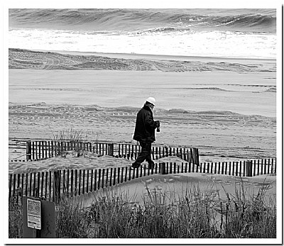
Cliff - Sand on the Big Mac sandwich may not be so bad; these guys are very gritty and used to the lousy conditions. Thanks for your comments.
--Regards, Jan
|
|
|
|
 cliff hanger
{K:1390} 1/25/2007
cliff hanger
{K:1390} 1/25/2007
|
looks mournfull Jan, but i suppose i would be if i had the sand blowing on my sarnies at 90 mile an hour! :) Great shot though youve really captured the momen. Cliff.
|
|
|
|
|
Jan Hoffman
{K:39467} 1/17/2007
|
Leonardo - thanks so much for taking a look here. I will pop over right now and look.
--Jan
|
|
|
|
 Leo Régnier Я£
{K:67696} 1/17/2007
Leo Régnier Я£
{K:67696} 1/17/2007
|
Hi Jan!! I din't know this one... It´s very nice, I love the B&W at the beach! Congrats my friend!!
Leo
ps: I invite you to see my last uploads...
|
|
|
|
|
Jan Hoffman
{K:39467} 1/17/2007
|
Marija-- Thanks so much for your kind words about this photograph. I am still partial to the color version of this picture but all the feedback I have received favors the black and white version.
--Warm regards to you, Jan
|
|
|
|
 Marija Ristic
{K:4136} 1/16/2007
Marija Ristic
{K:4136} 1/16/2007
|
This is so lovely balanced in composition, subject and mood, Jan, I love it! The human so nicely 'breaks' the lines and I like 3 different 'layers' of textures in the photo. Nicely captured moment in an everyday life. Really well done!
regards
Marija:)
|
|
|
|
|
Jan Hoffman
{K:39467} 1/14/2007
|
Thanks, Viola. Funny you mention "silence" as that is the impression I had when I took the picture; the lonely and silent walk of the worker heading back to the beach with his lunch.
Thanks so much for viewing and commenting.
--Best to you, Jan
|
|
|
|
|
Violetta Tarnowska
{K:24497} 1/13/2007
|
Jan:)
I adore it..... Subject, scenery, silence....
Warm hugs:)
Viola
|
|
|
|
|
Jan Hoffman
{K:39467} 1/9/2007
|
Peter - thanks for taking the time to comment and for your kind remarks. The B&W version was suggested by another USEFILM member and I would never have thought of it without the suggestion. I still prefer the color version but a number of viewers think the B&W is better. By the way, your recent series of strong vertical format photos is very fresh, unique and good. I like the approach and you have selected material that "fits" well with the concept.
--Best to you, Jan
|
|
|
|
 Peter De Rycke
 {K:41212} 1/9/2007
|
Mmm, nice soft gray tones in this shot, and good contrasts too.. good work !!
Peter
|
|
|
|
 Srna Stankovic
{K:172232} 12/21/2006
Srna Stankovic
{K:172232} 12/21/2006
|
As always you are welcome Jan :)
|
|
|
|
|
Jan Hoffman
{K:39467} 12/21/2006
|
Srna-- thanks so much for your kind words.
--best to you, Jan
|
|
|
|
|
Srna Stankovic
{K:172232} 12/21/2006
|
Dear Jan, great words u sand us from this great B/W shot...and it is effective. Impressive image you have here, well done my friend. Regards from SRNA :)
|
|
|
|
|
Jan Hoffman
{K:39467} 12/21/2006
|
Merwyn-- Thanks so much for taking the time to make comments.
--Best to you, Jan
|
|
|
|
|
Merwyn Kanjes
{K:4227} 12/21/2006
|
For me is great atmosphere and impressive sense of composition. I love the BW tones. Well done Jan.
Regards, merwyn
|
|
|
|
 Jason Hopson
{K:3283} 12/16/2006
Jason Hopson
{K:3283} 12/16/2006
|
You're quite welcome, Jan. It's kinda funny, but I think through usefilm I've learned more about critiquing photos than taking them!
|
|
|
|
|
Jan Hoffman
{K:39467} 12/16/2006
|
Jason-- thanks so much for taking the time to deliver a great critique. I truly appreciate it.
--Best to you, Jan
|
|
|
|
|
Jason Hopson
{K:3283} 12/16/2006
|
Hi Jan. As you and others have already noted here, there are tough choices to make regarding this photo. Just comparing and contrasting the two B/Ws, there are aspects of each that I like over the other, and vice verca.
The higher contrast in Dierk's version draws more attention to the figure, and also greatly improves the visibility of the machinery tracks on the beach. But, as Doyle so keenly pointed out, much detail is lost. For that reason I prefer your version in that regard.
As for composition/cropping, I understand that keeping the sign in the frame tells a better journalistic story. However, to my mind (and eye) removing it improves the image by placing the hungry man off-center, creating a more dynamic image. But hey, it's your picture and leaving the sign in for the reasons you mentioned is certainly valid.
Jason.
|
|
|
|
|
Jan Hoffman
{K:39467} 12/16/2006
|
Suavi-- Thanks so much for your kind words.
--Jan
|
|
|
|
|
suavi cem
{K:225} 12/16/2006
|
very important B&W. Congr.
|
|
|
|
|
Jan Hoffman
{K:39467} 12/15/2006
|
Erland-- Thanks so much for viewing and commenting.
--Best to you, Jan
|
|
|
|
 Erland Pillegaard
{K:34147} 12/15/2006
Erland Pillegaard
{K:34147} 12/15/2006
|
Good capture picture
erland
|
|
|
|
|
Jan Hoffman
{K:39467} 12/14/2006
|
Lex-- thanks for the excellent and constructive critique. I "struggled" with the intial crop and decided to leave the sign in: it warns of rip tides. Somehow, as an observer of that beach I felt it was important to me to keep it in the photo even though aesthetics probably dicate that it be cropped out.
--Thanks again, Jan
|
|
|
|
|
L B.
{K:13965} 12/14/2006
|
Hi Jan,
I like the B&w version better, but i think you need a little crop. The foreground (aspecially the sign) could be cropped off. that way you make the composition more compact. And the atention will be more given to the man. All though the bushes at the foreground are really nice to.. tough deal :-)
cheers, lex.
|
|
|
|
|
Jan Hoffman
{K:39467} 12/14/2006
|
Nessa- a great place to eat but not when it is 39 F with a twenty mile cross wind. I bet this guy got sand in his Big Mac.
--Best to you, Jan
|
|
|
|
 vanessa shakesheff
{K:68840} 12/14/2006
vanessa shakesheff
{K:68840} 12/14/2006
|
What a great place to have your dinner..lovely b&w ..nessa
|
|
|
|
|
Jan Hoffman
{K:39467} 12/12/2006
|
Thanks again for the continuing input, Doyle.
I agree the crop and the sign are staying as is.
This helps...
--Best to you, Jan
|
|
|
|
|
Jan Hoffman
{K:39467} 12/12/2006
|
aLi-- Thanks so much for your input on the color and black and white versions. I truely appreciate it. This is reason USEFILM has been so valuable to me.
--Best to you, Jan
|
|
|
|
 Doyle D. Chastain
{K:101119} 12/12/2006
Doyle D. Chastain
{K:101119} 12/12/2006
|
Jan:
Clearly I'll be in the minority here . . . but I FAR prefer your posted image than the Dierk re-work. I don't care for too much contrast as I feel you start to lose information and details in both the black and white ends of the light spectrum . . . I still like the sign as an accent for the shot too. Let's be clear . . . hard hat, treadmarks . . . a sign and a coat . . . it's an image that works VERY well in B&W . . . since to me it conveys an almost journalistic capture of this moment . . . stark and real . . . and (IMO) the better of the two shots.
What a great comparative study! Well done my friend!
Season's Best Wishes,
Doyle I <~~~~~
|
|
|
|
|
Jan Hoffman
{K:39467} 12/12/2006
|
Michele-- Thanks so much for weighing in. I appreciate the comment. I agree.
--Jan
|
|
|
|
 Ali Naghizadeh
{K:19600} 12/12/2006
Ali Naghizadeh
{K:19600} 12/12/2006
|
Hi dear Jan, many thanks for spending the time on my suggestion and for this post.. Unlike Michele, this shot is more emotional for me. I really like it, You've done a great job, I also like Diek's work on your shot, the removing of the sign has added to to shot quiet a bit as the sign is a bit distracting. anyway, thanks again and verywell done for the great work.. goes to my Favorites..
My very best,
aLi
|
|
|
|
 Michele Carlsen
{K:146013} 12/12/2006
Michele Carlsen
{K:146013} 12/12/2006
|
Hi Jan,
It was strange seeing this in black + white since I just saw it yesterday in color but I do like it .
For me right now black and white is documentary, and color is more emotional..
but I know I swing from that analysis a LOT!
All I know for this shot is I feel more personal in the color image and less in blck
& wht... they are both super images !!!
Michele~
|
|
|
|
|
Jan Hoffman
{K:39467} 12/11/2006
|
Thanks, Dierk! I think your version is much better. When I get a chance I will re-work it again and follow your suggestion.
Thanks-- very helpful.
--Best to you, Jan
|
|
|
|
|
Dierk Kruse
{K:315} 12/11/2006
|
How about this version: more black and more white and no sign in the foreground ?
best wishes
dierk
|
|
|