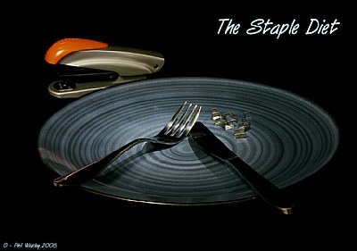
I like the lighting in this photo with the subtle highlights, works very well. Good concept, too. The text in the top right is a bit intrusive in the composition, IMO, and I think applying it more subtle, or leaving it out all together, would make the image stronger, I believe.


 talukder")