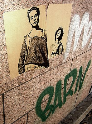
Hi Christian. If having the motives close to the edges is the way you like your compositions, I can only respect that.
The B&W effect would often depend on the conversion method. Desaturation, conversion to greyscale, global Channel mixer adjustments or separate channel mixing for shadows, midtones and highlights would all lead to different images, some stronger than others.
The B&W / toned B&W / colour choice would also depend on the mood you're trying to convey. Try playing around with different tonings, and see what you like. In the end, you may still like this colour version best, but at least you will have seen the other possibilities.
Matej, thanks for your constructive comment! I tried it in B/W, but that was too sterile, I thought. Perhaps with a similar color toning - that should perhaps make it? Regarding the angle, well, it is a bit cramped perhaps... but I currently have a taste for placing my motives rather far out towards the edge of the pic? I don't want a straight-on photo either, and not too much of the surrounding stuff, so this angle and one going from below upwards are pretty much the ones I could come up with. :)
I like the subject, but I think I'd like the photo even more if you had taken it in B&W (or converted it to B&W later). I think it would suit the subject better, and the posters are pretty much B&W already. For some reason the composition also feels somewhat cramped to me - the posters ask for more room at the top and on the left, the 'Barn' graffiti seems a bit tight at the bottom and on the right. Maybe a different angle of view would work well? As I said, the subject is fine and has potential but I think you're not quite there yet with this particular photo.