|
|
 Erik Neldner
{K:10846} 10/21/2005
Erik Neldner
{K:10846} 10/21/2005
|
cool halluncinogenic reflections here. nicely seen.
|
|
|
|
 Kareem Afifi
{K:5968} 10/21/2005
Kareem Afifi
{K:5968} 10/21/2005
|
what a great natural reflection of artificial colours !
really good work
|
|
|
|
 Igor Sivjakov
{K:4671} 10/21/2005
Igor Sivjakov
{K:4671} 10/21/2005
|
Good colors & reflection!
Igor
|
|
|
|
|
David Howard
{K:32} 10/21/2005
|
I like the way you got this picture with the reflection. The colores make it very magicle
|
|
|
|
|
Hamed Noori
{K:6805} 10/21/2005
|
Nice shot ..
|
|
|
|
 Jeanette Hägglund
{K:59855} 10/20/2005
Jeanette Hägglund
{K:59855} 10/20/2005
|
Beautiful reflections!
Jeanette
|
|
|
|
 Roberto Arcari Farinetti
 {K:209486} 10/20/2005
|
very very cool.. and perfect paint!
my bets wishes
roby
|
|
|
|
 Mohamed Banna
{K:34237} 10/20/2005
Mohamed Banna
{K:34237} 10/20/2005
|
very very nice abstract within these nice colors
congratulations for being featured
|
|
|
|
|
Paulo Vinícius
{K:2657} 10/20/2005
|
Good tones and well done composition
congrats...
|
|
|
|
|
Ömer Lütfü ELTAN
{K:346} 10/20/2005
|
Very interesting photo.Like painting canvas.Bravo
|
|
|
|
|
David Tasker
{K:4281} 10/20/2005
|
Fantastic Abstract
|
|
|
|
 Ian Miller
{K:9190} 10/20/2005
Ian Miller
{K:9190} 10/20/2005
|
I luuuuuurve this photo, it's both vibrant and deep in colour, and reminds me of when I was om Salt Spring Island in the Summer os 98 (Just thought I'd throw a plug for another Gulf Island, in there lol). Isn't Marcel the lovely female Jazz Singer Living, singing and hopefully still "Fiddling" on Pender? Thought she may have been at your Jazz Fest.
Ian Miller
|
|
|
|
|
Ahmet Baki Kocaballi
{K:13618} 10/16/2004
|
wondeful capture!
congrats
|
|
|
|
|
Lou Dina
{K:12194} 10/16/2004
|
Beautiful reflection shot, Becky. Great color, contrast and pattern. Lou
|
|
|
|
|
Becky V
{K:9699} 10/2/2004
|
Just so everyone knows, all old attachments were lost when Usefilm upgraded, so if I'm referring to something that isn't there (which is a lot because I used attachments quite frequently), I'm not trying to cruelly tease you or anything. It's just not there anymore!
Thanks for all your comments. :-)
|
|
|
|
|
Lucy Bernadette
{K:5806} 9/26/2004
|
i see only 1, this one, and it's a fabulous abstract. great colours, finely balanced. love it! just skimming through your portfolio and it's brilliant! can't wait to take a closer look.
|
|
|
|
|
Sam Oppenheim
{K:3362} 9/26/2004
|
I cannot see the 2, only this horizontal one (I looked thru your portfolio) wonderful images. I really love the colors and shapes in this one.
all the other comments echo my sentiment: really an amazing photograph, you have an excellent eye!
|
|
|
|
|
Renato Renato
{K:4759} 9/26/2004
|
colori fantastici!!!!!!!!!!!!!!!!!!!!!
ciao a presto Renato
|
|
|
|
|
Jesper Okkels
{K:131} 9/26/2004
|
Very nice work! I like the total abstraction. As a large print it could work as an artpaint on the wall...
|
|
|
|
|
Marc Gougenheim
{K:5398} 11/29/2002
|
My personal favorite in your portfolio. reflections are an ordinary subject, but this one has really great colors and I like way these colors and the darkest area actually frame the blue area. This is better than many 100% abstract reflection shots I've seen. Better because the colors are wonderful and because the composition is structured. Best regards.
|
|
|
|
|
Becky V
{K:9699} 10/10/2002
|
Thanks for your input everybody! :) I definitely want to shoot this scene again, though I'll probably have to wait until spring. :-/
|
|
|
|
 Lukasz Rzepinski (Łukasz Rzepiński)
{K:1211} 10/9/2002
Lukasz Rzepinski (Łukasz Rzepiński)
{K:1211} 10/9/2002
|
This is real WOW!
|
|
|
|
|
Kim Culbert
{K:37070} 10/7/2002
|
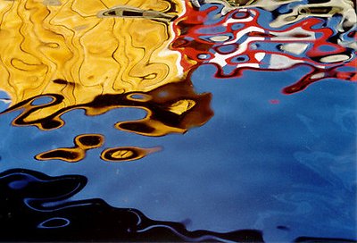
I'm throwing in my vote for the first one... The colours seem to dance more flowingly in it, and I love the capture of the oil. It almost doesn't even look like water... very cool!
|
|
|
|
|
. .
{K:2743} 10/4/2002
|
i like the first one too, well seen
|
|
|
|
|
Dylan Davies
{K:362} 10/1/2002
|
Even though the first ones yellow overpowers the frame (weights down the top corner?), i still like it better, the horizontal works better for me,
lovely colours by the way
|
|
|
|
|
Miles .
{K:896} 9/30/2002
|
Very colourful abstract. I agree with you the second shot has a nicer balance to composition but the exposure is not as good. Well spotted.
|
|
|
|
|
Betsy Hern
{K:12872} 9/30/2002
|
I like the first one. I like it so much I'm adding it to my favorites. The colors are fantastic! I especially like the blue, white and red area, it looks very much like pop art.
|
|
|
|
|
Becky V
{K:9699} 9/30/2002
|
The second photo: I think I like it better compositionally, but it's a bit overexposed. My camera settings were the same, so I'm not sure why that is. Maybe it was the way the sun was reflecting off the water?
|

|
|