|
|
|
Graham Mulrooney
{K:15728} 11/30/2003
|
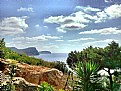
Good soft colours in the foreground which form an interesting mat of texture light and colour. The brash sky does not go with these colours so i've tried toning it down a bit. I think though there's still a problem with the direction of the light.
Thanks for your comments on my," Hiding In The Woods" they are much appreciated.
|

|
|
|
|
 Graciela Pierre
{K:7318} 11/28/2003
Graciela Pierre
{K:7318} 11/28/2003
|
Nice composition and colors. It looks like a painting!
Regards
|
|
|
|
|
kathleen fonseca
{K:11992} 11/27/2003
|
i just opened my version here..UF?s compression has caused a quality loss in the rest of your image so ignore all that..the horizon is pretty true to what i did. kat-
|
|
|
|
|
kathleen fonseca
{K:11992} 11/27/2003
|
Hi, Charles..you do some interesting PhotoShop work with some very nice photographs. i love your use of color and technique. There is a dreamy unreality here that reminds me of hand tinted photos from earlier times. Your composition is especially good and i have a feeling of space and clean fresh air that is so refreshing. i can just about lick those saturated pinks and greens and the sky is unreal enough to be a nice foil for the ground.
i agree with the comments about the horizon line. My first thought is that you didn?t need the soft horizon line. It seems the air in that part of the world would be so dry that you would have clarity all the way to the horizon and that would be part of the charm of the image. This is not the case in the tropics and a blurred horizon line is a maddening fact of life. I think a natural blur occurs due to humidity in the air and a sort of haze that dulls the scene from afar. This would also cause a slightly pale cast over the distant colors as well, no? i want you to know i did this more for my edification than yours but it came out sort of cool so i?m going to show you. i am in no way suggesting you do this, just showing you how things look here in the tropics. If you like your image as is, then by all means stick with that! First, i sharpened the horizon line to kinda get an idea how it might have really looked. Then i made a rough horizontal selection with the lasso tool about an inch above and below the horizon line which i feathered 75 pixels. i used a slight gaussien blur (i?m sorry, i forget exactly how much). The result seemed to naturally soften the horizon line as well as mute the colors ever so slightly. Not sure how it will show up here. Thanks for your comments on my image Windlown. i was very grateful to read what you said. Best rgeards: kat-
|

|
|
|
|
|
james mckenna
{K:6535} 11/26/2003
|
i love those colors, but the horizon does have a photoshop feel to it. if, indeed, you have digitally composed this image, you might try making the sky even more forced and unreal, pushing the color composition even more. the left side of the sky is the most interesting; maybe pull in more of that cotton-candy feel.
|
|
|
|
|
Donna Johnson
{K:9906} 11/26/2003
|
Is this a composite image? Well, I like it very much - as Jenny said, it has a watercolor feel to it.
Thanks for your comment on Wing . . . I agree - it would be better without the reflection of the duck up there. I did clone out another one to the right of the swan - I'm still not near as proficient in ps as I would like to be. In the future I will give this one another try.
|
|
|
|
|
jenny b
{K:126} 11/25/2003
|
This reminds of water colors, it's an emotive image. :)
|
|
|
|
|
Katrin Aasa
{K:740} 11/24/2003
|
Whatever you did - well done.
|
|
|
|
|
xy x
{K:41915} 11/24/2003
|
wonderful perspective and colours, great lighting and excellent composed, congrats, regards
|
|
|
|
|
Lorenzo Parisi
{K:6277} 11/24/2003
|
Excellent colors and view. Congrats! A bit too blurred in the horizon line.
Regards, Lorenzo
|
|














 0
0 


