|
|
|
Stefan Engström
{K:24473} 9/22/2004
|
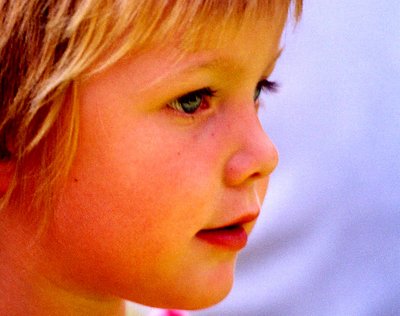
I like the contrast to the cool blue, but on the balance I'd say that the skin-color is too saturated for a portrait.
|
|
|
|
 Emgy Massidda
{K:60358} 9/21/2004
Emgy Massidda
{K:60358} 9/21/2004
|
Composition and crop are very good. Nice little girl, beautiful expression.
I like also the colors but I agree with Dina Marie about the grain
Superb capture, Tim
Best regards - Emgy
|
|
|
|
|
- -
{K:2309} 9/21/2004
|
No comment. Beautiful portrait.
|
|
|
|
|
Marta Pereyra
{K:5029} 9/21/2004
|
I like very much this colours, perhaps there is too much grain. With http://www.neatimage.com you can fix it.
It's a great portrait 
Congrats, Marta
|
|
|
|
 Teunis Haveman
{K:53426} 9/21/2004
Teunis Haveman
{K:53426} 9/21/2004
|
Tim een mooi portret
Smaken verschillen denk ik , want ik vind zachter kleuren mooier voor een porret, maar dat komt misschien doordat ik altijd met een rodd hoofd op de foto sta,Lol
Groet teunis
|
|
|
|
 Dina Marie
{K:-1410} 9/21/2004
Dina Marie
{K:-1410} 9/21/2004
|
i like the strong colors but as hard as i look at it, it still reminds me of a sunburned kid ?!
Strong colors are good for the most part but messing with the skin is tricky....
|
|


")

