|
|
 Dave Arnold
{K:55680} 12/29/2006
Dave Arnold
{K:55680} 12/29/2006
|
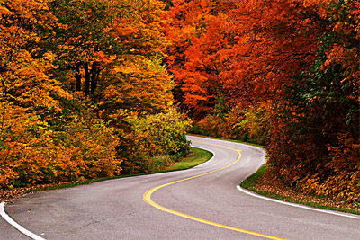
Some very nice colors captured, Roy, well representative of autumn! Stunning. I alos like the winding road, leading through the photograph. Congratulations on the photographer of the day award.
Best wishes,
Dave
|
|
|
|
 Peter De Rycke
 {K:41212} 12/28/2006
|
wow, such fantastic colours man .. great stuff .. congrats on the POD award .. Peter
|
|
|
|
 Giuseppe Guadagno
{K:34002} 10/23/2006
Giuseppe Guadagno
{K:34002} 10/23/2006
|
A joy for the eyes!
Giuseppe
|
|
|
|
 Paulo Sézio de Carvalho
{K:2273} 10/7/2006
Paulo Sézio de Carvalho
{K:2273} 10/7/2006
|
Uauuuuuuuuuuuu que paisagem magnífica!!! Bela paisagem.
|
|
|
|
 Joel Sweet
{K:228} 12/1/2005
Joel Sweet
{K:228} 12/1/2005
|
great composition! leave colours are so vivid. I like the contast the way it is personally
Gatineau park?
|
|
|
|
 Todd Weeks
{K:7636} 12/1/2005
Todd Weeks
{K:7636} 12/1/2005
|
Roy,
I suspect this was taken in the Gatineau Park. My neck of the woods for some 40+ years.
Absolutely stunning.
Todd
|
|
|
|
 tom rumland
{K:14874} 12/10/2004
tom rumland
{K:14874} 12/10/2004
|
roy, i have to apologize, but i'm spent from commenting today. spent the day catching up after being away for several weeks. however, i could not pass your photo up with expressing how incredible it is. great colors, classic composition, a beautiful photograph. excellent work!
take care,
tom
|
|
|
|
 Paul's Photos
{K:35235} 12/9/2004
Paul's Photos
{K:35235} 12/9/2004
|
beautiful colors... love the windy road.. I have taken pictures like this and think this one is great.. nice work.. it would be neat if you went back to this same spot and took a winter photo with snow.. and later maybe a spring or summer photos :)
|
|
|
|
|
Lori Stitt
{K:75282} 12/9/2004
|
The perfect 'S' curve leading you right into the frame! And gorgeous colors,
Good job,
Lori :)
|
|
|
|
|
Antonio Trincone
{K:23167} 12/9/2004
|
despite the urban mood due to the road the autumnal light for the trees and the shape of the road itself make this shot quite interesting and nice to see following the lines in the middle of the path
|
|
|
|
 Aurobindo Saha
{K:2396} 12/9/2004
Aurobindo Saha
{K:2396} 12/9/2004
|
Marvellous. Reminds me of John Denver's Aspen Glow.
Thanks for sharing.
Aurobindo
|
|
|
|
 Miguel Marques
{K:1374} 12/9/2004
Miguel Marques
{K:1374} 12/9/2004
|
A wall-hanger... no doubt!!!
|
|
|
|
|
Pumpkin HD
{K:1033} 12/9/2004
|
Beautiful shot
congrats
|
|
|
|
|
Les Hilburn
{K:395} 12/9/2004
|
This is a road that cars should never be allowed to drive down. It should be for people traveling at a speed no faster than their feet will allow. Mostly for such that not a single color, or slightly turned leaf will be missed. The colors are so explosive and you have done us all a favor by sharing it. Beautiful, stunning, warm, I could go on for hours. Great shot.
|
|
|
|
 Roberto Arcari Farinetti
{K:209486} 12/9/2004
Roberto Arcari Farinetti
{K:209486} 12/9/2004
|
nice mode nice shot roy.. a nice autumnal corner in the street!
the curves are in contrast with the lines of the trees, but are Homogeneous medley of colours and quietness is together one!
congrats for the main page
roby
|
|
|
|
|
Juliette
{K:585} 12/9/2004
|
7
|
|
|
|
|
Jani Salvataggio
{K:27283} 11/5/2004
|
Fantastic colours, great composition!!!
regards
Jani
|
|
|
|
 Darrell Larose
{K:736} 10/14/2004
Darrell Larose
{K:736} 10/14/2004
|
I would do a slight colour correction to keep the roadway grey. It probably was warmish because of the light filtering through the leaf canopy. With PhotoShop it is easy to locally colour correct the asphalt to be neutral. The brain plays tricks whaen we perceive something to be off colour.
Nice S-Curve which is a very strong compositional element. The colours a lovely. I would have taken this as well and then maybe waited for a second shot with a human element. Wait for a appropiate coloured sports car, bike whatever. This is not to say this shot isn't a wonderful image. You could have a series of winners from one shoot.
|
|
|
|
|
Djordje Jovicic
{K:919} 10/13/2004
|
fantastic colors! bravo...
|
|
|
|
 Gerry Pacher
{K:7303} 10/13/2004
Gerry Pacher
{K:7303} 10/13/2004
|
Dear Roy,
woouuw - these are beautiful colors. Great work!
Regards, Gerry
|
|
|
|
 Patrick Ziegler
{K:21797} 10/13/2004
Patrick Ziegler
{K:21797} 10/13/2004
|
Roy, It's a fantastic image. I should have never screwed with it. The more I look at it the more I like it. It must be a wonderfull drive down that road.
|
|
|
|
|
Rose Hooper
{K:899} 10/13/2004
|
I meant to say that the posted image is not precicely what the camera saw. I did what I would consider to be the appropriate adjustments to the raw image file before posting.
|
|
|
|
|
Stephen Bivens
{K:7308} 10/13/2004
|
Very nice.
|
|
|
|
|
Patrick Ziegler
{K:21797} 10/13/2004
|
Roy, Now I feel bad. I didn't mean for you to change it. If UF would let me re rate it I would give a 7+ over the 6 I originaly gave it. Maybe one of these next viewers would be so kind. By the way your entire portfolio is awsome!
|
|
|
|
|
Rose Hooper
{K:899} 10/13/2004
|
Hey Pat -- The image is changed from the original. It has more contrast, a tad more saturation, and has had the white balance adjusted (as if I had used a warming filter and velvia).
|
|
|
|
|
Rose Hooper
{K:899} 10/13/2004
|
You're seeing three things going on that give the apparent softness that may not be obvious in such a small version. This is a longer exposure - 1/6th of a second. This is a telephoto image (70mm x 1.6). There is intentional camera shake on the tripod (used my hand to operate the shutter) to soften the edges of the leaves a bit more.
|
|
|
|
|
Marcus Peters
{K:1182} 10/13/2004
|
I too think I prefer the origional. However, I might suggest a little more DOF next time. That tree in the center of the road in the back is a bit out of focus and I think it would feel better to me if it wasn't.
Just a thought.
Cheers
|
|
|
|
|
Patrick Ziegler
{K:21797} 10/13/2004
|
Don't get me wrong, your photo is great. I ment no offense. I just like darker more moody scenes. If I hade taken that shot I would be too proud to change a thing also.
|
|
|
|
|
Petros Stamatakos
{K:12101} 10/13/2004
|
Hmmm... I have to say that I absolutely love this photo. Beautiful composition, and lovely pastel colors.
I looked at Pat's version, and it's definitely a lot more contrasty than the original upload... Some people would probably prefer the "corrected" version. On my (calibrated) monitor, the original is, (I suspect) more accurate. It seems that in the digital age that we live in, our perception dictates that the more saturated an image is, the better. I try very hard not to fall in that trap, and at times fail.
Roy, I'm glad that you refrained from boosting saturation and contrast. This is much more natural and pleasing. In my humble opinion, this is a wall-hanger. Well done!
|
|
|
|
|
Rose Hooper
{K:899} 10/13/2004
|
To be honest, I don't like it overly contrasty and over-sharpenned. The full resolution file looks nice and sharp and detailled after a tad of unsharp mask and pushing the contrast/gamma up too high doesn't look good on my (calibrated) monitor. The oranges turn red, and the greens turn black.
|
|
|
|
|
Patrick Ziegler
{K:21797} 10/13/2004
|
Great colors, how could you not pull over and take a shot? 6
I can't help myself from tweaking. A little Gamma correction and unsharp mask is PS
|

|
|


")