|
|
 Angelo Villaschi
{K:49617} 6/28/2005
Angelo Villaschi
{K:49617} 6/28/2005
|
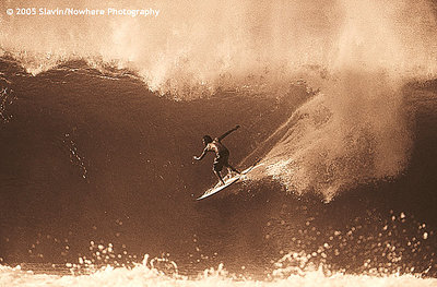
A cracking photo. I like the timeless archival feel from the toning. Besides that, the surfer is perfectly placed, with the trail from his entry/manouver creating a nice origin on the right, a nice line in his wake and a ride into the space on the left. Full of the fluid motion of the port!
|
|
|
|
Mary Brown
 {K:71879} 4/14/2005
|
I didn't think sepia would suit this kind of picture, but this is really nice.
Mary
-
|
|
|
|
|
phil martin
{K:274} 1/27/2005
|
I think the sepia tone works, although it may also look great as a B&W. Either way, the power of nature being challenged by a small figure is awesome.
I would also agree that the figure would probably be better placed more off centre...
|
|
|
|
|
Jim Gamble
{K:12164} 1/9/2005
|
OUTSTANDING, simply OUTSTANDING!!!!!!
Jim Gamble
|
|
|
|
|
Alastair Bell
{K:29571} 1/9/2005
|
Hmmmm.... Interesting.... Not sure I like the sepia... Somehow it doesn't seem to gel with the old feel sepia gives. Why not black and white?
|
|
|
|
 Dave Arnold
{K:55680} 1/9/2005
Dave Arnold
{K:55680} 1/9/2005
|
I aslmost thought this should be in natural color but then when I contemplate it, I like the sepia. The surfer looks as though he is made of bronze. Almost statuesque.
Best
Dave
|
|
|
|
 Bradley Prue
{K:30678} 1/9/2005
Bradley Prue
{K:30678} 1/9/2005
|
Unusual and creative touch. The image would benefit in my opinion, by offsetting the subject slightly from the center of the frame.
|
|
|
|
|
Malik Ramic
{K:1334} 1/9/2005
|
great idea.. i've never saw anything like this
|
|