|
|
 Robin Dunham
{K:1851} 6/19/2006
|
Naomi,
Beautiful images. Great portfolio.
I am researching a trip to Cambodia & Vietnam. Could you offer any travel tips?
Thanks, Robin
imagesbyrobin@yahoo.com
|
|
|
|
 Roland Lacson
{K:12214} 6/12/2005
|
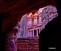
Although I prefer the subjects not to be centered in the frame in this case it works Naomi because the position in relation with the column ruins forms an arrow shape. I also like to mention the color contrast of the monks attire to the grey color surroundings, it really sticks out of the composition. Thanks much for your recent comment, cheers & best wishes.
|
|
|
|
|
Elahe S. Ahmadian
{K:8695} 3/26/2005
|
excellent architecture ,composition and clarity. superb contrast of warm orange against neutral gray.
|
|
|
|
 Naomi Weidner
{K:6636} 3/23/2005
|
It is cropped from the original and I toned down some over-exposed areas near the top. That's all. Thanks for looking, Marilyn. -- Naomi
|
|
|
|
|
Marilyn Nagy
{K:6008} 3/23/2005
|
Naomi, Is this layered or the actual colors? I like it however it was done. Marilyn
|
|
|
|
 chantal heijnen
{K:979} 3/21/2005
|
Hi Naomi,
The colours come out very bright! Nice!
Chantal
|
|
|
|
 ventrix drogo
 {K:65398} 3/20/2005
|
I like it. Mistic site. Good composition.
Bye.
ventrix (enrico)
|
|
|
|
|
Warren Tang
{K:413} 3/20/2005
|
Oh, I see, that explains the non-standard format of the crop. Then you might as well go "all the way", and make it a square format. By doing that, you cut off a bit of the extraneous foreground, and de-center the main subject at the same time.
Regards,
Warren
|
|
|
|
|
Domenico Pescosolido
{K:10022} 3/20/2005
|
Superb shot, where the color looks like to be the subjuct of the photo. Wonderful title.
|
|
|
|
|
Gino Quattrocchi
{K:39580} 3/20/2005
|
fabulous scene
the climate of great serenity of the place is included
very beautiful the contrast of the color
beautiful document of trip
|
|
|
|
 Naomi Weidner
{K:6636} 3/20/2005
|
Yes, Warrren, it would have been nice to show more of the top of the structure, but it was in sunlight and totally washed out. Thanks for your comment. -- Naomi
|
|
|
|
|
Warren Tang
{K:413} 3/20/2005
|
Naomi, I love the contrast between the vividly colorful robes, and the monotone, drab surrounding. I would have liked to see at least the tops of the building in the background. So perhaps shooting from a lower position and reducing the foreground from the frame and exposing more of the background would help.
|
|
|
|
|
Ken Alexander
{K:3905} 3/20/2005
|
This is really very nice, Naomi, a great mixture of textures, color, and lack of color. My only small suggestion would be to have the figures less centered.
|
|
|
|
|
Michele Occhi
{K:810} 3/20/2005
|
Sweeeeeet...
I love the coloured dresses in the grey area that sourrounds them!
The only thing I don't like is the ray of light (or lens flare) on the left side. Try to adjust it with ps.
Ciao
|
|


