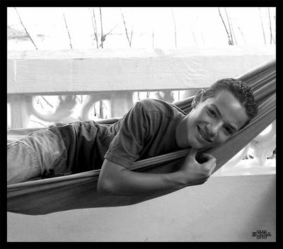
Hi Mark... nice hearing from you. Thanks for the comment. The skin tones were really hard to make look good. In the original color photo his tone is really tan. I need to practice more with B&W. I appreciate all the help you can give. Thanks and take care.
Gina, Nice composition and I think you've really caught your subject such that his personality shows through. Nicely done. In your reworked image, below, I like the skin tones better, but, and this is just personal style, I like the fact that your orginal image, above, creates a starker contrast between the subject and the background. If the hammock and the boy weren't the only dark areas, then you might want the horizontal line from the railing to keep the viewers eye focused on the subject. But, I don't think that is necessary here, and therefore in the image below, the increased saturation and clarity of the background are more distracting than beneficial. By the way, great title! :) Hope all is well. Mark
P.J. Thanks for the help. I am using PS 7. I did use the desaturation, and some other little adjustments to contrast and brightness. I practiced with the channel mixer. Your explaination helped alot. I will practice more to train my eye on what looks good. I also used the preset styles. What do you think about them? Does this photo look any better with the channel mixer?