|
|
Critique By:
Petra Engle (K:1282)
2/5/2003 12:14:34 PM
Another great one, Wallace! Her look is priceless. And I like the way you left negative space in the direction she's looking.
|
| Photo By: Wallace Rollins
(K:149)
|
|
|
Critique By:
Petra Engle (K:1282)
2/3/2003 3:20:54 PM
Hi Jim,
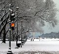
Hey, another snowy bench picture  . I agree with Andy, that the whitewash by the snow really works and with Harvey, that the 2 people really adds perspective and dimensions. Ok, that was an easy one . . I agree with Andy, that the whitewash by the snow really works and with Harvey, that the 2 people really adds perspective and dimensions. Ok, that was an easy one .
Lisa, I have refrained from posting something in the past, because just minutes before, someone else posted something similar.
What appeals to me, though, is how different people view and frame similar subjects.
While Jim's picture also contains a bench and is snowy, it is completely different from mine (though he does also have the bench on the right ).
|
| Photo By: Jim Fuglestad
(K:1564)
|
|
|
Critique By:
Petra Engle (K:1282)
2/3/2003 1:59:25 PM
Reminds of the portraits of the beginning of the 20th century, the graininess, black and white and strong contrasting really adds to that!
|
| Photo By: Wallace Rollins
(K:149)
|
|
|
Critique By:
Petra Engle (K:1282)
2/3/2003 1:52:57 PM
Aw, adorable picture, Brian! And the black and white works really well. Welcome here!
|
| Photo By: brian ypperciel
(K:-50)
|
|
|
Critique By:
Petra Engle (K:1282)
2/3/2003 1:51:27 PM
You can just feel the dampness in this picture! I love the inclusion of the ferns on the ground, adding a splash of color. I like it very much, Kim!
|
| Photo By: Kim Culbert
(K:37070)
|
|
|
Critique By:
Petra Engle (K:1282)
2/3/2003 1:46:20 PM
I agree with Matt, though I find the white more original. It seems black is the color of choice as a background for light colored flowers. Probably for a reason, but this flower is dark enough to also work against white.
|
| Photo By: Dan Sanford
(K:300)
|
|
|
Critique By:
Petra Engle (K:1282)
2/3/2003 1:39:25 PM
Hi AJ,
Oh, this brings back memories! I loved the Souk in Tunis! This image portrays so well the complete busy and random showing of the wares there! Great picture!
|
| Photo By: AJ Haselwood
(K:2148)
|
|
|
Critique By:
Petra Engle (K:1282)
2/1/2003 8:14:00 PM
I'll try some stuff, I don't know Photo Impact that well, though  . I do know the Canon S300 I had at the time had a tendency to "overcolor". I don't see the splashes myself, but I'll see if I can get them paler, LOL. . I do know the Canon S300 I had at the time had a tendency to "overcolor". I don't see the splashes myself, but I'll see if I can get them paler, LOL.
|
| Photo By: Petra Engle
(K:1282)
|
|
|
Critique By:
Petra Engle (K:1282)
2/1/2003 7:44:55 PM
Hi Andy,
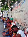
I'm looking at the picture and the skintones look exactly the way they did then ?? It was a *very* hot day and people were flushed and most of the workers were hispanic. Not trying to defend the colors, but I'm not sure what to change and how? Thanks for your comment, as always.
|
| Photo By: Petra Engle
(K:1282)
|
|
|
Critique By:
Petra Engle (K:1282)
2/1/2003 3:59:39 PM
Hi Katja,
You do have a gorgeous cat. I know, as your mother . Since this site is to teach you how to take pictures, I'm sure people will be able to give you some good ideas.
As your mother, I will just say, your cat is very pretty  . .
|
| Photo By: Katja Engle
(K:8)
|
|
|
Critique By:
Petra Engle (K:1282)
1/29/2003 11:46:49 AM
Very pretty colors, Melissa. The horizon is not completely straight, though. Nice beach! And I like the inclusion of the rock. Welcome here!
|
| Photo By: Melissa Dehncke McGill
(K:118)
|
|
|
Critique By:
Petra Engle (K:1282)
1/29/2003 11:40:07 AM
Not Anindya, but I think you can crop till just below the top of the bushes, so you have a fringe frame. The dark part on the bottom make the black too heavy and detracts from the sunset colors.
|
| Photo By: Kevin Garrett
(K:8)
|
|
|
Critique By:
Petra Engle (K:1282)
1/29/2003 11:38:17 AM
I like what Kim wrote as I'm definitely learning myself and, being a wine lover, this image is very appealing to me.
I agree about the red border, I'm not a border fan in general anyway.
I really like the precise lineup of the glasses it gives it an almost indefinite mirror effect. The color of the cloth is beautifully complimenting the wine as well.
As for the light, I agree with Kim, and wanted to throw out a suggestion a photographer friend of mine had, if you don't have star filter: use a panty hose over the lens, apparently, that has a similar effect.
Nice picture!
|
Photo By: Raymond Andringa
(K:963)

|
|
|
Critique By:
Petra Engle (K:1282)
1/27/2003 12:33:14 PM
Aw! I love the way he holds his paws and the look on his face. Great DOF too.
|
| Photo By: Christoph Schleiss
(K:87)
|
|
|
Critique By:
Petra Engle (K:1282)
1/27/2003 5:49:09 AM
Thanks, Heather!
|
| Photo By: Petra Engle
(K:1282)
|
|
|
Critique By:
Petra Engle (K:1282)
1/26/2003 1:59:56 PM
Hi David,
I have PhotoImpact and I'm not sure if that will allow such a detailed action. I'll look in the Help section. The building in the background is the Washington Monument, as this is the Mall in DC.
|
| Photo By: Petra Engle
(K:1282)
|
|
|
Critique By:
Petra Engle (K:1282)
1/26/2003 1:57:56 PM
Thanks, Lisa. I agree with you about the cloning in of snow. I kind of like the look of many footsteps right at the crossing.
Someone explained to me once though, that from a perspective point of view, it's better to have the line come from the right, because of the way the eye travels. Sometimes that choice isn't there though, in this case, had I thought about it, it would have changed the image, as the Capitol building would be in the distance, not the Washington Monument (which is almost out of sight, which is ok, as it wasn't the subject of the picture).
I don't know how true that is about perspectives, it made sense to me though.
|
| Photo By: Petra Engle
(K:1282)
|
|
|
Critique By:
Petra Engle (K:1282)
1/26/2003 1:34:35 PM
Thanks, David, I see what you mean. Too bad there are letters involved, otherwise I could just flip the image.
|
| Photo By: Petra Engle
(K:1282)
|
|
|
Critique By:
Petra Engle (K:1282)
1/26/2003 12:25:28 PM
Oh, this looks eerie! You did a good job creating an atmosphere. I also like the perspective.
|
| Photo By: Kilroy Was Here
(K:177)
|
|
|
Critique By:
Petra Engle (K:1282)
1/26/2003 11:48:58 AM
I like the way the nun provides a splash of color in the image. I would have liked to see her from the front, but that was probably difficult to do. Unique image!
|
| Photo By: Nicholas Tobin
(K:0)
|
|
|
Critique By:
Petra Engle (K:1282)
1/26/2003 11:43:44 AM
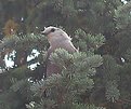
This looks like you probably had to zoom in quite a bit. Photographing birds is very difficult! You could make it better by bumping up the colors and contrast. Welcome here!
|
| Photo By: Kathryn Roberts
(K:187)
|
|
|
Critique By:
Petra Engle (K:1282)
1/26/2003 6:31:30 AM
Hi Harvey,
No, not at all, thanks for the comments. I took this picture 2 years ago with an APS camera and hadn't learned anything about the "rules" of photography yet.
I posted it here, because I'm planning on going downtown DC again this spring and these kinds of tips like yours will help me take better pictures this time. Thanks!
|
| Photo By: Petra Engle
(K:1282)
|
|
|
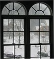
Critique By:
Petra Engle (K:1282)
1/25/2003 7:59:45 PM
Thanks, Andy. And you're right on! I'm impressed by you guys, LOL! I would never know these things! The window is our foyer window, so I have to photograph from across the hallway. I'll try a different angle next time, they're nice window for framing. Thanks for your comments!
|
| Photo By: Petra Engle
(K:1282)
|
|
|
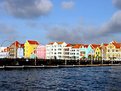
Critique By:
Petra Engle (K:1282)
1/25/2003 5:54:16 PM
Thanks, Marc. I really appreciate your comments, as I admire your photography. I have a more advanced camera now and have been learning a lot from these critique sites. I hope to go back to Curacao some day and take a better picture. It's a wonderful island!
|
| Photo By: Petra Engle
(K:1282)
|
|
|
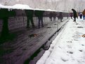
Critique By:
Petra Engle (K:1282)
1/25/2003 5:52:17 PM
Hi Marc,
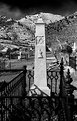
There really is no way to show this is a memorial better than this. The memorial is a wall with names of missing soldiers. It's very sober, there is nothing more to it. I like the suggestion of black and white, I'll try that.
It's an unusual memorial, for sure, but very sobering when you walk along the long wall of names of people who meant something to somebody and no one knows what became of them .
|
| Photo By: Petra Engle
(K:1282)
|
|
|
Critique By:
Petra Engle (K:1282)
1/25/2003 2:46:31 PM
Hi Brian,
Welcome here! This obviously would be a more pleasing image if it didn't have the huge sunspot on the left. If you crop that area out, the image is better. I do like the perspective, wondering where the path goes.
|
| Photo By: Brian Goff
(K:139)
|
|
|
Critique By:
Petra Engle (K:1282)
1/25/2003 2:20:42 PM
Definitely! You deserve a prize for the most detailed looker, LOL!
|
| Photo By: Petra Engle
(K:1282)
|
|
|
Critique By:
Petra Engle (K:1282)
1/25/2003 2:13:26 PM
Hi Harvey,
Wow, you know your cars, even when they're covered in snow . Yes, that's our neighbors, couldn't very well go out there and have them move it for the shot, LOL!
|
| Photo By: Petra Engle
(K:1282)
|
|
|
Critique By:
Petra Engle (K:1282)
1/25/2003 1:52:35 PM
Hi Roger,
Neat concept and very abstract. Too bad there is such a large bright reflection. I'm also not too fond of the frame, personally. I think if you were going to frame it, plain white or a darker blue would be nicer.
|
| Photo By: Roger Gelfand
(K:37)
|
|
|
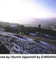
Critique By:
Petra Engle (K:1282)
1/25/2003 1:42:41 PM
Hi Jean,
Welcome here! If you have photo editing software, I would crop the top off this picture to just above the top of the church. The very bright white sky really detracts from the overall image, if that were gone, the focus would be on the horses, the church and the snow, making the image more interesting.
|
| Photo By: Jean Cain Cain
(K:0)
|
|