|
|
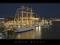
Critique By:
Freddie Sandström (K:1444)
9/11/2003 10:57:43 AM
Yes, really beautiful colours!! But I want to see more of the picture.
/Freddie
|
| Photo By: Trussov Dima
(K:176)
|
|
|
Critique By:
Freddie Sandström (K:1444)
9/11/2003 9:58:47 AM
The DOF is perfect! The model is very impressive.
/Freddie
|
| Photo By: zosia zija
(K:11106)
|
|
|
Critique By:
Freddie Sandström (K:1444)
9/3/2003 9:24:24 AM
I'm in exstasy!! I think it's going to be hard to break this impressive cloudformation. For me it's the best I've ever seen!
/Freddie
|
| Photo By: Roger Cotgreave
(K:15892)
|
|
|
Critique By:
Freddie Sandström (K:1444)
9/2/2003 2:42:40 PM
Lot's of attitude here!
/Freddie
|
| Photo By: zosia zija
(K:11106)
|
|
|
Critique By:
Freddie Sandström (K:1444)
9/1/2003 2:02:15 PM
Very cool position of the boy! Lot's of personality here!
/Freddie
|
| Photo By: MUAMMER YANMAZ
(K:4)
|
|
|
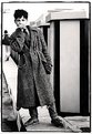
Critique By:
Freddie Sandström (K:1444)
9/1/2003 1:59:36 PM
Hey! It's the honourable Anders Petersen! One of my greatest inspirations!!! Wow!! I have one of his books in my lap right now. How did you meet him? Anyway, the picture is great. The light excellent.
This was a surprise indeed!
/Freddie
|
| Photo By: MUAMMER YANMAZ
(K:4)
|
|
|
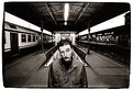
Critique By:
Freddie Sandström (K:1444)
9/1/2003 1:55:20 PM
and where's the blood!? Seems like I've seen this image in horror movies but there's always been blood in the water after a while.
Nice capture but I would like to see the whole opening. Right now it's cut right at the top.
Best regards
Freddie
|
| Photo By: ryan winton
(K:3027)
|
|
|
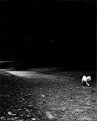
Critique By:
Freddie Sandström (K:1444)
9/1/2003 1:50:51 PM
The title sets the mood! Great choice! I feel for this dog somehow. He seems so lonely and the path seems so deserted.
Great!
/Freddie
|
| Photo By: volker goerschen
(K:1634)
|
|
|
Critique By:
Freddie Sandström (K:1444)
9/1/2003 1:47:51 PM
Very yummy blue colour Volker! This is just outstanding work. I'm really impressed! The leaning position works really well also. Leaning motives is usually delicate buisness but you seem to master the skill.
/Freddie
Ps Thanks for showing interest!
|
| Photo By: volker goerschen
(K:1634)
|
|
|
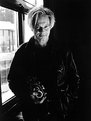
Critique By:
Freddie Sandström (K:1444)
9/1/2003 12:43:35 PM
Hey grandpa watcha doin' there!! Impressive colours. Excellent moment. I'm not sure if I like the window on the left. Nevermind it's a very nice picture anyway!
/Freddie
|
| Photo By: Carlo Macinai
(K:181)
|
|
|
Critique By:
Freddie Sandström (K:1444)
9/1/2003 12:39:09 PM
I think I prefer the black frame! You have really succeded on this one! The night looks so comfortable somehow. The light on the boat is excellent!
/Freddie
|
| Photo By: altur .
(K:6087)
|
|
|
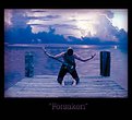
Critique By:
Freddie Sandström (K:1444)
9/1/2003 12:11:04 PM
I want to see the emotional state of conceit, arrogance. I answered a question a while ago on how to portray that and I found it tricky.
|
| Photo By: Lissa Hatcher
(K:3006)
|
|
|
Critique By:
Freddie Sandström (K:1444)
9/1/2003 12:08:09 PM
Is this the same ms. Hatcher?? My god! This is stunning work! Extremely powerful! I like the background you chose. Hey you must be a real expert in photoshop! Nice and crisp focus on the landing-stage and the guy. The background hasn't the same high pixel quality but it's not that important when it's just a background. I also like the bluetone.
/Freddie
|
| Photo By: Lissa Hatcher
(K:3006)
|
|
|
Critique By:
Freddie Sandström (K:1444)
9/1/2003 4:53:28 AM
You've used the wideangel well here! Excellent composition and the expression is really funny. Lightning is superb! The fluorescent lamp above him looks almost like a exclamation mark. Awesome!!
/Freddie
|
| Photo By: Alessandro Barteletti
(K:3)
|
|
|
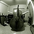
Critique By:
Freddie Sandström (K:1444)
8/31/2003 1:22:52 PM
Hehe! I like it! The wall to the left looks really funny thanks to the fisheye.
/Freddie
|
| Photo By: Li Fan
(K:164)
|
|
|
Critique By:
Freddie Sandström (K:1444)
8/31/2003 10:25:20 AM
Timeless and beautiful! I'm really looking forward to the black/white version also!
/Freddie
|
| Photo By: Lissa Hatcher
(K:3006)
|
|
|
Critique By:
Freddie Sandström (K:1444)
8/31/2003 10:21:55 AM
This is one of the better ones I've seen from you. Awesome atmosphere! The warm and darker wooden background in contrast with the almost white and cold woman is very effectful. Beautiful red colour on the chairs and a perfect position of the woman.
Very good!
/Freddie
|
| Photo By: Lissa Hatcher
(K:3006)
|
|
|
Critique By:
Freddie Sandström (K:1444)
8/29/2003 2:41:45 PM
The memory is strong and never expires. It fades but will always be there. It's beautiful and sad at the same time, bittersweet.
Beautiful Lissa!
/Freddie
|
| Photo By: Lissa Hatcher
(K:3006)
|
|
|
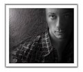
Critique By:
Freddie Sandström (K:1444)
8/29/2003 3:45:11 AM
Emotional! The right eye has been given just enought light. I like it.
/Freddie
|
| Photo By: ADAM ORZECHOWSKI
(K:7957)
|
|
|
Critique By:
Freddie Sandström (K:1444)
8/29/2003 3:07:13 AM
This is brilliant Bernt. Very classy!
/Freddie
|
| Photo By: Bernt Carlzon
(K:554)
|
|
|
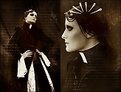
Critique By:
Freddie Sandström (K:1444)
8/28/2003 3:14:17 PM
Extremely well executed portrait! Powerful and dark - yummy! Looks like a character from the (very) old movie Metropolis.
/Freddie
|
| Photo By: Eolo Perfido
(K:91)
|
|
|
Critique By:
Freddie Sandström (K:1444)
8/28/2003 3:07:09 PM
I really like the relaxed hairdo! A warm and nice image. Very good!
/Freddie
|
| Photo By: Pawel Staszak
(K:59)
|
|
|
Critique By:
Freddie Sandström (K:1444)
8/27/2003 3:59:51 PM
You seem to have many friends who trust you (thinking of the other guy with love on his mind). It's truly wonderful to see! Makes me really warm inside.
Well this one doesn't make me warm inside but it's still full of warmth and love. Excellent!
/Freddie
|
| Photo By: Lissa Hatcher
(K:3006)
|
|
|
Critique By:
Freddie Sandström (K:1444)
8/27/2003 10:53:02 AM
Closer is a good title. Short and not too cheesy.
Very nice picture by the way  Clear and well balanced. Easy on the eye. I love what you've done to the frame, very classy! The vertical line-effect works. Clear and well balanced. Easy on the eye. I love what you've done to the frame, very classy! The vertical line-effect works.
/Freddie
|
| Photo By: Lissa Hatcher
(K:3006)
|
|
|
Critique By:
Freddie Sandström (K:1444)
8/25/2003 1:07:32 PM
Delicate!
/Freddie
|
| Photo By: Lissa Hatcher
(K:3006)
|
|
|
Critique By:
Freddie Sandström (K:1444)
8/24/2003 12:35:22 AM
It sure is design; The soft and round shapes of the car, the hard and geometrical shapes of the building. The smell of 50's the car adds to the image could also apply to the building because of the heavy archicetural development in the 50's. Especially in New York where the Guggenheim museum was brought up along with the Seagram building for example.
Very stylish and well executed image!
/Freddie
|
| Photo By: Jean-François Dupuis
(K:70)
|
|
|
Critique By:
Freddie Sandström (K:1444)
8/23/2003 7:43:48 AM
Oh man!! This picture went down right to my stomach and stayed there. Now it's gurgling around making me twitch like an epileptic. It's that good!
I love the underwater feeling(is it underwater?) and the light effect that's created here. It could be taken from the bottom of a lake where a drowned man is lying. It could also be a piece of a vivid dream. Not many pictures brings up this many interpretations in me.
Good work!
/Freddie
|
| Photo By: Tom Holmlund
(K:629)
|
|
|
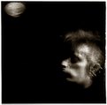
Critique By:
Freddie Sandström (K:1444)
8/23/2003 7:35:58 AM
The watermaster strikes again. McNitt is in the blue spotlight and he's shown once more what a man with a creative mind can do. Really impressive work!! F*%&#ng unbelieveable almost. The face is very powerful and the watercolour/ripples is excellent.
Mighty good sir!
/Freddie
|
| Photo By: Jim McNitt
(K:11246)
|
|
|
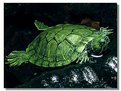
Critique By:
Freddie Sandström (K:1444)
8/22/2003 6:05:36 AM
It's a cool green colour on the turtle. But the picture is abit grainy. But I know of a way to fix this i ps. It's called neat image. You can find out more about it here: http://www.neatimage.com/
/Freddie
|
| Photo By: Akin Ozyazici
(K:4323)
|
|
|
Critique By:
Freddie Sandström (K:1444)
8/22/2003 6:00:48 AM
It's abit unsharp. You were unfortunate to get focus on the least important thing: the man in the background on the left. Too bad because the moment you caught is really interesting. You could also crop it a little diffrent. Take away some of the space on the left because it takes away some of the attention, much because of the focus on the man on the left. Don't know really how to fix this because the focus from the start was abit off. But I have to congratulate you on your good eye. Those kids are really wonderful and interesting.
/Freddie
|
| Photo By: Debprasad Datta
(K:1545)
|
|