|
|
Critique By:
Alex Billington (K:1260)
2/11/2005 7:21:04 AM
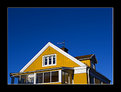
The greens and the colors coming from the windows of the building are really well done. That is a very good capture. I would only suggest improving the composition by eliminating the ground clutter. There is too much non-needed activity on the ground that is throwing off the serenity of the green windows in the building. Consider moving lower to the ground and closer to the building in the future in order to maintain the view and angle of the windows (and color) yet getting a view of the building that shows perspective (bigger when closer, smaller when farther) and more of darker surroundings, or only the sky, and less of things at the base that could cause clutter. That's my improvement suggestions. As I said otherwise, interesting photo so far!
|
Photo By: Nedim Muhic
(K:14362)

|
|
|
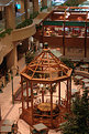
Critique By:
Alex Billington (K:1260)
2/11/2005 7:17:33 AM
I'm agreeing with George on the shocking absence of people! It's like everyone just disappeared... Very interesting!
The DoF and sharpness on this is immense. You've got the entire image in focus. There's a very warm and welcoming atmosphere/feeling to this photo and to the location. You captured that essence very well. It just makes me want to be there in the mall, just even to be there... A perfect marketing/attraction photo if that is what it's for! =P
|
| Photo By: kokupsy_un morita
(K:2651)
|
|
|
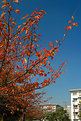
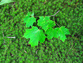
Critique By:
Alex Billington (K:1260)
2/11/2005 7:15:00 AM
The colors are very strong, very vivid. Obviously your sharpness and DoF where perfectly set in order to capture everything well, the colors of the leaves and sky and all... You've obviously got the technical ability and knowledge, I just think this lacks in composition.
The buildings and clutter in the bottom really takes away from the beautiful sky and leaves that is really the sole focus of what is in this photo. Even if you were trying to reference some other building or object in order to give more dimensionality or contrast to the tree and leaves, there could be a better outlook for deciding what to include in the background. Even if you pulled the buildings and extra trees out of focus in the background, it would've helped maintain the level of detail on the leaves/tree only. Pulling the camera back and getting a more deeper angle would also help to remove that clutter from the bottom and leave just sky and more of the trees and colorful leaves...
That's just my tip for improvement... =) Otherwise good job, keep up the good work!
|
| Photo By: kokupsy_un morita
(K:2651)
|
|
|
Critique By:
Alex Billington (K:1260)
2/11/2005 7:10:06 AM
Wow... not bad... do you work for them, or how did you get this? Looks almost like a studio arrangement... and that is VERY hard to do for a car!
Does seem a little dark, though... I would've suggest exposuring it more or adding a little more light.
It's a very interesting angle of light, creates a very refined mood to the car. The perspective of it as well, the wide angle (which I love more than anything) is excellent. This really adds some excellent dimensioning to the car. All-in-all this is a very well arranged shot.
As I said, the only bit of improvement is in increasing the bright level on the areas that are already lit so that you can bring out the tones of the car a lot better, create even more contrast, and just show in more vivid detail the actual curves of the car that are being lost too much in the dark level... Keep up the great work!
|
| Photo By: vince wong
(K:72)
|
|
|
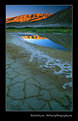
Critique By:
Alex Billington (K:1260)
2/11/2005 7:05:44 AM
Oh... my... goodness...!!!! This picture is AMAZING!! This is one of the most beautiful wide angle landscape shots I have EVER seen in my entire life!! There is honestly not much at all I can suggest cause this is almost completely perfect!!!! I do wish the bottom was cropped higher, right at the bottom of where the green bush thing begins... and then you could get more of that beautiful sky...!! Amazing I say... amazing!!
|
| Photo By: Patrick Di Fruscia
(K:486)
|
|
|
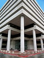
Critique By:
Alex Billington (K:1260)
2/11/2005 7:03:22 AM
WHOA awesome... Sweet wide angle architecture capture!! You should (possibly in the future when the guard is asleep) try and do a double shot of this and stitch them together so you get this picture as the bottom and then a looking up vertical picture all the way up the top and into the sky. This is excellent so far, everything was captured very well. Keep up the great work!
|
| Photo By: Paul Lara
(K:88111)
|
|
|
Critique By:
Alex Billington (K:1260)
2/11/2005 1:07:43 AM
This is really cool... You almost get a horizontal wide-angle feel to it even though I know the lens and it isn't wide angle at all... Very interesting and very well done! The light isn't that bad, but as you said, you got a flare and it seemed problematic. And as someone else mentioned, the old time feeling to this is very unique. Very good job on this photo... actually, excellent job on this photo!
And nice lens choice 
|
| Photo By: James McGinnis
(K:6045)
|
|
|
Critique By:
Alex Billington (K:1260)
2/11/2005 1:03:19 AM
Wow!! Beautiful shot!! This is a new fave... This is very very well done! The black and white is excellent and the grain adds to it very well... Great job!!
And nice lens too
|
| Photo By: Joern Stubbe
(K:65)
|
|
|
Critique By:
Alex Billington (K:1260)
2/11/2005 12:50:55 AM
Hey I just wanted to comment to you, and also make this a general comment to all who view this, that there is a print version available that can be purchased in high resolution glossy/matte format of the image (without the border) and wanted to forward that link...
You can find the print version available HERE:
http://www.deviantart.com/print/101669/
Thanks for all the comments so far!! =)
|
| Photo By: Alex Billington
(K:1260)
|
|
|
Critique By:
Alex Billington (K:1260)
2/10/2005 2:15:05 AM
Wow! Excellent greens! Great photo!
|
| Photo By: Caglar Tukel
(K:39)
|
|
|
Critique By:
Alex Billington (K:1260)
2/10/2005 2:14:04 AM
HO this needs some excellent recognition!! This isn't just a same old flower shot, this is done very well... The background is much more unique, something that flower photographers typical fail to achieve... but this has something very unique. The tree though, just throws it off a bit, but not much. Very good shot...
And get a wide angle lens cause wide angles and distortion are beautiful too!
|
| Photo By: Sean Nel
(K:557)
|
|
|
Critique By:
Alex Billington (K:1260)
2/10/2005 2:12:05 AM
I think the background could be improved a little more. The flowers themselves are very well done, perfectly sharp and colorful, I just think there needs to be more to the composition. The background could be more smoother or entirely repetitive instead of having odd crossing blurred shapes. I think if you consider somehow finding a way to get closer to the flowers from a different angle and pushing the background farther it would achieve better uniformity on the entire image. That's just two cents for improvement. The flowers themselves are excellent!
|
| Photo By: John Nobody
(K:4914)
|
|
|
Critique By:
Alex Billington (K:1260)
2/10/2005 2:08:44 AM
Beautiful! Everything is sharp.. Very good background choice, a bit unconventional for flower shots, yet still excellent. Great job all around with this shot. Colors are vibrant!
|
| Photo By: Jamie Brown
(K:25)
|
|
|
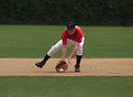
Critique By:
Alex Billington (K:1260)
2/10/2005 2:06:59 AM
This is a very well done and generally quite sharp sports photo. I think it could've been better if we saw more of the player's face in that same pose / action... Good job otherwise!
|
| Photo By: Jesse Knutson
(K:187)
|
|
|
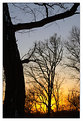
Critique By:
Alex Billington (K:1260)
2/9/2005 4:08:35 PM
It wasn't actually that cold... thankfully! The sun was out and it was a bright warm(er) day than normal, so we went out... Though I do see that coldness that looks like its coming from it. Heh... Thanks for the comments!
|
| Photo By: Alex Billington
(K:1260)
|
|
|
Critique By:
Alex Billington (K:1260)
2/9/2005 4:07:15 PM
Hmmmm wow tough comparison... I'm almost liking the official submission more than the one you attached. Whatever you did to fix the colors did a very good job. The ones in the original are just... well... actually the colors in the background are a little bit better (in the new one) now that I look at it again! There is a lot of extra orangey color in the official submission, but in the original it really takes even more of that tone out and leaves more natural colors... I honestly can't say (haha)...! It's a tough choice, a tough comparison. Still a visually pleasing picture. Good job!
|
| Photo By: Ahmad Ehab
(K:275)
|
|
|
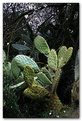
Critique By:
Alex Billington (K:1260)
2/9/2005 4:04:04 PM
Well there is a lot of black, I won't deny that, and as I said, the cactus does stand out quite a bit from its surroundings. I was just thinking more of the upper left and top area where the sky is visible through the foliage. That little bit of lightness brightens up the remainder background foliage in that area and brightens that area up just a little too much. I know it's nit-picky, but its just my two cents for improvement... 
|
| Photo By: dror dromi
(K:459)
|
|
|
Critique By:
Alex Billington (K:1260)
2/9/2005 4:00:02 PM
Thanks for your comment.
|
| Photo By: Alex Billington
(K:1260)
|
|
|
Critique By:
Alex Billington (K:1260)
2/9/2005 6:17:54 AM
And yet again this is why I love wide-angle... Excellent shot... I don't know if I can say anything for improvement on this, because honestly this is perfect in everyway. A completely beautiful professional shot. Amazing...
|
| Photo By: Patrick Di Fruscia
(K:486)
|
|
|
Critique By:
Alex Billington (K:1260)
2/9/2005 6:11:47 AM
Similar in comment to your "Symmetry" photo, this is great as well... That blue sky is just beautiful!! It couldn't not be more stunning...!! Excellent colors and sky... This deserves a lot of recognition!
|
| Photo By: Laszlo Illes
(K:2019)
|
|
|
Critique By:
Alex Billington (K:1260)
2/9/2005 6:08:52 AM
Whoa... excellent, crisp, vibrantly colorful... amazing! Great concept! I'd criticize to see a bit more of the roof/building and that shadow from the tree is a bit distracting (but I know you probably couldn't do anything about it).... Excellent photo!
|
| Photo By: Laszlo Illes
(K:2019)
|
|
|
Critique By:
Alex Billington (K:1260)
2/9/2005 6:01:37 AM
I agree with David regarding cropping the bottom. The cactus seems to be very well lit, did you use a flash? It stands out among its other backgrounds a bit more, and is quite sharp. The background good be a little better smoothed out so it isn't so distracting, but otherwise nice photo!
|
| Photo By: dror dromi
(K:459)
|
|
|
Critique By:
Alex Billington (K:1260)
2/9/2005 5:58:05 AM
Wish we could see more of that pipe? That would've been a good object to include more off, add some more to look at and some more compositional depth... Still a great shot, very smooth, very perfect... Excellent details for a shot referencing a "good morning"... Good job!
|
| Photo By: Yutaka Itinose
(K:22586)
|
|
|
Critique By:
Alex Billington (K:1260)
2/9/2005 5:56:52 AM
Hehe... Very well done shot... Interior photography is quite tough... This very well shows everything in perfect detail. The door/window is a little overexposed and very bright, but there wasn't much you could do to compensate that yet keep the brightness and smoothness that you have maintained in all the inside details... There is just quite a bit happening with light from all over and reflections in every corner, but it's generally a solidly smooth shot...
|
| Photo By: ppdix
(K:17069)
|
|
|
Critique By:
Alex Billington (K:1260)
2/9/2005 5:43:20 AM
Hey... I'm kind of a bit thrown off... there's a shadow that's a straight on much larger shadow surrounding her, and yet it looks really fuzzy or almost not there... I'm thrown off cause I don't know if you tried to take it out or it that is naturally how it is... but that's my only bit of criticism... I hope it's ok that I provide criticism, it's only in hope for improvement. Otherwise besides that shadow, this is an absolutely amazing shot. The colors are excellent, and everything is in absolutely sharp detail. As someone else said, the contrast between her and her fashon/clothes/(and shoes) and the orange background is brilliant!! BTW the background is also red on my computer... Don't know if that is implied or not, but still... Beautiful shot! Keep up the great work!
|
| Photo By: tybo n
(K:962)
|
|
|
Critique By:
Alex Billington (K:1260)
2/9/2005 5:34:50 AM
This is really cool and well done. Composition is perfect... Its a really cool monument, deserves a well done photograph, and I think you've done just that. This could be hard to appropriately capture, but you've done a great job of getting everything in the frame. As Rebecca said, the exposure IS perfect... Everything is this is quite beautiful! Excellent job and a great normal change from the typical very dramatic or shorter DoF shots... This one deserves some more recognition!
|
| Photo By: Richard Dakin
(K:12915)
|
|
|
Critique By:
Alex Billington (K:1260)
2/9/2005 5:32:10 AM
I love almost-distorted wide angle shots... Beauty of a wide-angle on this... That cloud capture is perfect. I'm not sure what type of composition you were going for with that object, but the angle is good and the blue sky is perfectly exposed. Keep up the good work!
|
| Photo By: Joseph Tang
(K:36)
|
|
|
Critique By:
Alex Billington (K:1260)
2/9/2005 5:30:44 AM
I'm not sure why no one has commented on these yet? Although most people have seen lots of flower pictures, this stands out among a large many I've seen... It is very soft and smooth, and the DoF is almost quite perfect regarding keeping the flowers and the green stems in focus. I would only suggest for improvement to try and keep the uglier jointed stems (directly below the flowers) either covered by the flowers (higher angle) or out of focus with less DoF or wider aperture. Other than that, the image seems a bit flat, but nothing that some level correction couldn't fix. It generally flows quite well, and I said is very soft and smooth, very serene. Good job so far, keep up the good work!!
|
| Photo By: Marian Veteanu
(K:39)
|
|
|
Critique By:
Alex Billington (K:1260)
2/9/2005 5:27:55 AM
Heh good story with the image... Good shot, everything fills it all just as it is, you don't need more or less to understand. The focus is perfect, too... I have not much more to say besides excellent shot! Keep up the good work!
|
| Photo By: Vance Lester
(K:339)
|
|
|
Critique By:
Alex Billington (K:1260)
2/9/2005 5:22:05 AM
Ahhhh holy crap you're throwing me off! =P It looks absolutely stunning! Is that actually entirely an original photograph? Or is one part actually painted or something... Cause it looks awesome! Excellent work! I'd say even if it was a natural photograph (and none of it was painted) it'd still be brilliant! I love trains, need to work on finding some to photograph. Great job!
|
| Photo By: Mitchell Miller
(K:3009)
|
|