|
|
Critique By:
Cary Shaffer (K:393)
5/8/2005 5:04:02 PM
cool. love the texture and composition. this is a wall hanger
|
| Photo By: ama tor
(K:1432)
|
|
|
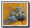
Critique By:
Cary Shaffer (K:393)
4/17/2005 1:56:31 PM
sweet. love the pose and composition.
|
| Photo By: Joern Stubbe
(K:65)
|
|
|
Critique By:
Cary Shaffer (K:393)
8/7/2004 1:31:34 PM
great title. i can see Lance! excellent image. that's the most creative title ever.
|
| Photo By: ama tor
(K:1432)
|
|
|
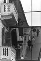
Critique By:
Cary Shaffer (K:393)
8/7/2004 1:19:42 PM
nice frame within a frame. good exposure between the wall and the scene through the window. the scene within the window looks about a 1/2 stop hot. a little manipulating could fix that. did you use fill flash?
i would like to see a bit more of the asement surrounding the window. i'd like to see the sill and the top of the arch. it's just a little tight imho.
|
| Photo By: Edin Dzeko
(K:543)
|
|
|
Critique By:
Cary Shaffer (K:393)
5/22/2004 11:20:58 AM
good exposure. make sure your buildings are vertical. this image has a nasty tilt.
|
| Photo By: behrooz noorizadeh
(K:0)
|
|
|
Critique By:
Cary Shaffer (K:393)
5/22/2004 11:18:12 AM
nice. here in pittsburgh it would've been 3 old people on the stairs. great composition.
|
| Photo By: David McClenaghan
(K:9481)
|
|
|
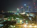
Critique By:
Cary Shaffer (K:393)
5/22/2004 10:58:29 AM
pittsburgh, pa. shot from the northshore below the clemente bridge, outside of pnc park. near the river rescue facility. thanks for checking it out.
|
| Photo By: Cary Shaffer
(K:393)
|
|
|
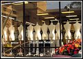
Critique By:
Cary Shaffer (K:393)
5/17/2004 4:50:59 AM
what a bunch of naked dummies. great subject. be careful the imge doesn't become too busy. there is alot to take in here. i think a tighter crop with emphasis on the dummies would turn this shot into something much better.
|
| Photo By: Andy Pollard
(K:1359)
|
|
|
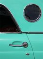
Critique By:
Cary Shaffer (K:393)
5/17/2004 4:40:57 AM
great balance and interest in this shot. this is something t-bird people would buy. nice.
|
| Photo By: rob bishop
(K:561)
|
|
|
Critique By:
Cary Shaffer (K:393)
4/22/2004 12:51:52 PM
absolutely georgous, and so is your image.
|
| Photo By: Aleksandra Jaskowiak
(K:5)
|
|
|
Critique By:
Cary Shaffer (K:393)
4/22/2004 12:49:53 PM
wow. very nice. love the centered composition. it's not the same ol' same ol'.
|
| Photo By: Andy Tasher
(K:126)
|
|
|
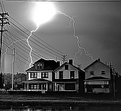
Critique By:
Cary Shaffer (K:393)
4/22/2004 4:48:02 AM
ofcourse it's real! no ps. just lots of lightning that night. it's the only frame out of 24 that i got anything on. long exposure and lots of luck.
|
| Photo By: Cary Shaffer
(K:393)
|
|
|
Critique By:
Cary Shaffer (K:393)
2/26/2004 5:51:50 AM
very good image, it tells a story. great composition and good lighting.
|
| Photo By: Kimberley McG
(K:158)
|
|
|
Critique By:
Cary Shaffer (K:393)
2/5/2004 10:04:46 PM
very surreal. i love the square cropping.
|
| Photo By: Mitchell Miller
(K:3009)
|
|
|
Critique By:
Cary Shaffer (K:393)
2/5/2004 9:59:56 PM
i'd be careful sticking the left flower right on the edge of the frame.
|
| Photo By: jorge sanchez
(K:-21)
|
|
|
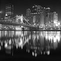
Critique By:
Cary Shaffer (K:393)
10/16/2003 6:39:30 AM
the good old clemente bridge. be careful with the tilted horizon. even with a wide angle lens, you have to watch. be careful with the highlights on the bridge. duquesne light didn't do as good a job as lighting the bridge as they should have. their lights create too many hot spots. i have not shot this bridge since they lit it. so, what i offer is only an opinion. maybe knock down the exposure by one stop? i don't think you'll lose to much detail on fifth avenue place. maybe it only needs a half step decrease. i don't know. check out my shot called "span", it's the 9th st. bridge looking towards the point.
|
| Photo By: Paul Litwak
(K:187)
|
|
|
Critique By:
Cary Shaffer (K:393)
10/16/2003 6:25:50 AM
genarally very nice, but a few little tweaks need to be done in my opinion. i don't like the blown out highlights on her. no detail in the clothing, and a spot of white on her breast. the background is tilted. there's stuff growing out of her left armpit.
however, the photo does have a great attitude, as the title reflects. your model has a good look to her.
|
| Photo By: Nitin Shakdher
(K:33)
|
|
|
Critique By:
Cary Shaffer (K:393)
10/16/2003 6:20:02 AM
very good. night time black and white rules in my book. not too dark at all. any lighter and the mood is lost. i agree with yannic. do a slight crop on the right, exactly where he said.
|
| Photo By: Jon Pankhurst
(K:577)
|
|
|
Critique By:
Cary Shaffer (K:393)
8/10/2003 7:34:58 PM
very cool. that's a keeper for sure. not much to say about it, it's perfect.
|
| Photo By: Tom Crowning
(K:426)
|
|
|
Critique By:
Cary Shaffer (K:393)
8/10/2003 7:29:44 PM
cool title.
|
| Photo By: Steve Silverman
(K:42)
|
|
|
Critique By:
Cary Shaffer (K:393)
8/7/2003 5:58:21 AM
perfect. nothing more to say. two lights? one from above and one from behind?
|
| Photo By: Marco Favali
(K:76)
|
|
|
Critique By:
Cary Shaffer (K:393)
8/7/2003 5:45:20 AM
just a thought.
|
| Photo By: Joa Kim
(K:1743)
|
|
|
Critique By:
Cary Shaffer (K:393)
4/16/2002 10:23:44 AM
cool. i bet you told them not to wave.
|
| Photo By: Yan McLine
(K:0)
|
|
|
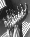
Critique By:
Cary Shaffer (K:393)
4/16/2002 10:18:38 AM
man, i can't believe this photo didn't get any more hits than 50! this is a great shot. well composed and well thought out. are the hands bathed in the same light that is hitting the floor? they look like different sources to me.
|
| Photo By: Darío Puente
(K:83)
|
|
|
Critique By:
Cary Shaffer (K:393)
4/16/2002 8:10:06 AM
well done. i like the old against the new. good eye. seems just a bit crooked though.
|
| Photo By: Ruta Lebionkaite
(K:0)
|
|
|
Critique By:
Cary Shaffer (K:393)
4/14/2002 12:14:37 AM
try cropping it to give more accent to the light area. keep some of the darkness, but i don't think you need so much. i think it will pop out much more.
|
| Photo By: Carl Beihl
(K:357)
|
|
|
Critique By:
Cary Shaffer (K:393)
4/14/2002 12:01:04 AM
good eye. how long did it take to line up your camera? i bet a couple of minutes. great shot.
|
| Photo By: Yan McLine
(K:0)
|
|
|
Critique By:
Cary Shaffer (K:393)
4/4/2002 7:07:53 AM
random pop. pretty cool idea. i like the DOF. i may suggest a tighter crop since the handle thingy on the rear box gets lost. losing some frame off the top may make it a bit more abstract. cool shot.
|
| Photo By: Kari Reed
(K:5)
|
|
|
Critique By:
Cary Shaffer (K:393)
3/19/2002 1:14:00 PM
wow, i missed the color the first time through. excellent idea. i think the lady in blue is just enough to upset the balance and make the photo alot more interesting. alone, it is a great shot, but the color adds so much more. i don't know about the guy in red, since it is so small here. i bet an 11x14 is awesome. good eye and good job.
|
| Photo By: Carl Beihl
(K:357)
|
|
|
Critique By:
Cary Shaffer (K:393)
3/19/2002 12:26:12 PM
i see that she has the c-47's on her shirt. if she's a photo assistant, i want one.
|
| Photo By: Antonio napoli
(K:0)
|
|