|
|
Critique By:
Tim Bailey (K:-467)
3/21/2008 5:20:17 AM
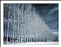
I wonder how this scene would look if you stood very close to the trees, using a fisheye, or a wide-angle lens?
|
Photo By: Peter De Rycke
(K:41212)

|
|
|
Critique By:
Tim Bailey (K:-467)
11/16/2007 9:41:08 AM
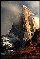
Hmm. I need to make a trip to Alberta someday, hehe.
|
| Photo By: Tim Schumm
(K:29196)
|
|
|
Critique By:
Tim Bailey (K:-467)
11/8/2007 8:19:44 AM
I envy your landscapes. You are truly a masterful photographer, well worthy of being regarded a professional. Of the six pages or so of photos I've looked at, this one is my favorite.
|
| Photo By: Tim Schumm
(K:29196)
|
|
|
Critique By:
Tim Bailey (K:-467)
11/8/2007 7:03:28 AM
I like this. It shows a man's sentimental side beneath a rough exterior. His smile reveals his love for his mother. I don't necessarily think he is prejudiced, though. He is probably just proud of his country.
|
| Photo By: Mervo
(K:8643)
|
|
|
Critique By:
Tim Bailey (K:-467)
6/20/2007 6:49:21 AM
excellent balance between shadows, highlights, and midtones here. the composition and fluorescent light sources are key to this interesting photo.
|
| Photo By: Ian Sweet
(K:474)
|
|
|
Critique By:
Tim Bailey (K:-467)
3/15/2007 5:34:35 AM
wow. the multitude of colors and the dimensions of this picture are very intriguing!
|
| Photo By: Anson Moye
(K:3480)
|
|
|
Critique By:
Tim Bailey (K:-467)
3/15/2007 5:18:02 AM
Again, wonderful!
Your choice of depth of field really transforms this from an ordinary scene into something etherial.
|
| Photo By: Carol Watson
(K:5185)
|
|
|
Critique By:
Tim Bailey (K:-467)
3/15/2007 5:15:29 AM
while I rarely comment on photos, I feel I must comment on this one...
the singularity, sharpness, and shape of this tree are spectacular, especially when contrasted against the blurred background.
well done!
|
| Photo By: Carol Watson
(K:5185)
|
|
|
Critique By:
Tim Bailey (K:-467)
12/13/2006 7:01:19 AM
here is the original, before photoshop....
|
| Photo By: Tim Bailey
(K:-467)
|
|
|
Critique By:
Tim Bailey (K:-467)
6/2/2006 5:51:37 PM
here is the original, before Photoshop
|
| Photo By: Tim Bailey
(K:-467)
|
|
|
Critique By:
Tim Bailey (K:-467)
5/22/2006 11:34:49 PM
haha, I had a feeling this was a Holga shot when I saw the thumbnail. Good choice of camera for this scene.
-t
|
| Photo By: Arvin Alston
(K:1495)
|
|
|
Critique By:
Tim Bailey (K:-467)
5/1/2006 4:02:42 PM
This picture has a great balance between softness and sharpness. The yellow and green hues are striking.
|
| Photo By: Manu
(K:13082)
|
|
|
Critique By:
Tim Bailey (K:-467)
10/19/2004 7:30:14 PM
nicely composed, and very sharp. Perhaps you could try this same scene during a sunset?
|
| Photo By: Pavel Rozhkov rpa
(K:678)
|
|
|
Critique By:
Tim Bailey (K:-467)
10/19/2004 7:27:30 PM
this has some great yellow tones.
|
| Photo By: KEVIN TEMPLE
(K:8657)
|
|
|
Critique By:
Tim Bailey (K:-467)
10/4/2004 5:05:06 AM
incredible. the grey and brown tones are beautiful.
|
| Photo By: KEVIN TEMPLE
(K:8657)
|
|
|
Critique By:
Tim Bailey (K:-467)
10/4/2004 5:02:11 AM
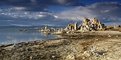
I like this one even better than Mono Lake.
|
| Photo By: bren sheehan
(K:1359)
|
|
|
Critique By:
Tim Bailey (K:-467)
10/4/2004 4:59:17 AM
I like the colors produced by the grad filter.
|
| Photo By: bren sheehan
(K:1359)
|
|
|
Critique By:
Tim Bailey (K:-467)
10/4/2004 4:52:59 AM
good lighting.
|
| Photo By: Jamie Martin
(K:133)
|
|
|
Critique By:
Tim Bailey (K:-467)
10/4/2004 4:46:42 AM
great in every aspect.
|
| Photo By: Markos Berndt
(K:382)
|
|
|
Critique By:
Tim Bailey (K:-467)
9/23/2004 3:17:49 AM
Thank you for your suggestions.
|
| Photo By: Tim Bailey
(K:-467)
|
|
|
Critique By:
Tim Bailey (K:-467)
9/4/2004 5:14:41 PM
here is the original, before Photoshop work...
|
| Photo By: Tim Bailey
(K:-467)
|
|
|
Critique By:
Tim Bailey (K:-467)
8/29/2004 2:02:51 AM
VERY nice. The softness and warmth of the lightning endow this scene with a surreal appearance. good choice of lens too.
|
| Photo By: Gregory McLemore
(K:35129)
|
|
|
Critique By:
Tim Bailey (K:-467)
7/20/2004 4:37:24 PM
I like your use of the vignette.
|
| Photo By: David Rogers
(K:1082)
|
|
|
Critique By:
Tim Bailey (K:-467)
1/25/2004 6:22:13 PM
I like the crisp appearance of leaves' edges. Contrast & saturation are excellent.
|
| Photo By: Pete Nicholls
(K:633)
|
|
|
Critique By:
Tim Bailey (K:-467)
12/16/2003 2:22:41 PM
A unique idea.
|
| Photo By: Lesley Silvia
(K:-66)
|
|
|
Critique By:
Tim Bailey (K:-467)
12/2/2003 11:09:40 AM
good use of shadows. The texture is very clear, as well.
|
| Photo By: Piotr Moszczenski
(K:96)
|
|
|
Critique By:
Tim Bailey (K:-467)
12/1/2003 3:33:47 PM
excellent cityscape. perhaps a little too much contrast, though.
|
| Photo By: Zoran Ratkovich
(K:0)
|
|
|
Critique By:
Tim Bailey (K:-467)
12/1/2003 3:04:20 PM
mmm, nice and fresh. The border works well.
|
| Photo By: Amna Al Shamsi
(K:21795)
|
|
|
Critique By:
Tim Bailey (K:-467)
11/28/2003 1:01:39 PM
an excellent portrait. well done.
|
| Photo By: Kate Fedosova
(K:254)
|
|
|
Critique By:
Tim Bailey (K:-467)
11/28/2003 12:56:11 PM
thanx for your commentz. Yes Tung, I superimposed a blurred layer over the original in PS, then erased over the buildings, so that the foreground maintains its sharpness while the sky and water are blurred to form a smoother gradient.
|
| Photo By: Tim Bailey
(K:-467)
|
|