|
|
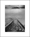
Critique By:
Vlad P. (K:1477)
8/26/2005 7:33:49 PM
Excellent capture, Gabor. I like the way it's composed and the tone range is perfect for digital (I want to say "almost like a film"). I'm wondering if its quality associated somehow with the "Crystal Clear Prints" advertised on this page? Anyway, it's really very good.
|
| Photo By: Gábor Koscsó
(K:-229)
|
|
|
Critique By:
Vlad P. (K:1477)
8/14/2005 4:43:09 PM
Really stanning image. A good eye! And techically it's fine. Congrats on SC and BP.
|
| Photo By: Edin Dzeko
(K:543)
|
|
|
Critique By:
Vlad P. (K:1477)
8/14/2004 7:10:29 AM
Very nice image. Colors are delicate, both the sea and the sky is smooth. Interestingly, it's all almost monochromatic. Excellent feeling of perspective. I also like that the composition is off centered. Just excellent.
|
| Photo By: Tomasz Niemiec
(K:97)
|
|
|
Critique By:
Vlad P. (K:1477)
6/19/2004 9:07:31 AM
Really nice picture, like an abstract. Magic light indeed. The only thing I would suggest is to increase overall density (and than maybe to slightly decrease saturation).
|
| Photo By: khalid mohd
(K:-4)
|
|
|
Critique By:
Vlad P. (K:1477)
5/29/2004 8:51:37 AM
Nice composition and toning.
|
| Photo By: jeff f.
(K:120)
|
|
|
Critique By:
Vlad P. (K:1477)
5/29/2004 8:32:55 AM
Beautiful, moody landscape. I like subtle tones.
|
| Photo By: Ted vandenBergh
(K:5119)
|
|
|
Critique By:
Vlad P. (K:1477)
5/29/2004 8:26:21 AM
Unusual shot, very creative. I'd say superb. Excellent composition and colors.
|
| Photo By: Hermen Pen
(K:9168)
|
|
|
Critique By:
Vlad P. (K:1477)
5/29/2004 7:53:19 AM
Excellent composition. Well balanced.
|
| Photo By: Siegfried Burgstaller
(K:-8)
|
|
|
Critique By:
Vlad P. (K:1477)
5/29/2004 7:32:33 AM
Nice landscape, beautiful reflections. Wide angle works well here.
|
| Photo By: Tim Schumm
(K:29196)
|
|
|
Critique By:
Vlad P. (K:1477)
5/29/2004 7:26:39 AM
The image is well composed. Beautiful colors and reflection. The only suggestion would be to burn the sky. IMO the sky, especially clouds look overexposed.
|
| Photo By: Teunis Haveman
(K:37426)
|
|
|
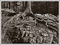
Critique By:
Vlad P. (K:1477)
5/29/2004 7:12:42 AM
Powerful image, excellent texture. Good contrast and density. Toning also works well here. Maybe a little bit too centered on my taste. I'd crop off 10-15% on the left, but cropping is quite subjective, it's up to photographer. The picture is good as is.
|
| Photo By: Frank Sala
(K:2643)
|
|
|
Critique By:
Vlad P. (K:1477)
5/29/2004 6:32:44 AM
Very impressive colors, well captured.
|
| Photo By: Martin Mora
(K:4666)
|
|
|
Critique By:
Vlad P. (K:1477)
5/26/2004 7:13:46 AM
Nice composition. Excellent pattern and good contrast. The only thing, maybe I'd wish to see it a little bit sharper.
|
| Photo By: Larry Edwards
(K:843)
|
|
|
Critique By:
Vlad P. (K:1477)
5/22/2004 9:10:04 AM
Perfect emotional portrait. I like symmetrical placement. Grainy effect contributes well too.
|
| Photo By: Toini Blom
(K:2039)
|
|
|
Critique By:
Vlad P. (K:1477)
5/22/2004 8:43:29 AM
Excellent reflections, DOF, and color contrast.
|
| Photo By: Steve Rosenbach
(K:8338)
|
|
|
Critique By:
Vlad P. (K:1477)
5/22/2004 8:35:32 AM
Excellent colorful sunrise, almost abstract. The only critique, the composition is too centered. Not sure, but maybe panoramic (or square??) format would work better here. Or if to crop say 20% on the left. Just my thoughts, not necessary right. Colors are really amazing.
|
| Photo By: scott villalobos
(K:48)
|
|
|
Critique By:
Vlad P. (K:1477)
5/22/2004 8:13:58 AM
IMO looks like a very nice abstract.
|
| Photo By: Steve Rosenbach
(K:8338)
|
|
|
Critique By:
Vlad P. (K:1477)
5/21/2004 8:09:00 AM
Very good landscape shot, Vladimir. Excellent tones. That stone in lower right-hand corner balancing composition well. The only my problem is slightly lower density in the center, especially visible on the grass in fg (probably effect of polarizer). Maybe it makes sense to burn this central area to make the densities more uniform. Nevertheless, the image is nice as it is.
|
| Photo By: Vlad Z
(K:448)
|
|
|
Critique By:
Vlad P. (K:1477)
5/21/2004 7:38:40 AM
Excellent cityscape, nice dynamics and the depth. The tones/contrast are just optimal. Interestingly, people in St.P. now like to take a walk with Borzois before going to the bed. That's nice.
|
| Photo By: Alexey Tikhonov
(K:4)
|
|
|
Critique By:
Vlad P. (K:1477)
5/21/2004 6:03:55 AM
Excellent double portrait. Very nice DOF and tones. Well captured expressions. A minor nitpick. Top 10% probably needs a tad more burning, or the image needs just a thin border, otherwise its top blending with white UF bg.
|
| Photo By: Mietek Kalinowski
(K:181)
|
|
|
Critique By:
Vlad P. (K:1477)
5/21/2004 5:46:18 AM
Interesting idea, well done.
|
| Photo By: andrea miglio
(K:0)
|
|
|
Critique By:
Vlad P. (K:1477)
5/20/2004 2:43:30 PM
Nice, moody winter landscape. Maybe highlights in the center a little bit overexposed, but not much. Overall, IMO looks very good in terms of placement of elements and the tones.
|
| Photo By: Grigory Ivaschenko
(K:458)
|
|
|
Critique By:
Vlad P. (K:1477)
12/25/2003 3:42:30 PM
Really cool shot. Nice tonality and color contrast.
|
| Photo By: Yuri Bonder
(K:268)
|
|
|
Critique By:
Vlad P. (K:1477)
12/24/2003 7:34:12 AM
Excellent reflections and the clouds, nice colors. On my taste foreground needs more light. I'd dodged a little bit this dark lower 1/3 typical for polarizer (e.g. using Quick Mask). Nevertheless, the capture is very good as is. Congrats on POD.
|
| Photo By: David Bourke
(K:2239)
|
|
|
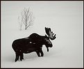
Critique By:
Vlad P. (K:1477)
12/22/2003 9:01:10 AM
Congrats, IT. Looks cool. You say *Wildlife*, but I'd classified it as say *Still Life*. Nice humor.
|
| Photo By: In Transit
(K:29432)
|
|
|
Critique By:
Vlad P. (K:1477)
12/21/2003 11:04:12 PM
Sorry, Ken, I overlooked the improved version. Now I can compare it with the original cropped upload too. I'd say that the image with cloned cars/signs looks much better. Not sure about both horses, at least that white one looks fine, I mean lighting is fine. Finally, I like your toned versions better than the original (color).
Thanks for commenting on my images.
|
| Photo By: ken osborn
(K:2997)
|
|
|
Critique By:
Vlad P. (K:1477)
12/21/2003 10:28:57 PM
Everything was said. I just support others, amazing light makes this shot. This actually what photography is all about. Excellent capture.
|
| Photo By: Darrin James
(K:3944)
|
|
|
Critique By:
Vlad P. (K:1477)
12/21/2003 10:19:41 PM
First of all I'd agree with Anouschka and Katrin about the truck and car. Basically, I'd suggest to clone out a)truck; b)traffic light and signs; c)car moving on the road. This may strengthen nostalgic look.
I'm not so strong photoshopper and has *discovered* Channel Mixer just recently. David's suggestions seems make sense. My feeling is that I would prefer a little bit more contrast.
The castle looks really impressive, nice texture. The clouds are great. The sepia-like toning adds nicely to old look.
|
| Photo By: ken osborn
(K:2997)
|
|
|
Critique By:
Vlad P. (K:1477)
12/21/2003 9:54:01 PM
I appreciate everyone for stopping by and commenting. I guess, Peta and Mister Ken counted all the patterns quite precisely.
I also appreciate Ken Williams for his useful suggestion to get this black glossy plate. This suggestion was made on a different site (photo.net) on a different purpose (to use for egg shots). But this pattern made by blinds on the plate attracted my attention immediately. Finally, I got lucky to capture almost exactly what I wanted.
Kamil and Mike, on one hand I agree with you that the symmetry here isn't perfect. On the other hand I'm not sure if it should be so precise, some lack of regularity sometimes works better. Just my guess, I maybe wromg. Anyway, thanks for your suggestions.
|
| Photo By: Vlad P.
(K:1477)
|
|
|
Critique By:
Vlad P. (K:1477)
10/26/2003 2:20:25 AM
Nice fall capture, beautiful reflections.
|
| Photo By: Hassan Ahmed
(K:2995)
|
|