|
|
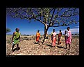
Critique By:
Marco Vredegoor (K:7301)
9/30/2008 8:52:07 AM
Beautiful picture, so nice and colorful. Your overall portfolio is so joyful too. Very nice work.
All the best, Marco.
|
| Photo By: Gurmeet Sapal
(K:691)
|
|
|
Critique By:
Marco Vredegoor (K:7301)
9/23/2008 9:21:07 AM
hey roger, nice to see Camden Lock in action. In the beginning of this year i paid a visit to it, and few weeks later i heard it (partly) burned down. Im just glad to see now it is still alive and so sunny. 
By the way thanks for your comment on my portfolio. I do indeed like the new Tamron 11-18 lense. Especially for architectural pics which i want to be better in.
All the best, Marco.
|
Photo By: Roger Williams
(K:86139)

|
|
|
Critique By:
Marco Vredegoor (K:7301)
8/8/2008 10:52:03 AM
excellent sunset, shame of your name in the image tho. If it was a boat or some other sort of element it would be very nice, but now it's only distracting. By the way: did you compress the picture vertically? It almost looks that way.
But very nice colors. Very good work,
all the best, Marco.
|
| Photo By: Rich Swanner
(K:-3732)
|
|
|
Critique By:
Marco Vredegoor (K:7301)
8/8/2008 10:48:34 AM
very nice work and excellent lighting. Perhaps a horizontal crop would be better. But the details, sharpness and colors couldn't be better then you photographed here. Very nice work.
All the best, Marco
|
| Photo By: majkim s
(K:209)
|
|
|
Critique By:
Marco Vredegoor (K:7301)
8/6/2008 3:37:48 PM
hi nick, thanks for your really nice comment. No, there was no glass in front of this. The distance between me and the lizard was one meter or so. So i didn't have to use a very long lense to capture it this way.
|
| Photo By: Marco Vredegoor
(K:7301)
|
|
|
Critique By:
Marco Vredegoor (K:7301)
7/28/2008 11:24:24 AM
wow, excellent colors in this picture. Real nice sky, of course the pier in the water helps to create some lines in the picture and the depth is really nice created by the mountains. I like it that the water surface isn't totally smooth. That would maybe reflect the sky too much and would perhaps be too distracting. Very nice, and good crop too.
All the best, Marco.
|
| Photo By: Neil Higgins
(K:11)
|
|
|
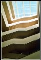
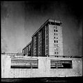
Critique By:
Marco Vredegoor (K:7301)
7/28/2008 11:19:51 AM
wow, nice and unusual view. in this architecture is a real nice pattern and clear lines. You can even hold it up side down and you would still have an evident staircase. I'm a little ambiguous about the top window though. Maybe it is better to leave it off the picture and just choose for the pattern in the stairs that gradually turn darker. anyway good picture, good eye!
All the best, Marco.
|
| Photo By: Nick Karagiaouroglou
(K:127263)
|
|
|
Critique By:
Marco Vredegoor (K:7301)
7/16/2008 10:56:29 AM
hey michele, very nice picture. I can see why this shot was difficult, and the crop could be a little wider to catch the whole whales. But nonetheless it is a very good shot. I like the colors in it. and the see-through windows on the bottom are confusing. On the small thumbnail i thought it was a picture of a huge aquarium (which would be great to have!!), but this is a nice painting.
all the best, marco
(yes im having holidays from my busy schedule and now i managed to buy a decent camera, so i should pick up on my photography)
|
| Photo By: Michele Carlsen
(K:146013)
|
|
|
Critique By:
Marco Vredegoor (K:7301)
11/2/2007 4:39:08 PM
wow, amazing piece of art. very nice expressionistic like colors and very nice subject. Well done! all the best, Marco.
|
| Photo By: Annemette Rosenborg Eriksen
(K:55244)
|
|
|
Critique By:
Marco Vredegoor (K:7301)
11/1/2007 10:45:59 AM
very nice objects to photograph together. I really like the combination of these strong shapes. Shame the composition is not so extremely symmetric as your intention (no doubt) would be. It is a little bit tilted, and not totally in the middle. If it was, that would make the picture absolute the best. But the idea is there and good of you to see that. Compliments on that. All the best, Marco.
|
| Photo By: Nessa Gnatoush
(K:341)
|
|
|
Critique By:
Marco Vredegoor (K:7301)
10/18/2007 10:30:16 AM
hey riny, dank voor je comment. ja het was mooi herfstweer van t weekend en dan zoek je het bos op, niet waar?? Groetjes uit Oldenzaal (Hulsbeek).
|
| Photo By: Marco Vredegoor
(K:7301)
|
|
|
Critique By:
Marco Vredegoor (K:7301)
10/18/2007 10:29:02 AM
excellent shot, good colors and nice background. Nice and sharp outline of silhouets. Well composed! All the best, Marco.
|
| Photo By: gamze sahin
(K:66)
|
|
|
Critique By:
Marco Vredegoor (K:7301)
10/18/2007 10:25:45 AM
nice picture! real colorful and a very good composition. All the best, Marco.
|
| Photo By: Ismet Smajis
(K:6911)
|
|
|
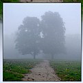
Critique By:
Marco Vredegoor (K:7301)
10/18/2007 10:24:25 AM
wow cool picture. The trees look like an old couple they belong together. Well composed! All the best, Marco.
|
| Photo By: robert jedrusik
(K:806)
|
|
|
Critique By:
Marco Vredegoor (K:7301)
10/16/2007 9:53:16 AM
wow, this just looks like a scene from a movie!! Excellent composition with the head in the foreground which guides your look towards the nice couple in the back who are enjoying the sunset. A sunset is always so glamourous and can be cliche so soon, but this shot you have taken is so fresh and original and not glamourous at all. I like it so much! The colors are excellent too..!!! Not a thing on the picture I don't like...
|
| Photo By: Michele Carlsen
(K:146013)
|
|
|
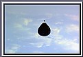
Critique By:
Marco Vredegoor (K:7301)
10/16/2007 9:48:14 AM
hi stan, thx for your comment to me. This picture of you reminds me of one of mine. because this type of hot air balloon is not only a joke: it also exists!! Below the link to my picture which is the proof... All the best, Marco.
http://www.usefilm.com/Image.asp?ID=1190948
|
| Photo By: Stan Ciszek
(K:56854)
|
|
|
Critique By:
Marco Vredegoor (K:7301)
10/12/2007 10:08:13 AM
hey michele, how are you? such lovely colors the autumn has. Here in the netherlands, it is usually over in a few days, and all the leaves turn dark brown. Today it is a grey and cloudy day, the leaves still have a bit of color, and hopefully they last till the weekend when the sun is going to shine (as the weathermen told us) So hopefully i will have a nice autumn picture as you have here too. All the best!
|
| Photo By: Michele Carlsen
(K:146013)
|
|
|
Critique By:
Marco Vredegoor (K:7301)
10/12/2007 10:03:05 AM
great portrait, really dreamy look upon her face. It could improve on the background and the composition, but it is a very good capture of a beautiful face. The eyes have a really dramatic expression. Well done! Great portfolio too by the way!! All the best, Marco
|
| Photo By: mark Brunner
(K:34)
|
|
|
Critique By:
Marco Vredegoor (K:7301)
9/24/2007 9:15:10 AM
hi michele, thanks for your kind words. I just have a few days off work and went out to take some pictures and it was really sunny so I hope the pictures turned out ok, so I will post them here.
|
| Photo By: Marco Vredegoor
(K:7301)
|
|
|
Critique By:
Marco Vredegoor (K:7301)
9/24/2007 9:13:46 AM
hi thnx for your comments. I also tried in black and white, and it turns out really good too. maybe even better.
|
| Photo By: Marco Vredegoor
(K:7301)
|
|
|
Critique By:
Marco Vredegoor (K:7301)
9/20/2007 5:25:02 PM
great shot , good composition and i really like the way the effect works. Is that by the camera? or did you use special measures to develope the negative?
|
| Photo By: Wojciech Jastrzebski
(K:455)
|
|
|
Critique By:
Marco Vredegoor (K:7301)
9/20/2007 5:22:36 PM
very powerful, nice pic!
|
| Photo By: Wojciech Jastrzebski
(K:455)
|
|
|
Critique By:
Marco Vredegoor (K:7301)
9/20/2007 5:19:22 PM
ok, you make me curious what this is... it has the shape of an eye, but judging by patterns that is not what it is... my guess would be that you are showing it to us up side down. And it is something nature. But much more i can't find.
|
| Photo By: Annemette Rosenborg Eriksen
(K:55244)
|
|
|
Critique By:
Marco Vredegoor (K:7301)
9/20/2007 5:15:23 PM
yeah i was in the neighbourhood :P
|
| Photo By: Annemette Rosenborg Eriksen
(K:55244)
|
|
|
Critique By:
Marco Vredegoor (K:7301)
9/20/2007 5:14:05 PM
simplistic but good composition! the different shades in grey work really nicely and help creat a feeling with the picture. the square shape is a good chosen shape, it brings out the vertical lines more. Otherwise i think it would be too horizontal.
All the best, Marco.
|
| Photo By: Pawel Rubaj
(K:801)
|
|
|
Critique By:
Marco Vredegoor (K:7301)
9/20/2007 5:11:28 PM
wow excellent picture. Great colors and great sky. Really dramatic clouds indeed. The perspective works really great here.
|
| Photo By: Annemette Rosenborg Eriksen
(K:55244)
|
|
|
Critique By:
Marco Vredegoor (K:7301)
9/20/2007 5:01:23 PM
hey michele, how ru? i like this picture very much. It looks at first like a simple object, but when i took a sharper look i saw that you posted the primary colors each in one corner (or accidently??) Red left upper corner, blue right upper corner and below left the flowers are yellow. The only problem is that the empty right corner below pulls ur eye into the middle and to the back. But you can also say that when u clicked the pirate was in the middle and swinged towards the left of your frame
Anyway: always nice to see this kind of allday american life. It brings to perspective how small the world really is. There is so much to see on this, and it is very sharp. I like it! a 7+
|
| Photo By: Michele Carlsen
(K:146013)
|
|
|
Critique By:
Marco Vredegoor (K:7301)
9/15/2007 10:42:02 AM
ah coffee my favourite drink, nice shot too.
|
| Photo By: Pablo Dylan
(K:63918)
|
|
|
Critique By:
Marco Vredegoor (K:7301)
8/28/2007 12:42:31 PM
hi michele, even the summer is very busy, but i always take time to see the pictures here. I also took som time to take some pictures myself, maybe i will post them soon if any's good enough.
all the best, marco.
|
| Photo By: Michele Carlsen
(K:146013)
|
|
|
Critique By:
Marco Vredegoor (K:7301)
8/25/2007 12:58:55 PM
hi michele, interesting picture and it does make u wonder how people could have made this kind of sarcofugus in the ancient times. I can't see how you have taken this shot... is it lying down or is it standing above your head. I do see that you had a flash on your camera, which makes the colors lack a certain mysteriousness. (if that is a word in english :)) I think it would add more to the character if you had uses a tripod and no flash, also the sharpness on both ends is not equal. But that may be a problem of how you faced this mummy. I like the subject though, it is really beautiful. Take care, Marco.
|
| Photo By: Michele Carlsen
(K:146013)
|
|