|
|
Critique By:
ian pearson (K:1736)
7/21/2005 3:29:49 PM
Hi James, thanks for the comment. Always good to see your work through someone else's eyes. I've gone into Photoshop and adjusted the hue to + 15, the saturation to +20 and the lightness to -11, the last to get a bit more colour depth. regards, Ian Pearson
|
| Photo By: ian pearson
(K:1736)
|
|
|
Critique By:
ian pearson (K:1736)
7/19/2005 5:06:14 PM
Hi Pat,Looking at your camera settings I'm surprised you managed to get such a great shot with hand held and 1/60 on telephoto.I like the crop on this one and the colour is great. I had a go at adjusting the colours to tone down the blue in Photoshop, as I think that this shade of green is more complimentary to the red/brown of the squirrel's fur.Don't know if it will meet with approval.regards Ian Pearson
|
| Photo By: Patrick Jacobson
(K:29151)
|
|
|
Critique By:
ian pearson (K:1736)
7/19/2005 11:26:34 AM
Hi Angelo, just looked at the file excif info in Photoshop and I see that the settings are auto which gives ISO 100 and the speed was 1/350th at F8, not the 1/15th at F? that I put on the photo description. Slipped up there. The time was late afternoon with low sun angle and shade and no flash, so available light picked up the background ground litter colours. The noise probably resulted from a resolution of 'Fine' setting which gives a file size of about 2MB and then cropping to 1/10 of the image size.The original composition was discarded in favour of the other Dandelion photo I uploaded previously, but on further investigation, for a different effect, saw the 'face' in the middle of this shot, and decided to try for an abstract presentation, colour and all.I tend to shoot at fairly low resolutions(for a 5MB camera) for economy and file size as I don't normally blow up and crop out so vigorously, and find that file sizes of 2MB gives good A4 prints for my local photo club meets.Thanks for your comments, I only just uploaded it. regards Ian Pearson.
|
| Photo By: ian pearson
(K:1736)
|
|
|
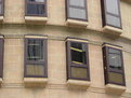
Critique By:
ian pearson (K:1736)
7/19/2005 9:09:41 AM
Hi Len,I quite like this photo as it shows an unusual window design, with the surrounding stonework and colour.The angle gives strength to the stonework supporting the window frames and the curvature of the wall suggests a castle of old. Ian Pearson
|
| Photo By: Len Webster
(K:25714)
|
|
|
Critique By:
ian pearson (K:1736)
7/19/2005 8:36:29 AM
Hi Osvaldo,I find this photo to be very bland with the large blank sky. It could be anywhere in the world and does not suggest early morning anywhere for that matter.The conversion to black and white has not enhanced it either. Ian Pearson
|
| Photo By: osvaldo rima
(K:6862)
|
|
|
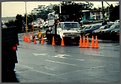
Critique By:
ian pearson (K:1736)
7/19/2005 7:55:26 AM
Hi John, A photo is a vehicle for the composition theme. It must at all times hold the observers attention and convey the message locked up in the arrangement of the composition.This photo falls down on all counts. You have placed centre stage a large white truck and created a background of various items of street scenery. What you have missed out on is the red for danger message that the composition should suggest, totally lacking here even with the hazard cones spread around but not contributing to the overall scene. Ian Pearson
|
| Photo By: John Beavin
(K:4477)
|
|
|
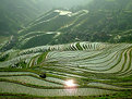
Critique By:
ian pearson (K:1736)
7/19/2005 7:10:54 AM
Hi James, A very powerfull composition. It has the ability to hold the observer's attention without causing the eye to wander around looking for a viewpoint.There is so much on show but the photo keeps the mind focused on the panorama and is to be highly commended for having got what you planned to achieve. Love the misty green. Ian Pearson
|
| Photo By: * James *
(K:20200)
|
|
|
Critique By:
ian pearson (K:1736)
7/12/2005 2:28:04 AM
Hi Steven, Thanks for the comment.I checked out the excif information in Photoshop and it should have been 100 iso. The card type information had the iso on the end from a Minolta 7Hi camera photo previously entered.A small slip-up but it makes a lot of confusion for how the shot was achieved.I should have realised that as the camera was in auto or program mode, the iso was 100, set by the camera, to suit the situation, and only changes if the light is really low. Ian Pearson.
|
| Photo By: ian pearson
(K:1736)
|
|
|
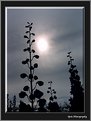
Critique By:
ian pearson (K:1736)
7/10/2005 4:37:34 PM
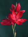
Hi Sue, to me this is a typical moonlightshot, even though it is a sunlight composition. The effect of the blue cloudy background and the flowers in stark sillouette give the composition an aura of mystery, compounded by the effect of the framing with it's lighting and shadow effect.I think the framing is so well done and it adds an illusion like that of a Tretchikoff painting.A truly artistic photographic achievement. Ian Pearson
|
| Photo By: Quix Photography
(K:20204)
|
|
|
Critique By:
ian pearson (K:1736)
7/10/2005 4:02:25 PM
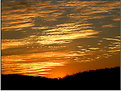
Hi Jon, nice cloud detail against the setting sun. I would have liked to have seen more of the tree top sillouetted against the sunset.There are more composition prospects, in tree branch sillouettes, than the trunk of the tree. Ian Pearson
|
| Photo By: Jon O'Brien
(K:11321)
|
|
|
Critique By:
ian pearson (K:1736)
7/10/2005 3:51:19 PM
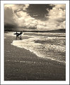
Hi Mitch, beautifull composition. Never seen a blue sunset, but your choice of colour is great. I agree with Michael glenn, I would have taken all the detail off of the two figures to maintain a pure sillouete. Posing is good and the misty horizon forms a perfect backdrop. Ian Pearson
|
| Photo By: Mitchell Miller
(K:3009)
|
|
|
Critique By:
ian pearson (K:1736)
7/10/2005 3:40:28 PM
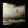
Hi Ned, first I must say how really impressed I am with your presentation. The framing totally compliments the composition which is out of this world.To get a photo like this by shooting directly into the sun is a fantastic technical achievment, and only two colours.I take my hat off to you, you are truly a photographer of the highest calibre. Ian Pearson
|
| Photo By: Ned Ali
(K:11928)
|
|
|
Critique By:
ian pearson (K:1736)
7/10/2005 3:24:32 PM
Hi Robert, a truly fantastic photo. To capture the colours like this and balance the reflection with the actual image takes real genius.Having the centre totally a black outline is great, and creates such a powerfull composition. Ian Pearson
|
| Photo By: Robert Jones
(K:1692)
|
|
|
Critique By:
ian pearson (K:1736)
6/30/2005 5:11:59 PM
Hi Leanne, I love the close up detail of the centre bits and the DOF, quite well done. The lighting is a bit varied and should have been shaded, to enable fill in flash to bring out the textures of the petals evenly. Attention to background detail to eliminate the fence, as in adding a bit of plant foliage etc helps.I assume you are using a tripod and telephoto with macro if available. It really pays, when you have a subject with this much detail, to choose the time of day to get the light right, e.g. late afternoon. Ian Pearson
|
| Photo By: Leanne Johnson
(K:80)
|
|
|
Critique By:
ian pearson (K:1736)
6/30/2005 4:55:51 PM
Hi Neil, your explanation may be very valid, but it is the photo that tells the story. This photo says nothing. To any uninformed observer, a part of a tree in the middle of a picture is puzzling if it conveys nothing.If this were hanging in an exhibition I don't think it would attract a crowd of silent admirers, so therefore it misses the point. Ian Pearson
|
| Photo By: Neil Niamh White
(K:9165)
|
|
|
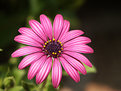
Critique By:
ian pearson (K:1736)
6/30/2005 4:43:14 PM
Hi Marco, A rather clever use of a flower to represent a theme.The centre is very symbolic of the ancient styalised view of the sun, as seen in old paintings from the middle ages. Ian Pearson.
|
| Photo By: Marco Montesi
(K:1531)
|
|
|
Critique By:
ian pearson (K:1736)
6/30/2005 3:10:39 PM
Hi Deb,As I don't normally relate to abstract shots too well, here's my best shot. I think the composition is cleverly done in getting the arrangement to harmonise with the range of colours and the dark background giving it an air of mystery.It is full of imagination and that is what comes out. At first glance the mind is led into the photo and it is left to the observer to form the picture as they feel it.You need an open mind and an artistic flair to really appreciate an abstract for what it is trying to convey. Ian Pearson
|
| Photo By: Debashis Nag
(K:501)
|
|
|
Critique By:
ian pearson (K:1736)
6/30/2005 2:27:26 PM
Hi Lea, thanks for your comment, I'll give it another go when the next batch rears their heads. Ian Pearson
|
| Photo By: ian pearson
(K:1736)
|
|
|
Critique By:
ian pearson (K:1736)
6/28/2005 7:48:59 PM
Hi Valentin, good photo. I think you have captured the moment very well. Your depth of field is absolutely spot on. I always look for the fine details on shots like these, and you have got the hair,eye lashes and eyebrows spot on, and such lovely skin detail. Ian Pearson.
|
| Photo By: Valentin Enriquez
(K:444)
|
|
|
Critique By:
ian pearson (K:1736)
6/28/2005 7:25:12 PM
Hi Jean, I quite like this photo. The colours of the sun rise with their hazy shades of brown compliment the hair and sun tanned face of the subject. The fill in lighting on the face and hair is exceptionally well done, and I like the way the highlights on the hair have been brought out.I would like to have seen the face turned slightly to the right. Overall a nice composition.
|
| Photo By: jean louis gouders
(K:42)
|
|
|
Critique By:
ian pearson (K:1736)
6/25/2005 4:03:20 AM
Hi 'Liz, typical postcard shot, (compliment intended). Only the very best make it here.I just love the range of colours and to achieve it shooting into the sun is quite awesome, fools most light meters to dumping out the subtle colour tones.The shadowed palms and foreground really make the composition and give it atmosphere.Timing is vital here. A few seconds later and the whole colour range just slides away.Really well done.I think it deserves a 7.
Ian Pearson.
|
| Photo By: Elizabeth O'Neal
(K:4436)
|
|
|
Critique By:
ian pearson (K:1736)
6/25/2005 3:48:39 AM
Hi Lily,they say that every picture tells a story, and if you get it right there is no further need to go into a description. I didn't see the first one so can only look in awe at the final culmination.The huge foreground, with the sun reflected as if from a million diamonds, is like a giant launching pad for the eye, and projects the observer into the photo and leads you to the dramatic cloud scene.I like the way the two surfers are presented, so casual, as if by accident, but playing such a vital part in the theme of the composition. If they had been placed closer to the camera, with more body detail, then the composition would have collapsed, and we would have been left with just a couple of guys surfing.The texture of the beach is perfect and breaks up the plainess of the sand. Top honours for a top photo.
Ian Pearson.
|
| Photo By: Tiger Lily
(K:10966)
|
|
|
Critique By:
ian pearson (K:1736)
6/25/2005 3:21:52 AM
Hi Richard, I don't think the title does the photo justice as it suggests just another of the same old theme. Here we have a nice pleasing scene with good colour gradations and a thoughtfull composition using the vee in the hills as a sun guard.Nice bit of nature at it's best.
Ian Pearson
|
| Photo By: Rick Koth
(K:2971)
|
|
|
Critique By:
ian pearson (K:1736)
6/25/2005 2:13:44 AM
Really well done. I think the background really makes the composition of the backlit thorns stand out.This is a real test for any light meter and shooting into the sun really is a difficult composition.I couldn't fault the photo in any direction, and so the top honours are well deserved.
Ian Pearson.
|
| Photo By: C K
(K:1987)
|
|
|
Critique By:
ian pearson (K:1736)
6/25/2005 1:57:25 AM
It doesn't matter what camera you are using or for that matter what settings,or how long you have been doing it, to be able to capture a photo with this atmosphere and feeling is pure genius that is not taught.This is artistic achievment of the highest calibre.
It would be interesting to know what film,camera combinations were used,and if it was digital, some details of the setup.
Ian Pearson
|
| Photo By: Justyna Ortyl
(K:-159)
|
|
|
Critique By:
ian pearson (K:1736)
6/20/2005 4:49:51 PM
Hi Ceceilia, Not only is this photo fantastic it is well presented.I like the way the flower leans into the frame, and the lighting is so well done.I assume you are using flash to be able to get 500th at 5.6 with a 200 iso and a dark background? Ian Pearson
|
| Photo By: Ceceilia Robinson
(K:1023)
|
|
|
Critique By:
ian pearson (K:1736)
6/20/2005 4:18:55 PM
Hi Roger, the photo was highly cropped, about 25% of the original file size of 1.5MB, to isolate the subject from the person whose lap he was sitting on.Also I normaly use a fine setting on my Minolta Dimage 7i, as it gives reasonable card capacity and easier to handle file sizes.The photo has been reworked a bit in Photoshop to render the background neutral. Ian Pearson
|
| Photo By: ian pearson
(K:1736)
|
|
|
Critique By:
ian pearson (K:1736)
6/20/2005 12:35:24 AM
I feel that less grass and more of the lake would be a better composition. There are two viewpoints here, the first is the two waterfowl, the second is the lake, and the eye is forced to move back and forth seeking a point of concentration and so the title theme of the photo does not manifest itself. Ian Pearson
|
| Photo By: Len Webster
(K:25714)
|
|
|
Critique By:
ian pearson (K:1736)
6/19/2005 11:35:29 PM
Hi Ellen,thanks for the comment,I think the background in a photo makes or breaks it.This was one of about a dozen with various light combinations.The lighter ones seemed to dominate the photo and made the composition weak.The use of a digital camera was an overwhelming advantage as it enabled me to see my results and vary them accordingly. Ian Pearson
|
| Photo By: ian pearson
(K:1736)
|
|
|
Critique By:
ian pearson (K:1736)
6/19/2005 11:24:27 PM
Hi Gary, thanks for the comment,your composition'Freshness' has inspired me very much and this is how I will be approaching my photo subjects in future.I think a photo should be a vehicle for the theme that it suggests as opposed to being viewed directly for what it is. Ian Pearson
|
| Photo By: ian pearson
(K:1736)
|
|