|
|
Critique By:
Maria Luisa Vial (K:36017)
1/28/2005 9:15:32 PM
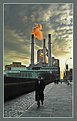
I feel here a very dramatic atmosphere... The sunset, cluds and the chimney with the red smoke create this,,, Mister cool seems to be walking away from the dramatism... Excellent composition... Very nice colors...
Cheers,
MaLuisa
|
| Photo By: Thilo Bayer
(K:50358)
|
|
|
Critique By:
tom randa (K:852)
1/28/2005 9:22:24 PM
This is truly a magnificent composition. As far as the nise goes, scan the photograph and either clone stamp the dust and hair of the neg out or use the bandaid tool in Photoshop. I would like to use your superb composition for my senior high school students as an example of the way a photographer sees, seeks out and uses the environment to capture what could almost be just another photograph of a clock tower.
Cheers, Tom from Australia.
|
| Photo By: Kai Yiu, Chan
(K:431)
|
|
|
Critique By:
Tim Schumm (K:29196)
1/27/2005 12:09:51 PM
Hey fantastic shot ... love the saturated colors and the over all feel of your photo. Those windmills always look so weird and out of place, but in the fashion that you have employed them in your image, makes for a great feature and focus.
excellent photo!
|
| Photo By: Mark Evans
(K:17428)
|
|
|
Critique By:
Hanggan Situmorang (K:24833)
1/26/2005 1:34:28 PM
Good composition and mood. The horizon looks a little inclined. I think you can make it horizontal using any image editor. Good moment capture, congratulations, and welcome aboard to UF...
Cheers,
Hanggan
|
| Photo By: Selcuk Edik
(K:-134)
|
|
|
Critique By:
Carsten Ranke (K:14476)
1/20/2005 3:32:54 PM
Mark, it is really a great image and worth the effort ! Maybe you have a RAW "negative", then I would work on the RAW with the converter (dont know the sw, cause I`m a Canonian...). Anyway, on RAW or TIF (if possible, 16bit per channel) I would look at the histogram in PS: Image > Adjustments > Levels. Sorry if you know all this stuff, dont know your PS learning curve...) You see a blck slider, try a shift to the right to set the shadows to black. Play around with the grey slider to adjust gamma / contrast). Or, if you have PS 8 / CS try the Image > Adjust > Shadow/ Highlight tool, quite impressive new feature (try low to 0% amount for shadows, higgher for highlights, then finetune with tonal width and midtone contrast). My uploaded try was a "quick and dirty" one with Picture Window Pro 3.5, a very fast, affordable sw I make 60-80% of levels, contrast, resize etc. Not as powerful as PS CS, but works with 16 bit/chan?nel (!) Regards, Carsten
|
| Photo By: Mark Wlaz
(K:4564)
|
|
|
Critique By:
Robert Stokes (K:4509)
1/16/2005 1:41:17 PM
1 freakin' comment??? I guess the usefilm community just doesn't have the 'balls' to recognize.
As for the techs of the image, very nice stitch. Of course it would be nice if the light was less contrasty, but hey, it can't always be overcast when we go out with paddle and camera in hand.
I haven't paddled whitewater in a few years now, mostly cause all my paddling buds are married with children now. Not that I was good enough to throw a steep creek like this, but I managed to survive a few class 4 runs. Later.
|
| Photo By: Delete My Account Delete my Account
(K:1232)
|
|
|
Critique By:
Domjan Svilkovic (K:3104)
1/16/2005 2:05:04 PM
Thanks Daniel for your comment! That was also my first reaction - why the hell didn't I leave more room on the left. As I don't have a high resolution CCD I try to compose the picture as best I can while shooting, to eliminate the need for later cropping (what you see is a full frame).
On the other hand, this way I get an almost perfect diaginal symmetry.
I tried cloning the left side to see what happens. Maybe it's really better.
|
| Photo By: Domjan Svilkovic
(K:3104)
|
|
|
Critique By:
January Trzoda (K:1776)
1/16/2005 12:45:37 PM
yes, i was almost sure it was 50mm
i never used nikkon but i love standard lenses.
if i had to pick only one lens to take it in a round-the-world trip it would be a bright 50mm.
and there is a lot of superb portraits here mady by 50mm rokkors, nikkors, planars etc.
but of course it is your outstanding gift for photography, not the gear you use that creates such wonderful photos, Marta
see you,
jt
|
| Photo By: Marta Glinska
(K:89)
|
|
|
Critique By:
Dirck DuFlon (K:35779)
1/16/2005 12:08:36 PM
What a great, nostalgic image, Rebecca! The dappled lighting, textures and soft sepia tones are all terrific - I also really like the way the opposing angles of the boards and shoes complement one another. The composition is really superb!
Just one little technical nit (sorry!) is that the angle of the gap in the boards at upper-left needs to be rotated clockwise a little to match the perspective in the rest of the shot.
|
| Photo By: Rebecca Raybon
(K:26654)
|
|
|
Critique By:
Jorg Reif (K:16020)
1/10/2005 9:23:20 PM
Hi Maurizio, since you asked for it, here my two cents worth of scrutiny. I think the idea is great, race between a boat and a gull. Came to my mind: picture must have been taken in Cuba to arrive at this title, where even the gulls a racing to reach Miami. The shortcoming in my mind is that all the action is in the concept and is not rendered in the photo or very little of it (the wake is the only component supporting the concept strongly). Since you placed everything on the right edge both your objects seem to be close to vanishing from the picture soon. So first recommendation would be: place the objects to the left third, or better quite a bit off median, giving them some way for their race(and the viewer the space to perceive they are racing and that this will go on for a while and its worth while watching). It would also help if the picture would go up a little, so that the birds location is less marginal.
In general I think there is too much empty space in this picture to make it really interesting. An easy way to fill this space would be with colour - short of having a stronger tele lens mounted. The grey tones are not different enough to act as components giving the comp tension. The different blues of sky and water together with the white wake and boat, the dark horizon line and the white and grey bird might have added this tension. I think the difference in the b&w (actually all grey) tonality does not give enough tension and interest to support the concept. In short the way I look at it: it probably would have been a better colour pic in the first place! Just an opinion! Regards Jorg
|
| Photo By: Maurizio Spadaccino
(K:5132)
|
|
|
Critique By:
aydin turker (K:3988)
1/11/2005 10:31:00 AM
Marian.. old buildings and antiques always have a deep effect on me.. the interesting part is those things are made/constructed by people who are not alive now and their products are still around us.. these ancient structures and pieces are messages from past to future like an echo of spritual voice oscillating to eternity..thanks for the nice shot.. cheers and best wishes dear friend..
|
Photo By: Marian Man
(K:80636)

|
|
|
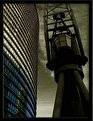
Critique By:
Mark Hamilton (K:8387)
1/10/2005 11:54:32 AM
What's too much.
The hardest thing in photoshop is learning when enough is enough. It's so easy to give images that one last tweak which inevitability becomes their downfall.
I think the PS treatment to accentuate your vision here is damn fine. But I find the image looking a bit pasted. I don't know if they were seperate layered images but it looks like they could do with a touch of defringing as they appear to be suffering from that not so nice halo effect or perhaps that was your intent.
I like the juxtapostion of the two elments the smooth rounded lines of the building on the left is an interesting contrast to the harsh geometric shapes found on the crane.
I like it.
Mark
|
| Photo By: Manu
(K:13082)
|
|
|
Critique By:
Serge Moscow (K:-2917)
1/10/2005 2:46:39 PM
Walt, I understand you and fully agree with yours position. For some period of time I've occupied the same one. In future you'll ready to learn these questions, no problems.
Corrections in WB is not obligatory and not the same in any case. In winter typically we need negative (more warm) correction of colour temperature, in summer it'd be correction in blue. I'd prefer do not correct WB and quite often I do not, because modern digital cameras work perfect in most cases.
If you have not PS, you can use PS elements or firm software from yours camera. The most important point here is to have a camera with possibility to write in RAW mode. Then, in Nikon Capture programm you will be able to change all parameters of image. And you'll not need in PS.
But most of photographers work with this program, of course...
Regards,
Serge
|
| Photo By: Walt McNeil
(K:2146)
|
|
|
Critique By:
Antonia BauerleinSehnert (K:30599)
1/8/2005 4:29:32 AM
First, let me say that this is spectacular to me. If this were the view from my window, I could sit for hours with a glass of wine and a friend and feel as if I were in heaven. Next, your expression, "13 of these in a dozen," is priceless--never heard it before. When I first came to Usefilm, you came to comment on something I did, and I was so honored, because from looking at your expression (in your personal photo), at your awards, and at your portfolio, I immediately thought of some college professors when I was younger who had so much experience and we students would all sit in awe, and hope we could not only learn, but earn their favor. So your good marks made me feel like I'd just gotten an "A," and I was all fired up that you'd paid me a visit. Well you just did it again recently, and I was just as honored. I hope you will do it more often...and I'm not just asking for your approval...I love to get good quality critiques from the best. T.
|
| Photo By: Hugo de Wolf
(K:185110)
|
|
|
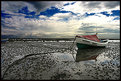
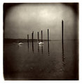
Critique By:
Robert Jaworowski (K:533)
1/8/2005 7:47:34 AM
Brilliant capture of brilliant landscape. I like this shot very much, mainly because it's both, static and dynamic. Static boat and dynamic sky creates very strong mood of this picture. Composition works perfectly for me too. Regards, Robert.
|
| Photo By: KEVIN TEMPLE
(K:8657)
|
|
|
Critique By:
Norma Barr (K:1769)
1/4/2005 4:17:08 AM
How beautiful! The way you have composed the image is just lovely. The background is as busy as it needs to be with the lightest area in the perfect spot. The colors in your frame enhance an already wonderful image.
|
| Photo By: Alexey Sapa
(K:27174)
|
|
|
Critique By:
Melissa (K:1791)
1/4/2005 4:22:54 AM
Todd, I was very struck by this image of your handsome son. I loved the use of available window light. And his expression is beautiful. That said, there were a couple of elements that bothered me. First, I noticed this was shot with Fuji film, which would explain the green cast. Second the dark shadow on the left side kept drawing my eye away from his. So I took the liberty of doing a couple of small edits. I color corrected it to reduce the green cast, cropped it to reduce the shadow, and bring the viewer's attention back to his eyes. Then I did a slight diffuse glow to emulate sunlight. Lastly I did a grain reduction to soften the overall grain without compromising the clarity. I hope you don't mind. It is such a striking image, I couldn't resist.
Kind Regards,
Melissa
|
| Photo By: Todd Carroll
(K:-278)
|
|
|
Critique By:
Carol Watson (K:5185)
1/4/2005 4:37:06 AM
Awesome, Bea!! Great mood and composition! I recently got a Holgaroid from Santa (based on your recommendation). Looking forward to experimenting with it. :-) Have you done anything for light leaks on your holga or do you shoot as is?
|
| Photo By: Bea Friedli
(K:10189)
|
|
|
Critique By:
Mary Sue Hayward (K:17558)
1/3/2005 8:32:41 PM
Sue, first of all, hats off to you for putting so much thought into helping your friend with her business. You know I like your work, but I think both of these images need some help to be as professional looking as possible.
Marcy's ideas seem quite reasonable to me. The photo does not show the product as well as it could be shown. The light is flat and the DOF is not strong as you already noted.
The background doesn't help much...maybe it is too dark. It looks like a blanket or a scarf...not something professional. The bright blue near the bottom seems confusing to me. It isn't clear if it is part of the package being sold or if it is a photography prop.
From the point of composition, the items seem crowded and jammed together. It might look cute in person, but from the photo alone the viewer cannot tell what the individual items are. There are some rolled up things, and either a DVD or video, a book, some stuffed animals. If I was shopping, I'd be tempted to purchase the same items individually and arrange them more attractively on my own.
All this said, I would not have been nearly as successful with this attempt.
By the way, I googled 'baby gift baskets', and found loads of sites with similar photos. Might be helpful to peruse them for ideas.
Good luck to you and your friend! Hope you share the next set of images.
|
| Photo By: Sue O'S
(K:12878)
|
|
|
Critique By:
George Black (K:102014)
1/2/2005 5:35:41 PM
This is a wonderful photo--virtually classical in its composition and subject matter. Forget about the blown-out highlight. In such a beautiful study, it will bother none but the most finicky among us. Besides, as much as we want technical perfection, we want a great picture more.
Regards,
--George
|
| Photo By: G G
(K:61359)
|
|
|
Critique By:
THEODORE STAMOULIS (K:2507)
12/8/2004 6:02:55 PM
Hey Femke!
Once upon a time I used to work at the morning shift for the Athens International airport. I really enjoyed the morning car ride to get there. I had to leave home 6.00 in the morning to be there at 6.30 (30min late :-) I often carried equipment with me trying to capture scenes from this waking time of the city from my car. Actually I had the fantasy that this would make my shooting skill fast, especially because I use manual focus. I am so glad I didn't kill myself (or someone else) and still managed to get a couple of nice shots. This little girl is sadly waiting to get to school :-(
p.s. I always hated schools and most of the educational organizations. I am looking forward to see nice shots from you!
|
| Photo By: Femke de Wit
(K:6020)
|
|
|
Critique By:
Bryan Jarmain (K:11941)
12/26/2004 4:35:45 PM
Femke, another really nice photo - I think better then "Three of a Kind" (less distractions) - well framed, great focus and detail. I like the bohek a great deal (in both photos), but the white line near the stem may be a bit distracting (a bit of PS work could clean it up somewhat - using cloning)...
|
| Photo By: Femke de Wit
(K:6020)
|
|
|
Critique By:
Carmem A. Busko (K:48785)
12/24/2004 1:53:15 PM
Hello Jorg... your blue composition over the Pacific is very pleasant to me because it resembles a very special day.. and moment... well registered by my friend Márcio Costa:
http://www.usefilm.com/image/472076.html
Yours is as beatiful as this.
Greetings
Carmem
|
| Photo By: Jorg Reif
(K:16020)
|
|
|
Critique By:
Tamara N (K:2617)
12/21/2004 7:27:56 AM
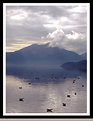
I like both of those other images very much. I especially like the one of the family walking away, with the child between the parents. However, I think I like this one of the cows best because the cows themselves are very well exposed, and at the same time, you have the hazy mountains in the background.
Well, really, I just like them all! It's such beautiful scenery and you did a great job capturing the view and setting a peaceful mood.
|
| Photo By: cessy karina
(K:14205)
|
|
|
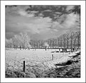
Critique By:
Neil Dolman (K:26883)
12/19/2004 9:11:21 AM
Hi Peter, i clicked on this because i liked the title and yes it does look like snow in the thumbnail, and last but least today i awoke to a covering in white - at last. Big storms over the last couple of days have brought a lot of snow to the mountains. As to your technique, i think it is coming on fine. I would prefer a little more contrast in certain parts of the image but that is personal preference, but could be easily done in layers i guess. Still you are the artist... Keep it up and best wishes for the season and new year from Switzerland, Neil
|
| Photo By: Peter De Rycke
(K:41212)
|
|
|
Critique By:
Lester Tradelbloom (K:3291)
12/19/2004 7:55:05 AM
Fantastic perspective Stephen! This is something to be proud of, it is such a simple, subtle photograph, but the perspective you have captured is wonderful. Personally, I think the bar in the background detracts from the strength of the image - see repost.
Congrats.
- Justin
|
| Photo By: stephen evans
(K:-104)
|
|
|
Critique By:
Ian McIntosh (K:42997)
12/14/2004 11:33:04 AM
Hey gidday Heath, nice to hear from you!
Stunning gallery mate and genuinely useful "abouts", like it.
This is going to be a nice place to come to once in a while ( not the hell, though one has to admire the crispness of the lighting conditiuons there by the looks. Notice you're resisting the urge to cook this into something else with photoshop like adding red.
|
| Photo By: Heath Bennett
(K:4429)
|
|
|
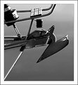
Critique By:
Verena Rentrop (K:15233)
12/14/2004 4:29:53 AM
Dear Peter,
this is my favourite in this serie of ship details, one reason is the b&w chosen but especially for the composition which is well arranged and full of different tilts...well done
Cheers,
Verena
|
| Photo By: Peter De Rycke
(K:41212)
|
|
|
Critique By:
Ed Francis (K:1165)
12/10/2004 12:32:52 PM
This is an arresting image, though I haven't quite figured out why. The contrast of the lights against the background sky - which seems almost to be impossibly lit by the lamps is very effective. I like the mystery of the background trees. There's more to a good image than the technicalities though. I'm still not sure why I'm drawn to this one.
The title... I see where the two bit comes in, but maybe I'm just a bit thick... is it supposed to allude to something? Some poetry perhaps? A silly Sandra Bullock movie that I didn't see, maybe?
Thanks for sharing,
Ed
|
| Photo By: Neal Nye
(K:15827)
|
|
|
Critique By:
Armen Jamkotchian (K:5879)
12/10/2004 3:44:53 AM
Very original idea. Also, I think technically and compositionally this image is very well done.
I suggest to move the parashute inwards to reach the 1/3 both horizontally and vertically.
Best regards - Armen
|
| Photo By: Fernando Resendes
(K:473)
|
|