|
|
Critique By:
david malcolmson (K:4145)
12/25/2003 6:01:24 AM
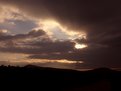
Isaac, I'm taking this opportunity to wish you a Merry Christmas and a Happy New Year. I am very grateful for your kind comments over the past year. Best wishes. David
|
| Photo By: Isaac Shaw
(K:2563)
|
|
|
Critique By:
david malcolmson (K:4145)
12/23/2003 6:32:16 AM
Wonderful light, colour and textures here,Steven. I love the rendition of the water in the foreground,with that slightly ghostly effect that comes from using a long exposure. My only reservation here is that I think you have darkened the sky too much- maybe a 2 stop grad would have been better as the sky looks too dark in relation to the sea - it almost looks like it came from a different picture altogether.
|
| Photo By: Steven B. Poitinger
(K:1757)
|
|
|
Critique By:
david malcolmson (K:4145)
12/21/2003 3:27:23 PM
Marillia, I'm filled with admiration for your imaginative and ingenious use of a desktop scanner. I am equally impressed by the result, a fine and sensitive self-portrait that seems to convey all you wanted to say. It helps that you had such a fine model - at least she would know exactly what you wanted her to do! I couldn't leave this without remarking on the fine technical control here.One for my Favourites folder. Best wishes. David
|
| Photo By: marília campos
(K:517)
|
|
|
Critique By:
david malcolmson (K:4145)
12/21/2003 10:51:12 AM
Is this an exercise in studio lighting or a commercial image? I know wine goes well with (cooked) food but in this context it loses some of its appeal. I don't think this kind of set-up would sell many bottles of wine. It's a matter of thinking of a way to make the wine appealing through suitable lighting, composition and props. This is an extraordinarily difficult field of photography but there are many fine examples in magazines and ads to provide inspiration to any one who wants to try it.
|
| Photo By: Tom Balfe
(K:0)
|
|
|
Critique By:
david malcolmson (K:4145)
12/21/2003 10:32:38 AM
I find the overall effect of this rather oppressive. The heavy toning contributes to this, but so also does the viewpoint you have chose here. The castle should dominate the scene by means of the way it stands out from the surrounding environment rather than by merely taking up the most space in the frame. Through lack of this context the castle just looks lumpish and four-square. You have gone to extraordinary trouble to get the toned effect here but you could have saved yourelf a lot of time if you had used the Channel Mixer instead. I feel that the toning you have contrived here leads to an unbalancing of the tonal range of the image as a whole. For instance the shadow areas of the castle lack sufficient depth - they look muddy, and the sky is too dark. There's a fine image waiting to emerge from this if you do something about the balance of tones. Sometimes less really is more.
|
| Photo By: ken osborn
(K:2997)
|
|
|
Critique By:
david malcolmson (K:4145)
12/21/2003 5:14:51 AM
An enchanting shot of a young child in a world of her own. The lack of a recognisable
visual context somehow increases the sense of her being in another world.
|
| Photo By: Chris Blaszczyk
(K:610)
|
|
|
Critique By:
david malcolmson (K:4145)
12/20/2003 10:24:21 AM
I love the happy, confident pose of this lady. Isense a good rapport. The lighting and exposure are well-handled.I just wonder if there is too much black here - there is quite a bit in the photo itself and the frame adds its own share.
|
| Photo By: Pawel Staszak
(K:59)
|
|
|
Critique By:
david malcolmson (K:4145)
12/20/2003 10:10:22 AM
A telling juxtaposition of the sacred and the profane, Gary. I'm glad you converted this to greyscale - colour would have been too literal. A satisfying and well-balanced range of tones contribute to the excellence of this image.I am going to add this to my Favourites folder.
|
| Photo By: Ari O
(K:990)
|
|
|
Critique By:
david malcolmson (K:4145)
12/20/2003 10:02:18 AM
Cats have a genius for comfort-they must have a homing device that leads them to the warm places. A well-captured potrait of your handsome feline friend - the warmish light heightens the comfortable mood.
|
| Photo By: simon wootton
(K:2542)
|
|
|
Critique By:
david malcolmson (K:4145)
12/19/2003 4:04:15 PM
James, I've been here before, but it's a pleasure to see this classy image again. I want to thank you for your comment on my image 'Monk's Cell'. There was a wire grille on the door of the cell which diffused the light slightly when out of focus. You have a keen eye to notice the effect. The crookedness of the window was there on the negative and I decided to leave it as it was. Re ** I have said or done nothing to offend the individual concerned, in fact I have praised **'s work. It seems a case of taking up the cudgels on behalf of someone else. It really isn't **'s business.
|
| Photo By: james mckenna
(K:6535)
|
|
|
Critique By:
david malcolmson (K:4145)
12/18/2003 2:38:21 PM
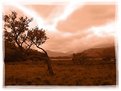
This is a very gentle apocalypse, Stephanos, barely ruffling the grass or the leaves of the trees. Let's hope the real one is just as untroubled.
|
| Photo By: Stefanos Aivazis
(K:94)
|
|
|
Critique By:
david malcolmson (K:4145)
12/18/2003 2:34:42 PM
Your treatment of the subject is quite unusual. The almost complete absence of the original colour combined with the tinting makes for an attractive image.
|
| Photo By: Sergio M
(K:527)
|
|
|
Critique By:
david malcolmson (K:4145)
12/18/2003 2:28:57 PM
Congratulations, Antonio. I like the warm lighting here, so appropriate for this autumnal subject. Best wishes. David
|
| Photo By: Antonio Trincone
(K:23167)
|
|
|
Critique By:
david malcolmson (K:4145)
12/17/2003 12:43:53 PM
There's a cinematic quality to this image. The expressions are very well captured and the light is very good. The post on the right of the image is out of keeping with the mood - I would have cloned it out.
|
| Photo By: Fersan Fidansoy
(K:205)
|
|
|
Critique By:
david malcolmson (K:4145)
12/17/2003 12:39:46 PM
This is a fine 'street' image, Telmo. The depiction of the beggar is very eloquent and moving, but my attention was also drawn to the interesting figures in the background. They add something valuable to the total affect of this well-executed image.
|
| Photo By: Telmo Domingues
(K:9639)
|
|
|
Critique By:
david malcolmson (K:4145)
12/17/2003 12:34:32 PM
This is an unusual, but effective angle on soccer, Rod. They must be very dedicated to play on what looks like a very cold evening. The figures are very ant-like - there's something distrubing about seeing human beings from this height.The light, the compositon and the perspective combine to produce a curious feeling of detachment .If that was your intention you have certainly succeeded. Best wishes. David
|
| Photo By: Rodrigo D
(K:1577)
|
|
|
Critique By:
david malcolmson (K:4145)
12/17/2003 10:56:06 AM
An impressive landsape image, Witold. You have very properly given prominence to the sky here beacause its beauty and drama. The whole of this rural scene has been nicely captured in a satisfying palette of grey tones.
|
| Photo By: Witold Spisz
(K:1293)
|
|
|
Critique By:
david malcolmson (K:4145)
12/17/2003 6:50:33 AM
Marilia, the wide-angle view gives a real adult's eye view of this little girl. I love her expression, one of affectionate recogntion mixed with a touch of the pleasure from her book she has just looked up from.
|
| Photo By: marília campos
(K:517)
|
|
|
Critique By:
david malcolmson (K:4145)
12/17/2003 6:44:50 AM
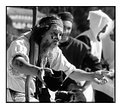
It's a pleasure to encounter a well- executed photograph of musicians ( most examples are an excuse for underexposed, unsharp, weirdly coloured images). What struck me here was the sheer enjoyment and exuberance of these musicians, nicelycaptured by you without the use of flashy visual trickery.I'm pleased that you didn't try compensate too much for the difficult lighting set-up - the contrast adds zest to the image. Best wishes. David.
|
| Photo By: Filipe Palha
(K:5432)
|
|
|
Critique By:
david malcolmson (K:4145)
12/17/2003 6:27:54 AM
Sherry, this captures that wonderful quality of innocence that children are blessed with.The softness of the image somehow conveys that fuzzy perception of the world that children have to protect them from the harsh realities of the world. Best wishes. David Ps. Thanks for your kind comment.
|
| Photo By: Sherry
(K:110)
|
|
|
Critique By:
david malcolmson (K:4145)
12/16/2003 7:34:06 AM
Was this taken at one of those 'living museums' that recreate the past? I like your use of the avaible light, a nice simple, effective arrangement. I would have liked to see a little more contrast overall, the image is a little flat. Slight adjustments in Photoshop Levels or Curves would make a great difference here. Best wishes. David.Ps. You share the name of a famous book-illustrator?
|
| Photo By: Kaj Nielsen
(K:15279)
|
|
|
Critique By:
david malcolmson (K:4145)
12/16/2003 7:08:53 AM
This is visually very striking - you could never ignore it. I'd like to know more about it's intended 'message' if it has one. It stands very much on the dividing line between photography and graphics and it veers too much towards the latter for my comfort.
|
| Photo By: dimitris theocharis
(K:-276)
|
|
|
Critique By:
david malcolmson (K:4145)
12/15/2003 4:38:24 PM
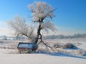
This is delightful.I find the colour palette very appealing, as well as the crisness of the light. The flight of birds on the right add to the mood of the scene.
|
| Photo By: Alan Orr
(K:9671)
|
|
|
Critique By:
david malcolmson (K:4145)
12/15/2003 6:54:53 AM
Congratulations, Harry. A well deserved accolade.I like quite a few things here - the strong diagonal composition, the variety of texture, the way the tiger's colours stand out from the rather sober background tones. Keep up the good work.
|
| Photo By: Harry Eggens
(K:14804)
|
|
|
Critique By:
david malcolmson (K:4145)
12/14/2003 2:17:25 PM
I derived enormous pleasure from this, Petra. It is so good on several levels. I relish the Romantic-Gothic feel of this - Emily Bronte with a dash of Edgar Alan Poe. I have to praise the imagination and the sensibilty that informs this image. And it is a treat for the eyes. Here is a happy instance where manipulation of the image is fully justified by the truth and beauty of the result. The crepuscular light and the muted autumnal tones are gorgeous. Here is real visual poetry.
|
| Photo By: peta jones
(K:12615)
|
|
|
Critique By:
david malcolmson (K:4145)
12/14/2003 1:49:52 PM
Is that how you were when you took this?
|
| Photo By: ryan winton
(K:3027)
|
|
|
Critique By:
david malcolmson (K:4145)
12/14/2003 1:42:14 PM
The light and the tones in this are quite pleasant but there is an empty space in the bottom third (right) that demands some extra element to balance the composition - a figure, a rock or large stone would have been suitable.
|
| Photo By: Ivan Etxebarria
(K:346)
|
|
|
Critique By:
david malcolmson (K:4145)
12/14/2003 9:14:34 AM
This one of those rare occasions when some background information would be useful. Is this a visual metaphor for the subordination of women in some cultures? The eyes carry the whole burden of the emotion expressed here, so little else is visible to provide clues.It is a disturbing image, and well-captured..
|
| Photo By: faisal abdullah
(K:89)
|
|
|
Critique By:
david malcolmson (K:4145)
12/14/2003 9:04:59 AM
The lady and her dog are a good subject for for this image. What spoils it for me is the heay manipulation. I don't think the subject justifies the burden of such heavy treatment. It is as if you are trying to give the image more significance than it merits. The effect is very mannered. What is wrong with simplicity?
|
| Photo By: Zelda Zabrinsky
(K:3036)
|
|
|
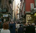
Critique By:
david malcolmson (K:4145)
12/14/2003 7:59:38 AM
To tell the truth, Antonio, I didn't enjoy the mood here! I am glad to be sitting here at home away from the crowds. Only a masochist would enjoy this scenario - is it the Christmas shopping time? This is another busy image, no point of repose here. It conveys something of that absorbed aimlessness of people who crowd into cities every weekend more out of habit and necessity than love of the place. Like me they would probably prefer to be sitting at home doing something pleasant. Best wishes. David.
|
| Photo By: Antonio Trincone
(K:23167)
|
|