|
|
|
ken krishnan
{K:19102} 6/3/2005
|
Evelyn,
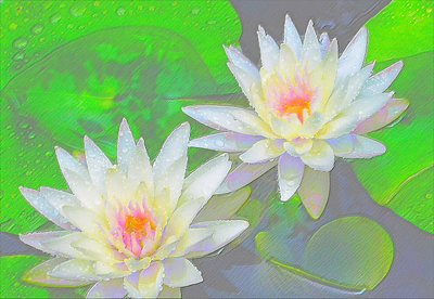
Refreshing lily indeed. The embossing works very well with the image.
cool
regards,
ken.
|
|
|
|
|
Evelyn Mayes
{K:8132} 5/25/2005
|
Thanks for your insightful evaluation, Jim. I appreciate you taking the time to look at them and decide. I sure had a hard time deciding which to post -- which is why I posted all three ;)
|
|
|
|
|
Jim Christensen
{K:18843} 5/25/2005
|
In regard to your question of preference, this is my favorite because of the soft sensual appearance. I like the pastel look. The other two each in thier own catagory, are very good. the detail on the first and the look of the unsaturated one.
|
|
|
|
 Laura Spell
{K:24080} 4/14/2005
Laura Spell
{K:24080} 4/14/2005
|
I like the first one, that you referred to as 'over' saturated. This one seems low on contrast, and the green is a strange, almost artificial looking color.
|
|
|
|
|
Deb Mayes
{K:19605} 4/13/2005
|
This works very well, Evelyn, and it put me in mind of a greeting card before I ever read your "about". I personally prefer the saturated version, and yet in this (greeting card) context, I'd buy this one for sure.
|
|
|
|
|
Merete Westerdahl
{K:11079} 4/12/2005
|
Wonderfull, Evelyn...
Kind regards
Merete
|
|
|
|
 Subhash Sen
{K:11931} 4/12/2005
Subhash Sen
{K:11931} 4/12/2005
|
Personally i liked the first one saturated better ,here there is too much light,cheers,subhash.
|
|