|
|
Critique By:
Bruce Wilson (K:540)
5/14/2002 9:18:52 PM
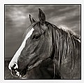
Technically this is a good phot, and the subject is sure alright, but the composition and crop feel a little confined. maybe a slightly wider-angle shot, inlcuding more of the large barn, might bring it into more prominence as the main subject.
|
| Photo By: Lisa Brainard
(K:743)
|
|
|
Critique By:
Bruce Wilson (K:540)
5/14/2002 11:06:52 AM
Asside form my interest in the fungal growth itself (very interesting!) this is a very good shot. I like the color contrast. The background looks a little grainy, and the DOF is a bit shallow for all the horns, but you sure caught it well otherwise.
|
| Photo By: John Charlton
(K:5595)
|
|
|
Critique By:
Bruce Wilson (K:540)
5/14/2002 7:03:48 AM
Thi smight be a nice scene, but I'm afraid it's a bit too underexposed to tell. The brightness of the clouds and reflection just isn't enough, and there is frankly too much noise from the scan in the portions of the frame that should be dark (looking at the bar below, what should be zone 0 show up as zone II). Perhaps an adjustment to the brightness and contrast (or even an automatic contrast adjustment in your image editing program) might fix it up. Adding too much brightness will bleach the color out of the sky, however, so you may need to try several settings before you've gotten it right. Also, if you haven't calibrated your monitor (using the shaded bar below) make sure you do, so that black on your monitor looks like black on ours.
|
| Photo By: Robert Wiewiórowski
(K:0)
|
|
|
Critique By:
Bruce Wilson (K:540)
5/13/2002 5:41:46 AM
I like the way you've captures the big castle in the back, but the tent on the left seems to be crowding it out. The tree on the right, not intruding too much, serves nicely as a frame, but the stuff on the other side is looming a bit too much. I don't think this image is croppable to fix it. Shooting a little later int he day would have created better colors too, I think.
|
| Photo By: Brian Steele
(K:620)
|
|
|
Critique By:
Bruce Wilson (K:540)
4/22/2002 9:57:55 PM
Very nice. The color reminds me of some of those odd stainings that were in vogue at the turn of the century (1900, I mean).
|
| Photo By: Victor Ginzburg
(K:53)
|
|
|
Critique By:
Bruce Wilson (K:540)
4/22/2002 9:55:33 PM
Fun shot, that, but it's titled wrong: should be 9.8 meters/second/second.
And please don't tell me how you did this unless many safely straps were involved!
|
| Photo By: David Chang-Sang
(K:680)
|
|
|
Critique By:
Bruce Wilson (K:540)
4/11/2002 10:32:27 PM
This is such a cool shot!
|
Photo By: Tony Smallman
(K:23858)

|
|
|
Critique By:
Bruce Wilson (K:540)
4/9/2002 8:53:34 AM
I really love these broad sweeping curves in your field shots. Gorgeous colors!
|
| Photo By: Michael Busselle
(K:221)
|
|
|
Critique By:
Bruce Wilson (K:540)
4/5/2002 3:13:49 PM
I like that. The crop now looks much cleaner, more deliberate, with some nice clean lines curving through the water.
|
Photo By: Bill Krul
(K:5597)

|
|
|
Critique By:
Bruce Wilson (K:540)
4/5/2002 2:56:17 PM
I like the cropped version better, stronger composition.
|
| Photo By: Michael Busselle
(K:221)
|
|
|
Critique By:
Bruce Wilson (K:540)
4/5/2002 9:28:58 AM
Nice color-contrast between the brightness of the flowers and the rich colors of the walls. The odd proportions of the doors to the window lend this shot a pleasantly surreal feeling.
|
| Photo By: Michael Busselle
(K:221)
|
|
|
Critique By:
Bruce Wilson (K:540)
4/5/2002 8:46:15 AM
Just plain beautiful! If the foliage didn't echo the shape of the bridge I'd say take it out, but you've done a nice job in spotting the similarities in shapes. Colors are magnificent.
|
Photo By: Bill Krul
(K:5597)

|
|
|
Critique By:
Bruce Wilson (K:540)
4/5/2002 8:25:27 AM
I think you've exposed perfectly for the highlights, but the darks arenb't dark enough, and you've got a pretty flat shot there. Easy to fix, I'd think. Compositionally I like it. There is maybe a bit more blur in the falls in the background than is good for the shot, but the foreground water is nice. I'd really like to see this again with the contrast brought up.
|
| Photo By: Christopher Thompson
(K:145)
|
|
|
Critique By:
Bruce Wilson (K:540)
4/5/2002 8:21:12 AM
I like the central figure, I think he adds to the shot. But the figures at the far right are too indistinct, I think, blending too much with the dark, to be meaningful. It appears that the left-central part of the shot, putting the standing figure at the left of the crop, might work better. You'll lose some of the colors, but the composition will be a bit stronger.
|
Photo By: Bill Krul
(K:5597)

|
|
|
Critique By:
Bruce Wilson (K:540)
4/5/2002 8:14:59 AM
Interesting experiment, but ultimately not compositionally interesting. Perhaps a quick look at the old tryptichs would give you a better idea of how to assemble three relates scenes into a single shot. If the left-most image was more like the right-most one, then the Eifel would have stood out more, and balanced the composition. Your horizons are the second big problem. They are not level, and don't line up. Using a ground glass with a grid on it helps a ton in these sort of shots.
|
| Photo By: Vincent Paul Toscano
(K:78)
|
|
|
Critique By:
Bruce Wilson (K:540)
4/5/2002 8:11:22 AM
You know, normally I think that fill-flash is overused, but here it has given you the unique effect of enhancing the irridescence of the feathers, a very pleasing effect to my eye. Parhaps the bird would stand out more with a complementary background, but that would requre a studio or the like. Very nice!
|
| Photo By: Jason Mckeown
(K:22200)
|
|


