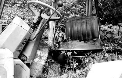
This is part of a study I've been working on of discarded transportation. It's the cab of a JCB that is slowly being reclaimed by nature in Cobham UK. Its not the best of the bunch, but it was the first one of this subject to get processed, so look out for some better ones soon. I think this one is a little flat and for some reason this upload looks really washed out compared to the image I get in photoshop.
In spite of the headroom & washed-out metal problems with the original upload, I think I like it more than attachment #1. Its strength relative to the attachment lies in the presence of the seat. It's so easy to get a feeling that once, somebody was sitting in that seat. The picture thus has this very strong human element, it suggests an unknown but very specific individual. The steering column is much more impersonal in this respect, so the attachment tells a story about machinery and the human civilisation as such, but not about a particular person.
The broken windscreen is good but I wouldn't say it's vital for establishing the JCB as discarded. It doesn't take much effort to break the windscreen of a perfectly non-discarded vehicle :-) The presence of the weeds (and partly also the fuel canister) is much more important for the discarded effect IMO.
As for the second attachment, I can't say whether it works better or not because in a way it's a fundamentally different picture. I'll just say it works well.
Could the reason for the pictures being brighter after you upload them be that you are using a different colour space than the one used on the web?
Why do all of these shots seem so washed out here? Nothing else I have posted have suffered so much, including some low contrast stuff! Anyway, an exterior of the same thing, Matej, does this work better? This one was shot with a Leica M2 and Tri-X.
Matej, thank you! Finally some constructive feedback. One more 'cool pic' and I'd have started to think I was wasting my time. I don't want to use this forum to showcase my work, I just want to post things that I'm not sure about, stuff I'm playing with and even test shots from new cameras. This is exactly the sort of comment I need.
You are so right about both the 'headroom' on the steering wheel and that horrible shiny bit of body work. When I was shooting I deep down knew that is was tight and that the foreground would white out but hey, its just another frame!
As I said, this is first out of PS and not the best. I'll add a couple more here and I'd be delighted to get your feedback. This one is a lot tighter but looses the very interesting rotten seat. I kept agonising about what to feature, in the end I think the steering column (which establishes this as transport) and the windscreen (which establishes it as discarded) works better.
This looks like a potentially very interesting project. My photographic interests lie in a similar realm, among other things, so I am curious to see where you take this series.
In this picture, I would be tempted to aim the camera higher. I don't think the space at the bottom is very important (especially with the presence of that detailless bright sheet of metal on the right). The chair and the steering wheel, on the other hand, are vital to the composition, as these are the identifying elements of the subject. The steering wheel is very close to the top edge - much too close I think - and this tightness is made even stronger by that small white spot in the background that merges the wheel with the edge of the photo.