|
|
Critique By:
Alex Billington (K:1260)
1/16/2006 1:57:14 AM
Excellent, amazing, beautiful landscape photography. Simply captures the essense in full!
|
| Photo By: Marc Adamus
(K:805)
|
|
|
Critique By:
Alex Billington (K:1260)
10/18/2005 7:39:42 AM
haha it is such a great song! glad you enjoy the photo! 
|
| Photo By: Alex Billington
(K:1260)
|
|
|
Critique By:
Alex Billington (K:1260)
7/20/2005 6:06:29 AM
Excellent! I love the comparison between the two and the black and white. A very subtle yet powerful street photo--great job!
|
| Photo By: Rochim Hadisantosa
(K:113)
|
|
|
Critique By:
Alex Billington (K:1260)
7/20/2005 5:59:57 AM
Just amazing! The steam, the warm sun and color, the silhouette, everything. Simple an astounding photo that deserves and award and honor!
|
| Photo By: Nandor Lang
(K:1257)
|
|
|
Critique By:
Alex Billington (K:1260)
7/12/2005 6:14:03 AM
Beautiful!! The perspective is what catches my attention the most... how the clouds and the sky and and everything seem to be leading right towards the tree and sun. Such a wonderful capture--just excellent!
|
| Photo By: Pawel Karpienko
(K:-17)
|
|
|
Critique By:
Alex Billington (K:1260)
7/12/2005 5:56:06 AM
Excellent. It is almost exactly like an idea I though of for a photo before even seeing this. So beautifully captured! Great job.
|
| Photo By: Konrad Zagloba
(K:3)
|
|
|
Critique By:
Alex Billington (K:1260)
5/6/2005 7:48:22 AM
Excellent detail in the flower with sharp, bright, and vibrant colors...! I only feel you could improve a bit more with the background and smoothing that out... Great job tho!
|
| Photo By: John Nobody
(K:4914)
|
|
|
Critique By:
Alex Billington (K:1260)
5/6/2005 7:46:21 AM
Although the bokeh (background) looks quite good and smooth, as well as very green, the remaining foreground flower element just doesn't seem as perfect as could be. I think the DoF (and aperture) could've been wider (as in higher aperture) in order to get more than just that single area of the branch where they split and knot off... The flowers seem ok, but could use a bit more attracting to them if they were more identifiable instead of pointing away in sporratic directions... Anyway, I think you got the technique down, you just need to hone the composition. Just giving you my two cents of advice! =)
|
| Photo By: Stefan Engström
(K:24473)
|
|
|
Critique By:
Alex Billington (K:1260)
5/6/2005 7:39:41 AM
Ooooh excellent wide angle. The rock element in the very close foreground is perfectly composed. Very flowing and smooth -- well done!!
|
| Photo By: Mark Evans
(K:17428)
|
|
|
Critique By:
Alex Billington (K:1260)
5/5/2005 7:41:09 AM
Excellent composition. You have succesfully found the key to producing perfectly composed photos. Everything in this fits together so perfectly... This honestly should be regarded as some of the most brilliant work ever that at least I, and many others, should look up to as perfectly composed and exposed photo. Simply astounding!
|
| Photo By: Patrick Di Fruscia
(K:486)
|
|
|
Critique By:
Alex Billington (K:1260)
5/5/2005 7:37:20 AM
As I am particularly partial to your work, this piece yet again proves how excellent of a technicaly photographer you are. The only bit of "complaint" (if it is even that) I have with this photo is that the long-exposure running water becomes too smooth and in constrast to the green leaves on the tree and the rocks jutting up from the water that are stunningly sharp, the smooth water does not exactly fit as well as many other elements have in most of your other photo work. Don't get me wrong, this is an amazing piece, but I feel it could use a bit more work in its composition to get a stronger final outcome.
|
| Photo By: Patrick Di Fruscia
(K:486)
|
|
|
Critique By:
Alex Billington (K:1260)
5/5/2005 7:31:07 AM
Whoa... Do you know what lens that is he is using on his Digital Rebel?
Otherwise, excellent photo. You rarely see photographers "behind the scenes", as they are always behind the lens. Great capture, very well done!
|
Photo By: Roberto Arcari Farinetti
(K:209486)

|
|
|
Critique By:
Alex Billington (K:1260)
3/25/2005 9:37:32 AM
Cool... I can't say this is a "stand out" piece in the artistic side of things... But in the journalism side (which you listed it in anyway) it is very cool, a great capture. Color is very dynamic (that tone) even though it originally was a digital shot. This stood out to me when I was browsing through pictures and I ended up clicking it and am glad I did! Good job! =)
|
| Photo By: Philip van de Graaf
(K:147)
|
|
|
Critique By:
Alex Billington (K:1260)
3/25/2005 9:35:08 AM
Very saturated and strong colors. Composition is a bit odd, not too much feel to it. You could've done it at a more unique angle or a more dynamic look regarding the pyramid's edges... Other than that, the colors and exposure are great. Well done.
|
| Photo By: Erik Hornung
(K:148)
|
|
|
Critique By:
Alex Billington (K:1260)
3/25/2005 9:32:26 AM
Awww... I have had many conversations with my friend about film vs digital and I am a digital user myself. This photo, however, really truly makes me understand how good film can really be. I don't normally see much truly great film work nowadays (with so much digital) but you've shot a piece on film with an old(er) camera that makes me feel otherwise for once. This is the kind of photo that really is honestly only possible with film. Bravo, excellent job, you've done something that only a few rare people in the world can do as amazing as this... =)
|
| Photo By: Alper Tecer
(K:7007)
|
|
|
Critique By:
Alex Billington (K:1260)
3/25/2005 9:27:59 AM
Woo, you continue to impress me more and more with your WONDERFUL wide angle shots!! Beautiful, very serene, and the leaves add an element that completes the scenery. Amazing photo!
|
| Photo By: Patrick Di Fruscia
(K:486)
|
|
|
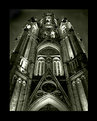
Critique By:
Alex Billington (K:1260)
2/26/2005 10:02:40 AM
Very cool!! It has a very sharp surreal aspect to it, perfect for the church that it is and the mysticism aspect. Excellent job!!
|
| Photo By: Manu
(K:13082)
|
|
|
Critique By:
Alex Billington (K:1260)
2/26/2005 10:01:48 AM
Absolutely stunning. The emotions and the feelings are amazing. Excellent, just excellent!
|
| Photo By: Efisio Mureddu
(K:13104)
|
|
|
Critique By:
Alex Billington (K:1260)
2/26/2005 9:52:56 AM
As the others have said, excellent portait. I just wrote another comment stating how much I enjoy very well done world photojournalism (portraits and everything). This is yet another very well done piece. The background and colors are amazing, that is an excellent compositional arrangement and capture. The face captures some emotions and is good as well. The only bit of improvement I suggest is having more focus on the face. It seems a little dark and also just seems to have the dynamic focus that other amazing photojournalism portraits have. I already think this is a very good photo, but I think it could be made excellent by improving that little bit.
|
| Photo By: Ayse Altan
(K:3905)
|
|
|
Critique By:
Alex Billington (K:1260)
2/26/2005 9:48:11 AM
I have had a niche interest in world photojournalism capturing the emotions and details of the simpler and unique lives of individuals around the world. This photo is just one of the many that you've taken that exemplifies this aspect of photojournalism and is a superb portrait. Great job and keep up the great work! Good background info as well!
|
| Photo By: Claude Renault
(K:1357)
|
|
|
Critique By:
Alex Billington (K:1260)
2/26/2005 9:44:00 AM
I absolutely love your work. My friend just got a 10-22 lens for his 20D and I had the chance to even look through the viewfinder and the angle you get is simple astounding. I wish I had such environments and landscapes and locations to visit in order to capture such beauty. I hope I have the chance to visit around the world to various places to capture this sort of beauty found in your photos. I am inspired both as a person and as a photographer by your photographic work.
|
| Photo By: Patrick Di Fruscia
(K:486)
|
|
|
Critique By:
Alex Billington (K:1260)
2/26/2005 9:41:32 AM
Very cool! I didn't think this was a photograph at first, but is!! I have yet to try my hand at astrophotography but this inspires me to do so. Excellent job!
|
| Photo By: Boris Stromar
(K:9)
|
|
|
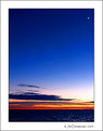
Critique By:
Alex Billington (K:1260)
2/14/2005 2:37:26 AM
Very nice... I think it just needs a little more "content". The sky and colors are amazing, can't be better, but there just isn't much. All there is is a hugely vast sky that takes up 90% of the photo and a very small but bright moon and a little bit of ocean... I think you can just improve upon the content in the future, because this is obviously a very good picture... Keep up the good work!
|
| Photo By: Jim Christensen
(K:18843)
|
|
|
Critique By:
Alex Billington (K:1260)
2/14/2005 2:35:35 AM
Very cool catch. The angle is the best part! Colors are interesting as well. Good job!
|
| Photo By: D mauzer
(K:316)
|
|
|
Critique By:
Alex Billington (K:1260)
2/13/2005 8:29:14 AM
Very cool photo! Good subject, good capture! Keep up the good work!
|
| Photo By: Larry Fosse
(K:66493)
|
|
|
Critique By:
Alex Billington (K:1260)
2/13/2005 8:27:21 AM
I agree... Snow throws off meters a LOT! I actually didn't think about the background or even realize how it came out when reviewing images on location, and I should've taken a closer look at it then... I personally wish I could've done something better. I think I would've either tried to keep it much more out of focus or just lighten or darken it more per your suggestion... Very good comment, thanks, I appreciate it! =)
|
| Photo By: Alex Billington
(K:1260)
|
|
|
Critique By:
Alex Billington (K:1260)
2/11/2005 7:21:04 AM
The greens and the colors coming from the windows of the building are really well done. That is a very good capture. I would only suggest improving the composition by eliminating the ground clutter. There is too much non-needed activity on the ground that is throwing off the serenity of the green windows in the building. Consider moving lower to the ground and closer to the building in the future in order to maintain the view and angle of the windows (and color) yet getting a view of the building that shows perspective (bigger when closer, smaller when farther) and more of darker surroundings, or only the sky, and less of things at the base that could cause clutter. That's my improvement suggestions. As I said otherwise, interesting photo so far!
|
| Photo By: Nedim Muhic
(K:14362)
|
|
|
Critique By:
Alex Billington (K:1260)
2/11/2005 7:17:33 AM
I'm agreeing with George on the shocking absence of people! It's like everyone just disappeared... Very interesting!
The DoF and sharpness on this is immense. You've got the entire image in focus. There's a very warm and welcoming atmosphere/feeling to this photo and to the location. You captured that essence very well. It just makes me want to be there in the mall, just even to be there... A perfect marketing/attraction photo if that is what it's for! =P
|
| Photo By: kokupsy_un morita
(K:2651)
|
|
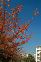
|
Critique By:
Alex Billington (K:1260)
2/11/2005 7:15:00 AM
The colors are very strong, very vivid. Obviously your sharpness and DoF where perfectly set in order to capture everything well, the colors of the leaves and sky and all... You've obviously got the technical ability and knowledge, I just think this lacks in composition.
The buildings and clutter in the bottom really takes away from the beautiful sky and leaves that is really the sole focus of what is in this photo. Even if you were trying to reference some other building or object in order to give more dimensionality or contrast to the tree and leaves, there could be a better outlook for deciding what to include in the background. Even if you pulled the buildings and extra trees out of focus in the background, it would've helped maintain the level of detail on the leaves/tree only. Pulling the camera back and getting a more deeper angle would also help to remove that clutter from the bottom and leave just sky and more of the trees and colorful leaves...
That's just my tip for improvement... =) Otherwise good job, keep up the good work!
|
| Photo By: kokupsy_un morita
(K:2651)
|
|
|
Critique By:
Alex Billington (K:1260)
2/11/2005 7:10:06 AM
Wow... not bad... do you work for them, or how did you get this? Looks almost like a studio arrangement... and that is VERY hard to do for a car!
Does seem a little dark, though... I would've suggest exposuring it more or adding a little more light.
It's a very interesting angle of light, creates a very refined mood to the car. The perspective of it as well, the wide angle (which I love more than anything) is excellent. This really adds some excellent dimensioning to the car. All-in-all this is a very well arranged shot.
As I said, the only bit of improvement is in increasing the bright level on the areas that are already lit so that you can bring out the tones of the car a lot better, create even more contrast, and just show in more vivid detail the actual curves of the car that are being lost too much in the dark level... Keep up the great work!
|
| Photo By: vince wong
(K:72)
|
|