|
|
Critique By:
Bryan Jarmain (K:11941)
3/20/2005 6:45:59 PM
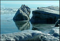
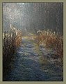
It is so difficult to get a good exposure with harsh lighting. I didnt feel that the loss of the dark detail was a problem as the real value in the photo to me is in the cool icy blue water and shadows and catching the whole feel of the place. A cooling filter may have helped as well. Let me have another go anyhow.
I now used the Shadow/highligh feature to bring the exposure down without loosing so much detail, and then added a cooling filter. Just my 2c worth...
|
| Photo By: Andre Denis
(K:66327)
|
|
|
Critique By:
Andre Denis (K:66327)
3/19/2005 2:20:19 PM
Hi Dennis,
I was following your discussion with Dave on the cropping of this photo. This sort of thing comes up all the time. Sometimes you have a great shot and then something stands out that throws everything off in your mind. Sometimes there is just nothing you can do. The beautiful sun rays shining through on the old cement abutment is the photo 
Andre
|
| Photo By: Dennis Polessky
(K:314)
|
|
|
Critique By:
Roberto Arcari Farinetti (K:209486)

3/18/2005 7:13:03 AM
wonderful mark, it is so strongly this idea, a something of misterious intriguer behind the teeth of the fork.. a DOF extremly strongly, creates a halo of great light and mystery! it seems that something must say.., the teeth of the fork..
the curve of the stem of the fork is beautiful, creates the effect of one fantastic spaceship that vien and towards of us!
cheers
roby
|
| Photo By: Mark Hamilton
(K:8387)
|
|
|
Critique By:
Mariana Castro (K:323)
3/13/2005 5:12:32 PM
Hi John, first of all, I'd like to thank you for all your kind coments on my photos. And then I have to tell you how much I'm liking your photos! I'll keep seeing your gallery, 'cause I love the kind of imagens you do!
And this one is beautiful, 'cause "M" has a great face and it looks so great in this image with the lake behind! The tones you use are great too!
|
| Photo By: John Strazza
(K:11535)
|
|
|
Critique By:
Carsten Ranke (K:14476)
3/13/2005 6:42:25 PM
This is one of the most interesting shots from your (excellent) portfolio for me, and I reason why. Maybe it is the fact that a part of my surrounding looks very similar to this scenery, and I made a series of B&W`s in Nov 2003 with fog and snow. Maybe its my intention to learn more about composition, and this a fine example for me. Third, it raises surely technical issues, because you shoot film, and I am "digital" for a while. In 2003, I did not work with masks and composites, so I was not comfortable with the results. I will try a rework on the RAW negative, to come close to the decent tones in your shot. Just curious: why do scan a print, not the negative ? IMO, some information gets lost when you print because the tonal range of negative is superior to print (right ?)
|
| Photo By: svend videbak
(K:7376)
|
|
|
Critique By:
alexander garcia castro (K:7335)
3/13/2005 6:49:56 PM
Judi, I do not miss Australia at all. But you are by far a very good reason to go back. Very touching pictures, very nice.. you leave me with no words. Every picture in your portfolio is full of emotions, of feelings. After seeing your pictures I can only say I did not get to know australia or australians. You need a special thing inside in order to take those pictures.
|
| Photo By: Judi Liosatos
(K:34047)
|
|
|
Critique By:
Carsten Ranke (K:14476)
3/13/2005 7:28:17 PM
I understand your evaluation, it is an outstanding shot by composition. It is the formal correlation of weed and power poles, a diagonal composition, and the contrast in every sense as already mentioned. Contrast by DOF, by nature, by size and material. To play devil`s advocate: why not remove the small piece of weed in the lower right ? Do you have fundamental objections against every manipulation ? Just curious what you think about that
|
| Photo By: svend videbak
(K:7376)
|
|
|
Critique By:
Mary Brown (K:71879)
3/13/2005 7:28:50 PM
I would never have thought that a rusty rail could be so beautiful. As you can see, I have been looking through your pictures. You definately have a talent for photography. Thanks for recommending this group to me. Considerable time has been spent looking at some great photos by many different people. I am hoping to learn some techniques so I can also take some memorable shots. Mary
-
|
| Photo By: Shane Finnigan
(K:1990)
|
|
|
Critique By:
karen clarke (K:18893)
3/11/2005 4:31:59 AM
In viewing your portfolio I have realized that you have a strong point when it comes to composition. Each photograph seems to be very well balanced. Such as with this one you can see the invisible yet perfect diagonal line. Now normally for something like this, most would crop down just above or on the upper part of the head. You have left some space, but it seems to work well for you. The white sofa showing on the bottom right hand corner is rather bright(and also the skin on the breast area and lower neck), but you have pulled it off nicely because of the great amount of contrast it has against the black shirt. And of course everyone knows it's such a big "no-no" to crop out parts of arms and hands...blah blah blah...but it works for your composition. A very natural looking expression, nothing forced, so I can tell that the model has a good relationship with you. What I especially love is that the photograph is pretty much devoid of color with white sofa and black shirt-but on the lower left you get hit by a bit of blue-but its not overpowering at all. Anyhow, a really nice portrait, you have a great eye for composition and details. Keep up the great work~
|
| Photo By: Luis Alvarez
(K:2038)
|
|
|
Critique By:
Larry Monserate Piojo (K:10780)
3/11/2005 4:46:38 AM
Hi Lara,
I love what you did in your portrait. The blurry adds mystery to the photo and the wide black backrground on the left is really a mystery to solve. Ive seen your works in your portfolio and I love them all! You have such a wonderful talent! I know you'll make it Big in photography! Keep it up! I adore you!
Oh by the way, I think "Regrets" would be a good title for that. Regret because as I look at her, she seemed to be walking away from that black space and suddenly turned back. She might have some thoughts in her so she walked away and suddenly came to realize her mistake but too late to return. Her eyes somehow speaks sorry and regrets. ....hmmmm... and that is just my imagination!!! ehehehe
b.regards,
athrio (larry)
|
| Photo By: Lara dos Santos
(K:1578)
|
|
|
Critique By:
svend videbak (K:7376)
3/7/2005 11:03:45 AM
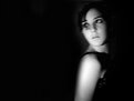
An impressive picture, I think I prefer this monotone version. Great clarity and detail. The harsh light and digital process makes for a very electric picture. It has an attractive alpine sterility (can't think of another word to describe it) and the slight perspectival elongation is dramatic. Also, the sun-starring is fashionable these days. Rgds, Svend
|
| Photo By: Carsten Ranke
(K:14476)
|
|
|
Critique By:
Den Thompson (K:30432)
3/7/2005 12:31:26 PM
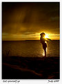
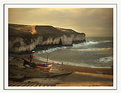
Magnificent image Lyne. The light in the sky and on top of the cliffs is gorgeous. Including the people is important to give the sense of scale which would have been lost without them. Well done.
BTW welcome to Usefilm and keep shots like this coming!
Den
|
| Photo By: lyne edeson
(K:107)
|
|
|
Critique By:
Carlos (K:12969)
3/5/2005 3:15:21 PM
the sweet connection of a child and a dog is a timeless image dear Nando.
Since my photographic ?identity? is pre-digital your image touches me deeply, in that the magic shown is of the same pure quality the great street shooters were able to invoke - the kind of image which stays with the viewer long afterwards.
This is in that class of pictures - a favorite.
Sinceri complimenti
C
|
| Photo By: Nando Mondino
(K:14261)
|
|
|
Critique By:
Andre Denis (K:66327)
3/5/2005 3:50:06 PM
Great shot Devin,
I know how hard it is to get good shots of these birds in flight. I was trying to capture some a few weeks ago here east of Toronto. I got a lot of nice shots when they were stationary, but could not get anything decent in flight, even with my multiple exposure setting on.
Andre
|
| Photo By: Devin Manky
(K:106)
|
|
|
Critique By:
Green Gemini (K:3391)
3/1/2005 1:57:31 AM
I like the man with the umbrella theme that you have going in your portfolio. I would like to point, the man legs seem to be transparent because I can see the frame of the picture through his legs. Did you want him partially in the painting, that he is looking at, and standing outside of it at the same time? If so, I like that idea. One other thing, I think you may have made the image a little bit too large becuase it looks somewhat choppy. Try proportionally reducing the image size a bit and that will make the overall image a bit more crisper. Overall, I love this shot. Great work!
|
| Photo By: Mitchell Miller
(K:3009)
|
|
|
Critique By:
Kristina Kohut (K:49990)
3/1/2005 4:52:42 AM
Your photo shopping gave this a strange quality, very different but good because of the originality and crisp touch while it's same time soft and smooth. Love the composition and beautiful light too! It's like a path of hopes... Maybe here is the way to spring?
|
| Photo By: NN
(K:26787)
|
|
|
Critique By:
Antonia BauerleinSehnert (K:30599)
3/1/2005 4:52:55 AM
This is truly a breathtaking shot from the standpoint of the color, dramatic sky and reflective water. If you were able to capture the children in a less clustered group with the right stances, this would have been a blockbuster. As it is, it is wonderful nonetheless and a treasure to be sure.
|
| Photo By: Sian
(K:2487)
|
|
|
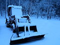
Critique By:
Eric Peterson (K:4419)
2/28/2005 3:47:56 AM
Like Kevin said, first thing to do is correct the white balance, unless you're looking to create a moonlit appearance. If you do want your snow white, it's too late to do it in camera but your image editing program should have the ability to fix it. In Photoshop Elements 2.0 the tool is called Color Cast and is in the Enhance menu under Adjust Color. Other programs may be different but should have a similar function. The other two improvements I'd suggest would be to not frame quite as tightly to allow just a bit more space around (mostly in front of) the tractor and use a smaller aperture for more DOF to keep the back of the tractor and trees in sharp focus. On the positive side the basic composition is good. Placing the tractor off center prevents the shot from seeming too static and helps create interest. It's a well seen shot esthetically that just needs a couple technical boosts to help it out.
Eric
|
| Photo By: Chris Martin
(K:35)
|
|
|
Critique By:
emily savva (K:21113)
2/25/2005 11:48:45 AM
exceptional distortion and passionate black-red combination for the end of the busy day and of a series i enjoyed all the way through... it had to come to an end but it was the journey that counts most  and it was imaginative and of high quality from beginning to end... intimate and searching for answers... or evoking new questions!!!! my honest congrats for your work my friend and a kiss Goodnight!!!! hugs... emy and it was imaginative and of high quality from beginning to end... intimate and searching for answers... or evoking new questions!!!! my honest congrats for your work my friend and a kiss Goodnight!!!! hugs... emy
|
| Photo By: Jeanette Hägglund
(K:59855)
|
|
|
Critique By:
Kat Apps (K:1139)
2/25/2005 12:13:37 PM
This is a great photograph. It is very well captured, you have used the light well. I would be interested to find out the shutter speed and aperture you used and whether or not you used a tripod. You have made good use of space. The photograph is very sharp. OVerall an excellent image. I love the effect and colours you have used. I find hands such a fascinating subject; they are so dexterous and pilable. You have captured the abilities of hands superbly. Well done
|
| Photo By: aydin turker
(K:3988)
|
|
|
Critique By:
M.M. Meehan (K:3751)
2/23/2005 4:39:13 AM
Wow!!! Incredible colors. It was worth being in the water for this one.
At f 16 that swift river must have been rolling along pretty good. This froze it.
I love the colors and composition. Have to add it to my favourites to look back on to see how you got these vibrant colors. I can get colors like that with my little digital Canon, sometimes, but I have yet to learn how to do it with my Elan. The 35mm is so much more fun to use because I have to actually think. )
|
| Photo By: Beverley Lu Latter
(K:513)
|
|
|
Critique By:
David Scherer (K:309)
2/21/2005 5:39:40 AM
This is a really good photo. The one thing I think might make it better is if the girl was framed better inside the photo. I can't put my finger on it but maybe pulling back just a tad with the lens to get a bit more details of her chest and head, so the image doesn't seem cropped a bit. It's difficult to do with shadow, but since you have a digital at least you won't have to worry about wasting film trying.
|
| Photo By: Andrew Semansco
(K:423)
|
|
|
Critique By:
Curtis Feather (K:5130)
2/21/2005 5:56:10 AM
Nice work here and I enjoy your portfolio. I find the two most recent posts more abstracted and a little more in depth. This here is also nice though, at first I was going to say it has an almost forced sense to it, but then I read you were going for the vintage movie studio shot, and this definately fits. There is a sense she knows she's being photographed, and is in a pose, not natural, although this works fine for what you wanted. Good work.
|
| Photo By: Coral Stengel
(K:118)
|
|
|
Critique By:
BRH BRH (K:-210)
2/17/2005 11:35:14 AM
Hi
I really like your portraits........
One of my problems is, that the background always seems to "disturb" my pictures. How do you make your background complement the portrait so well? Do you take them in a studio or do you work on them afterwards in PS?
|
| Photo By: // //
(K:6081)
|
|
|
Critique By:
emily savva (K:21113)
2/17/2005 11:39:13 AM
a marvellous love affair my friend!!!! amazing natural abstract... the richness of tones and textures is simply superb whereas my eyes wonder from one level to the other enjoying the pureness and simplicity of the image... think the heavy framing works really nice making the pic even more impressive and otherwordly!!! excellent by all means.... warm regards... emy
|
| Photo By: Morc Piantedos
(K:21834)
|
|
|
Critique By:
Arnoldas Jurgaitis (K:2)
2/17/2005 12:35:41 PM
Dear Svend,
The most impressive in this image is relation between white spots and black objects. All together they bring feeling of balance, like night sky with Great and Little Bear. Gray tones - like music which accompanies, joins and accentuates the rythm.
Great image
Arnoldas
|
| Photo By: svend videbak
(K:7376)
|
|
|
Critique By:
James McGinnis (K:6045)
2/15/2005 11:46:23 PM
Beautiful Arabian! That long delicate head and face is such a classic marker on the Arabians. Simply gorgeous!
I think you could have gone in two possible directions with this one. If you had picked your shutter speed up a bit you could have stopped her feet and had a really dramatic image of power. Had you gone the other way, you would have blurred the feet even more and brought out a sense of motion. This might have been a better choice because of the dust surrounding the feet. The only other suggestion would be to crop out the darker horse. Although it is in the background, I still find it to be a bit distracting.
It's a nice image. I would just offer these suggestions for your consideration.
|
| Photo By: Latif alobaida
(K:5005)
|
|
|
Critique By:
David Hofmann (K:22223)
2/13/2005 7:07:27 AM
I'm sure there are many ways and probably even better ones, but my method of "eye recovery" is making two conversions (from color to B&W) in to separate layers. A normal one, and one when I just pay attention to the eyes. Then I carefully paint (using 8% opacity with each stroke) the eyes-layer back though into the normal layer.
I tend to use laymasks instead of erasing parts but you know what I mean.
When going from color to B&W I often use little of the blue channel and that makes blue eyes become really dark. For my son Aaron I have to do the eye recovery a lot. I didn't do it on my "wind" photo of him and the eyes are really dark. But I kind of liked the contrast of the bright face and dark eyes so I kept it.
|
| Photo By: Dina Marie
(K:-1410)
|
|
|
Critique By:
taran (K:1284)
2/12/2005 6:55:31 PM
Ok, great photo, but there is a slight problem with this one, perhaps its my eye... I notice you are having problems creating halo's around your selections in this photo... it seems you have selected the buildings with the magic wand and adjusted the levels of the sky independently of the levels in the foreground and/or buildings. Now, although you have feathered your selection, you will still notice that your buildings now have a slight glow immediately surrounding their outsides, notice the roof on the left most building and you will see what I am talking about. I am sure there is a way you can minimize this effect by using a quick mask and a gradient, but I normally now go in by hand and burn the outsides of the buildings to make them darker. This is a time consuming process, but its the only way I can minimize the damaging effects of feathered selections. I am sure in the next few months I will come up with some kind of solution... working on that. Thanks for sharing.
|
| Photo By: Mark Beltran
(K:32612)
|
|
|
Critique By:
Russell Fletcher (K:1717)
2/11/2005 6:12:05 AM
Hi Melissa,
You have done extremely well considering the state the photo was in.
You can see some swirl/smudge lines on the grass where you have been taouching up, but looking at the original you can see that those areas required the most correction.
The colours that you have been able to achieve are excellent.
The only thing that really strikes me a requiring a bit more work is the left side the riders face (our left) this seems to be too white and highlited, I am not sure if you are able to give it any colour or atleast bring the brightness down a step.
Great work, I would love to hear your thoughts.
Russell
|
| Photo By: Melissa
(K:1791)
|
|